

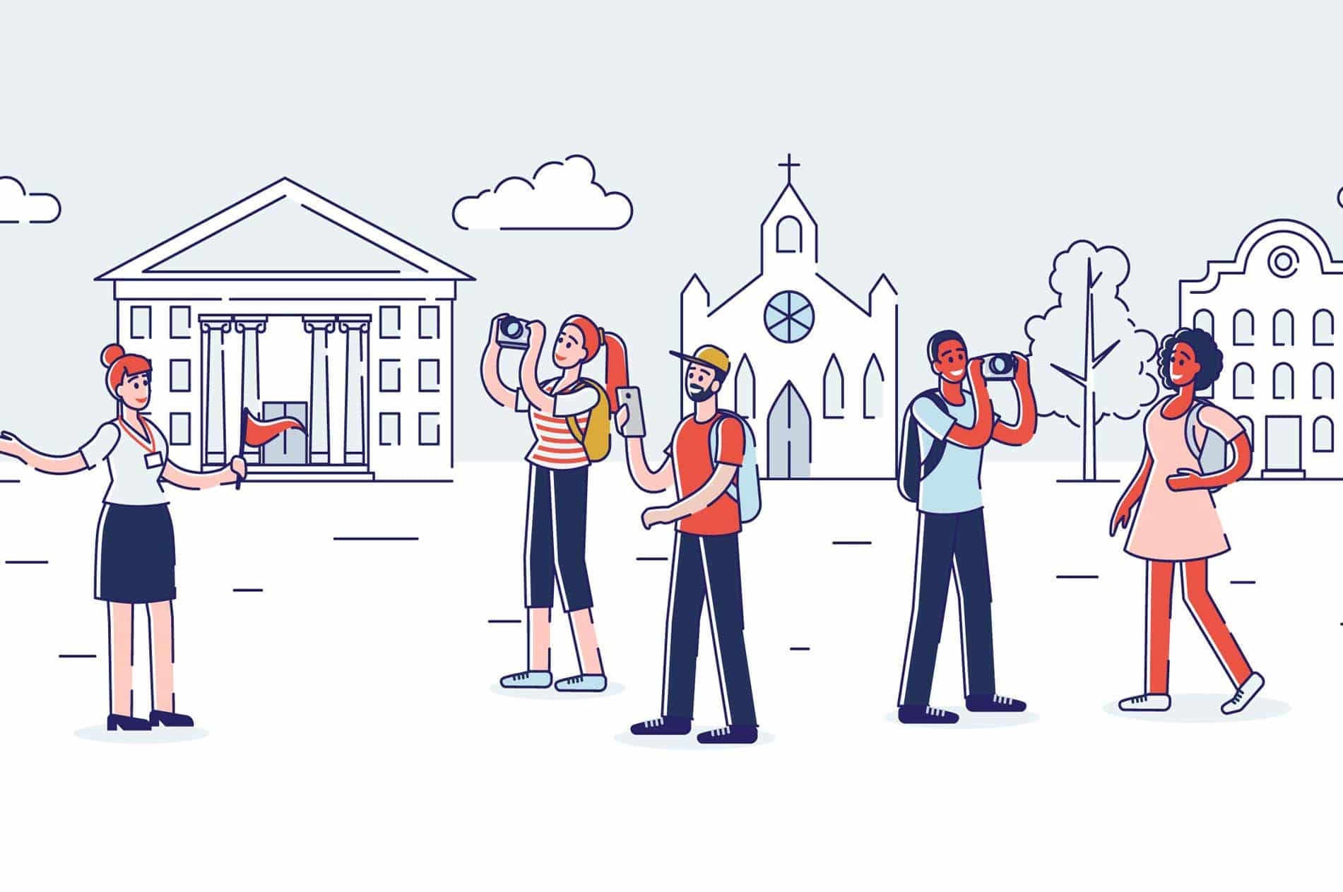
Travel youth market buying process
Ever wondered what goes in the heads of Millenials and Gen-Z wanting to buy online an adventure and explore the world? Well, let me share the secrets as a User Experience (UX) Designer and part of the travel youth market.
Travelling has become an essential part of every young person’s life and we just can’t live without it. As a UX Designer, I spent the last years analyzing the behavior of other travelers in their 20s and observing the steps they go through before buying an adventure online. I’ve been understanding their motivators for choosing a travel product, their emotional state before making a booking, and what makes them ready to make a booking.
Understanding who we are
We are seen as smartphones and social media-obsessed, where nothing from our outside world matters, but the reality is that we would use the power of the digital tools to grow, innovate, explore, connect, share and stand up for the issues we care about.
As digital natives, we have grown up with cultural influencers that have planted the seed of our global mindset. This makes us ready to explore content from countries near and far, encourage cultures different from our own, ready to venture out in the world, and make our travel matter.
All with the purpose to build long-lasting memories, overcoming our fear of missing out and find that human connection we’ve been craving for.
There is a great read that dives deeper into the subject showcasing the Travel Youth Market Trends of 2019
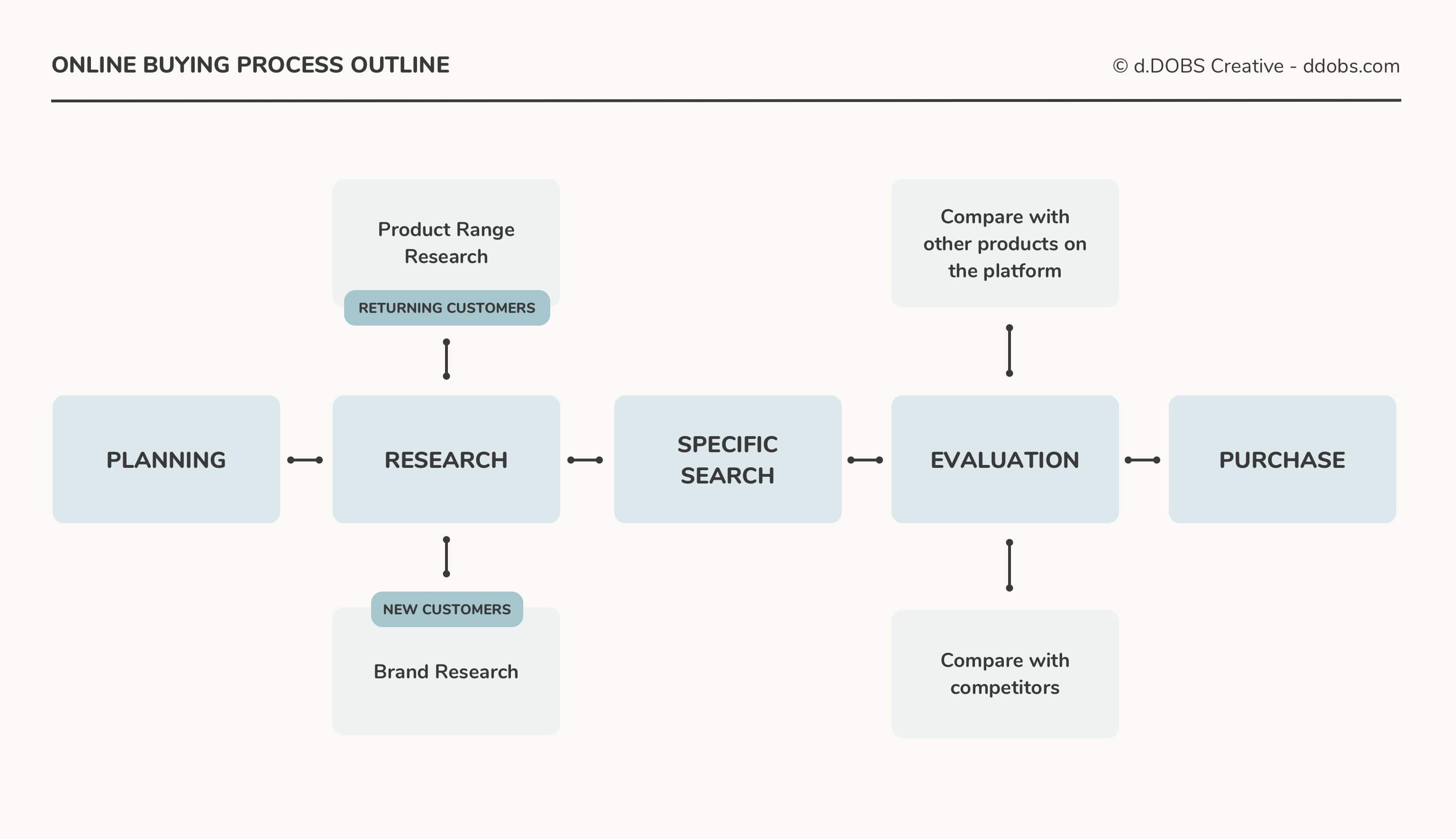
The buying process outline
Through working on digital eCommerce travel platforms, conducting focus group researches, and moderated studies I’ve defined five stages that a person would go through when placing a booking online.
RELATED: 6 Usability testing platforms rated best to worse
Planning phase
The emotional state is Wanderlust.
The customer’s shopping experience begins even before they have seen our digital platform or have realized that we offer a product that they would like to buy.
When it comes to traveling, in our every-day lives we daydream of the next adventurous destination. We don’t know what it is, but we know that we are ready for it.
Targeting people interested in travel with specific brand awareness messages is crucial. Regardless if it’s online or offline, what’s important is to grab people’s attention, plant the seed of a travel product that could resonate in their subconscious the next time they are ready to do research where and what to buy.
Research phase
The emotional state is Globetrotter
When you have guests at your doorstep, you don’t keep them at the door. You invite them to your house, offer them food and a drink.
This is the exact approach of how a digital platform should treat their customers — invite them in, don’t keep them waiting!
Most of the research phases start with a simple Google search. Some people know a specific travel brand they are looking for but most people don’t.
An example search of Millenials and Gen-Z looks like straight out of a bucket-list:
“I want to see the Eiffel Tower” or “How to get to Chichen-Itza?”
Having your platform’s SEO ready to engage with what the customers would be looking for is your invitation to the people. Once they come in, visually focused content should fast and easily present what’s the product like.
You can not expect from this stage to drive customers straight away to check out. It is very unlikely for someone to purchase in this phase. My research has shown that on average people return 5 to 8 times to the website before they are ready to proceed with making a booking.
Allow people to explore, look around, and understand what is it all about. The key here is to leave a memorable impression! A combination of easy-to-understand content, flawless user experience, and breathtaking imagery from real people who experienced the product in the past.
Specific search
The emotional state is Exploration
Once caught the people’s attention, the explorer nature inside your customers would drive them to look for a travel experience within their available time and budget.
Needless to say how important is the search experience of a digital eCommerce platform at this stage. Use that to dive deeper into the customers’ preferences — get to know them, learn what they are looking for, what do they desire most based on different search filters, keywords, etc, and create ways to present what’s relevant for their needs.
Allowing people to easily analyze the product would instantly drive them to the next stage of the buying process.
Product evaluation phase
The emotional state is Excitement
When buying something online, how many of us always have several tabs open on our browsers, trying to compare which product brings us the best value for money?
It’s no different from what Millenials and Gen-Z experience when are planning to purchase travel online.
Even more, for us, this purchase is probably the most important than any other we have ever done online. We’ve worked hard for our savings and we want to make sure we would spend it in the best possible way.
So help them do so!
It is unavoidable that at this stage the people would look into your competitor’s product, and try to calculate what is the best way to get the experience they are looking for, for the best price.
Convince people that your product is the one that is worth spending their money on. Help them understand the value of the product by making it relatable to what they are looking for — a product that would make their travel matter.
Build trust between the brand and the customer. Show that you are different from the competitors and display what are the benefits for people to choose you and not someone else. Using real people’s stories and testimonials of how their trip went could be the tipping point for many to choose YOU.
Purchase phase
The emotional state is Excitement x 10
There is nothing more exciting than finishing the booking for your travel plans and share it with everyone you know. Before people can do that, they would face the challenge of a booking experience.
Why is it a challenge? Rarely a booking experience is perfect — especially in travel, where people need to provide so many details when making a booking.
Millennials and Gen-Z would love to skip the boring stuff in life and get to the fun part as fast as possible.
In a booking process, the fun is to see your itinerary and make the final payment for it. In this emotional state, overwhelming people with making too many decisions while they are trying to get to the “end” could make them feel impatient and stressed which instantly would make them leave.
So keep the experience as simple as possible, and show that as a brand you are beside them in every step of the booking process — as would a real person do if they had to book the trip for them.
Design system in Sketch that is effective for UI designers
Hey designer, have you ever had the case of creating a million versions of the same screen just with very small differences in between? Or have someone asked you to create different prototypes for different stakeholders on the same project with very small differences? Have you ever wished to have a design system that would help you make quick and easy updates?
Of course, you have! So have I.
The struggle without a design system
I recently worked on a project where I had to create 3 different prototypes for different people within the businesses. Most of the design elements were the same with very small differences.
They had at least 5-6 versions of a homepage screen where the rest of the pages were with identical UI design.
On a bright, fun Monday, I received feedback on one of those identical elements. I was asked to replace a logo graphic with a different one. The reality I was facing was that I had to update about 50 screens with such a small change. #DesignersFun!
This made me think. I can either sit there and brainlessly update 50 screens one by one, spend a whole day and then someone will ask me to do the same tomorrow or to come up with a way to automate this process.
Тhe choice here is obvious. I had to create an automated design system that can support an unlimited number of changes that I can apply across screens in seconds.
The set-up I used
I design in Sketch, but apart from that I had help with some plugins that helped me to achieve this:
- AutoLayout by Anima
- Sketch Automate by Ashung
- Rename It by rodi01
Divide the design into sections
After you have created the design of your page for desktop or mobile think about how you can divide it into sections. As an example, I will use half of a design I did for a home page.
The sections I have defined are:
- Top Nav Bar
- Header with Search
- Intro Statement
- How it works
- And Instagram Images

Turn the sections into Symbols
The next thing I did is to turn the section into symbols. It is important to make sure that all the symbols have the same width (the size of your artboard) and also include all the paddings.
The easiest way to do this if the section doesn't go edge to edge is to draw a rectangle around the section and create the symbol with it. When you create your symbol, you can delete the unwanted rectangle.

- I've included half of the top and bottom margin I wanted to have in between sections. This is because once you put the sections one above the other, the padding space gets added
- You include the section's background color - either as an artboard background or just a rectangle with the background color
- I have used the AutoLayout plugin to make the correct alignments to center and lock some of the elements to stay in a fixed position on the artboard.
Create a Symbols Library File
The next step is to copy your symbols into a new sketch file that you would name something like My Project - Library.
Once you migrate your symbols to the new document, you can include it in Sketch as a Library from
Sketch > Preferences > Libraries
Now the last part that is left to do is to link the symbols in your design file to the library. It's simple - just change the symbols source from the left-hand side.
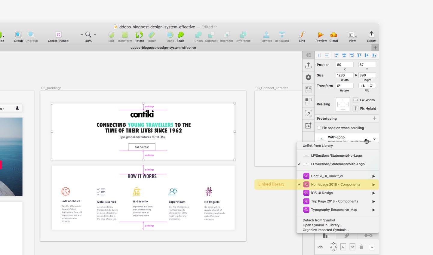
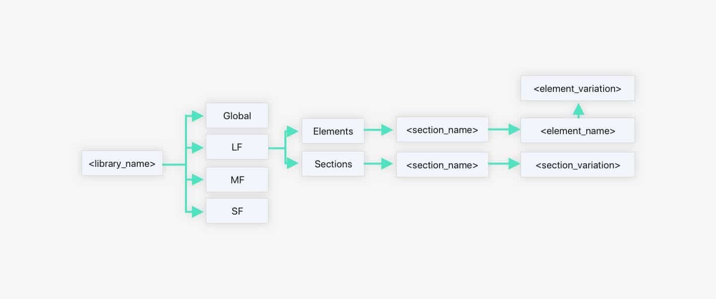
Organize your design system with structured symbols naming
When you create your symbols for your design and move them to the library file, it's good practice to name them with some sort of a structure.
For example, the structure I have used to name the symbols starts with the format I am designing for. Then its divided into Sections and Elements.
Under sections, I have put the complete design sections in the size and format as I would use them to build my pages. Under elements I have put all symbol elements (e.g. icons, and other elements) I have used to build the sections.
After that, I have categorized my symbols by section name. Then under the section name, I have added the different variations of a section.
To help you name your symbols you can use the RenameIt plugin for Sketch that I have mentioned above.
The finished design system
Once you have organized your symbols with correct name structure and you have used them in your designs, you can import any other symbol or variation of a symbol directly from your library. It should look like this:
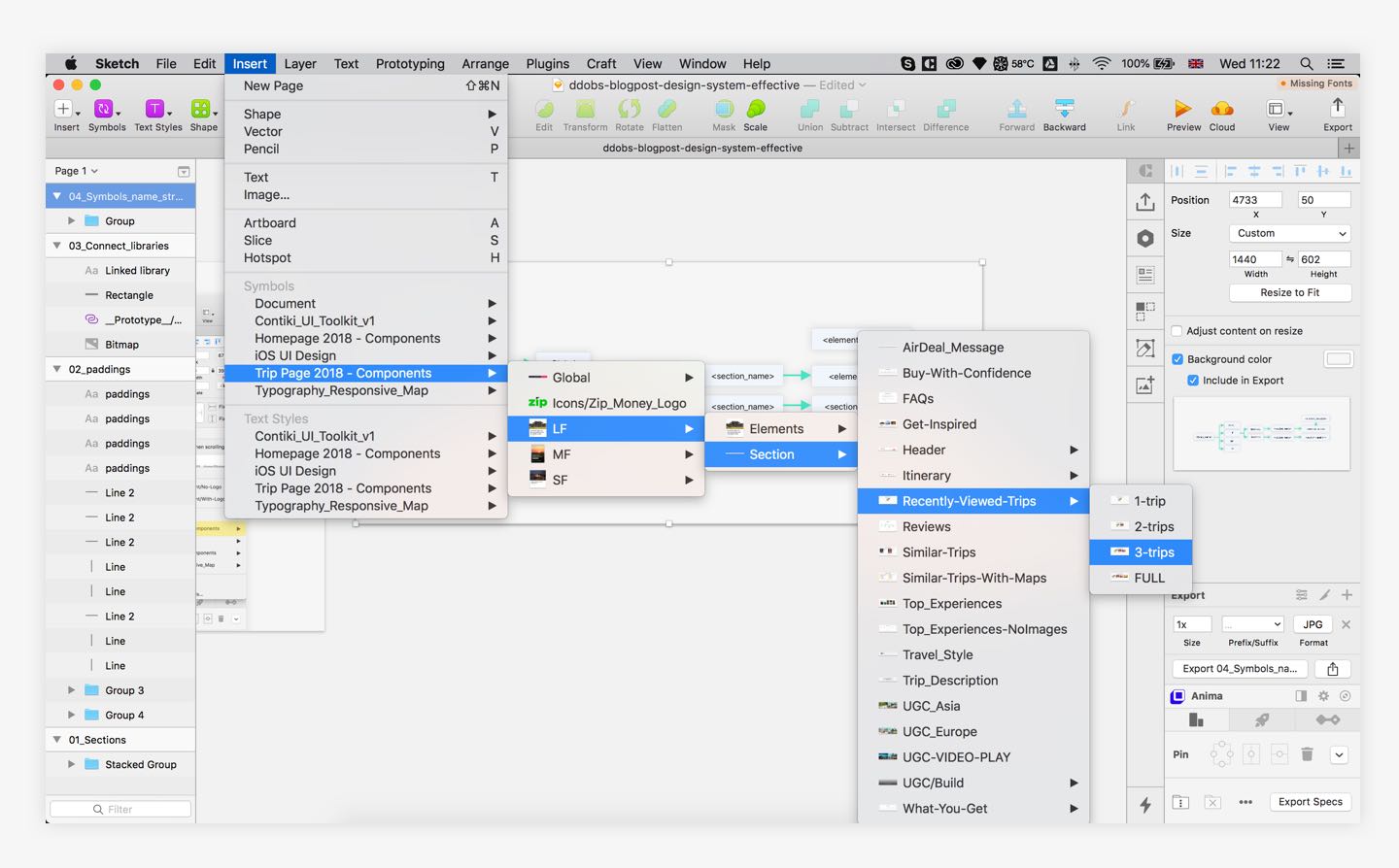
Note that sometimes when you update a symbol with a different version the height of the new symbol might be different. To update it easily you can use the Automate plugin that has an option to reset the Symbol to its original height.
Updating designs become easy
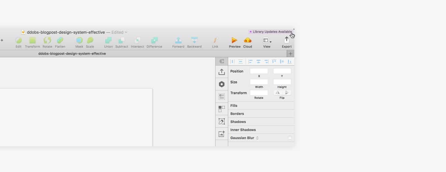
After all the hard work is done, updating the designs is now easy. Just open up the section you are editing in your library document, make the changes and save it.
Once you come back to your design file you would see an option from Sketch that will ask you to update your library. The changes will be applied on every single screen and artboard across the file.

6 Usability testing platforms rated best to worse
As a UX Designer, once you begin work on a certain project you always end up needing to perform usability testings on wireframes, prototypes, concepts, ideas or existing products. Doing so will uncover many interesting unknown facts about the product or validate already existing ones. In many cases, businesses do recognize that there is a need for usability testing in the product design workflow but almost every time they do not want to spend money on it.
The usability testing challenge
I was recently asked to find a remote usability testing platform that would fit the business needs and budget. But, what budget? There was no budget for testing planned at all. Because of that, the first step was to actually request some amount of money approved that I can use to spend on research tools and software.
After securing that, I started doing research on what platforms are out there, what features they offer, and how much they cost. I've put together a list that you might find useful and save you time in doing such research.
The information I have gathered below is relevant as of March 16, 2018
1. UserTesting.com
Subscription Cost: From $15,000 / year. Some of their other plans can go up to $25,000 per year.
Cost per participants: FREE. No additional cost is required to pay to add participants to your study. If you are unhappy with a participant it can be swapped free of charge.
Number of Studies: 12 / year. Unfortunately, this is quite a downside to have only 12 studies per year per organization
Account access: 3 people. You can have 3 people from the same organization running studies at the same time and having their own accounts

As part of your subscription, you also get participant screener questions. You can choose the device you would like to test on - desktop or mobile. Also available to filter by are options like age range, country, income, web expertise, and more
Personally, I believe this usability testing platform is great and they have over 1m testers across the world. Mainly in the United States but their panel size is quite decent in Australia, the United Kingdom, Canada & India. Although they are quite expensive, whenever you launch a test with them, the results come in within an hour which is quite handy if you are expected to deliver quick results. If you are unhappy with a video or a tester for some reason they would change it for you free of charge.
The experience while watching and analyzing a video is quite good too and offers features like adding notes, making little clips, and creating a highlight reel with the most important comments from all the videos in your study. That doesn't happen yet automatically yet but we can't have it all, can we!
If the business/project you are working on can afford this software, I would definitely recommend it! I was lucky to use it while I was working on a project to improve a design and the user experience for last minute deals listing on a travel agency website.
2. Validately.com
Subscription Cost: From $2,388 / year. Although this is the lowest plan it offers quite some features, it's also worth checking what their other plans are.[/toggle]
Cost per participants: $15 for unmoderated / $150 for moderated. Although you pay here for your participants separately, they offer you two types. Unmoderated is for remote usability testing where people think out loud and follow a script. Moderated is when you invite people on 1:1 video calls.
Number of Studies: 36 / year. If you run out of studies, you can top up your allowance for extra $588 and you will get 36 more studies until the end of your billing cycle.
Account access: 3 people. You can have 3 people from the same organization running studies at the same time.
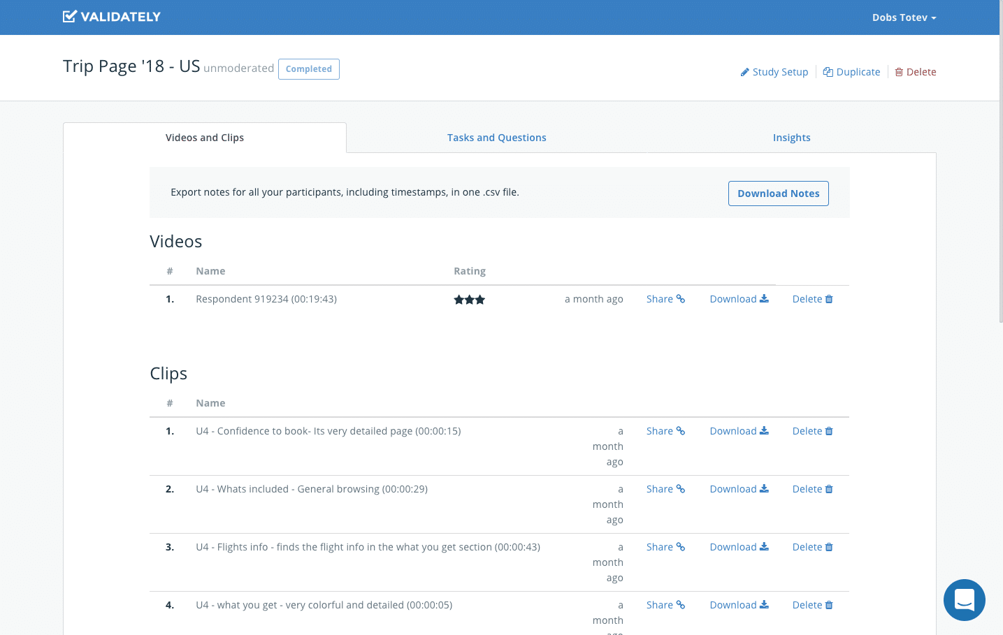
As part of your subscription, you also get up to 2 participant screener questions. You get to choose the device you would like to test on - desktop or mobile. Choose the demographics of your participants - age range, country or if they have kids or not. You also get a very sweet option to create insight reports where you can add short clips with highlights and comment on them that are fully shareable.
Probably the best usability testing platform that you can find and will match expectations vs. costs and turnaround time of results. When you set up a test, results come up quite fast, probably in about 2 hours or so although they say it might take up to 5 business days. Their UI for previewing and analyzing videos can be improved but it is not bad or difficult to use. They also have good customer support if you have any questions that you would like to ask. They offer testers in Canada, the US, Australia & NZ, the UK, and the Rest of the world combined.
3. WhatUsersDo (Discontinued)
Subscription Cost: From $10,500 / year. They also offer a pay per credits plan. You can purchase 10 credits at a time for about $700 and exchange 1 credit for 1 participant in a study.
Cost per participants: FREE with the subscription"]If you have the subscription you don't pay anything for the participants in your studies but if you use the pay per credit option you would have to pay 1 credit for 1 participant. You can buy 10 credits for about $700.
Number of Studies: Unlimited. This is great!
Account access: 1 person. Only 1 person can access the account and run studies but you can run multiple studies at the same time.
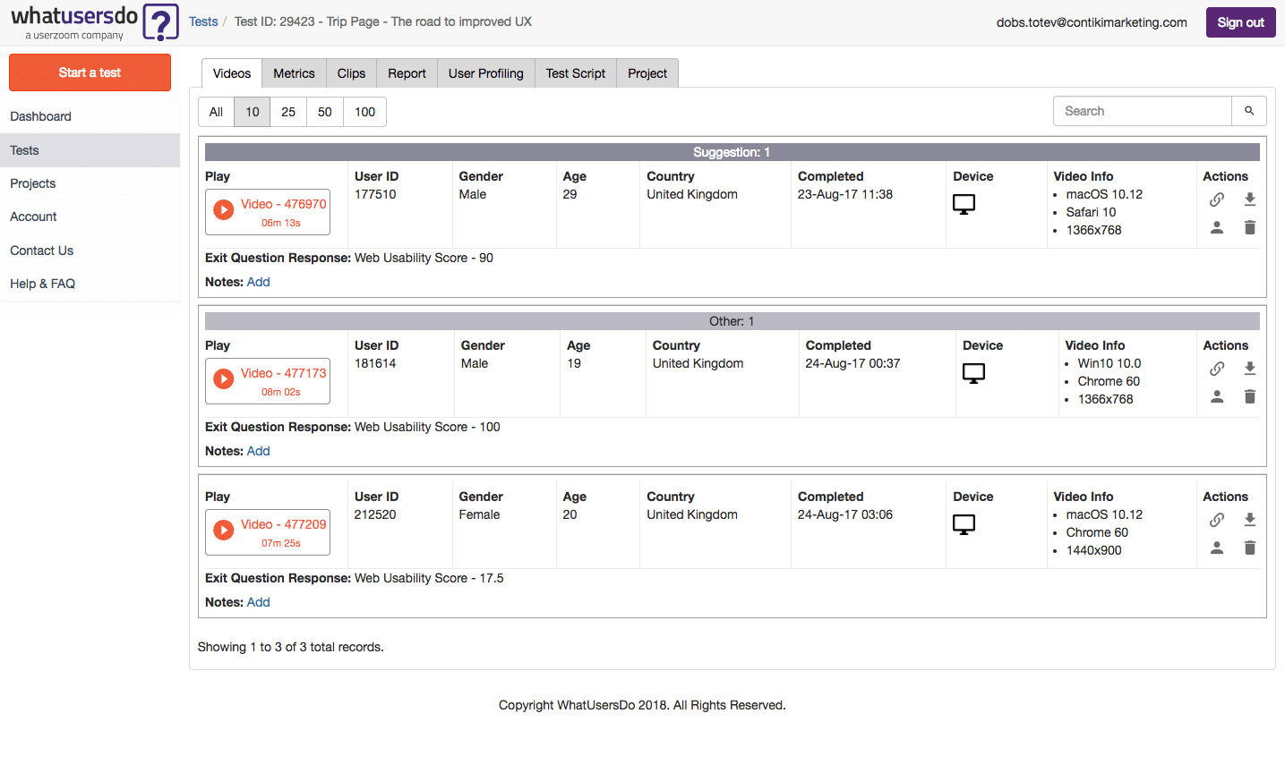
As part of your subscription, you also get participant screener questions. Choose the device you would like to test on - desktop or mobile. Choose the demographics of your participants - age range, country and more.
Overall I think WhatUsersDo are great! Personally, for me, the downside is that they do not offer testers in Australia. If you are working on a product that has it's target customers based in Australia then this online software would not be suitable for your needs.
I think the best part of this usability testing platform is that when you sign up for an account, you can also sign up for their Slack Community and interact with other UX researchers. You can also talk directly to expert researchers from WhatUsersDo. I have personally used the community to discuss research approaches and methodologies. The community is very active and friendly and it's worth being a member of.
This platform was acquired by UserZoom Inc. so I am expecting more exciting features to come forward.
4. UserZoom.com
Subscription Cost: From $28,000 / year. These guys are not kidding! That is the lowest they offer and it allows you to do tests only on a desktop. If you want to do mobile testing as well be prepared to pay a sweet fee of $40,000 - $60,000 per year
Cost per participants: $30-$50. If you are using participants on a desktop would be around $30 but if you are using participants on mobile would be $50 per person.
Number of Studies: Unlimited. It better be for that annual subscription fee.
Account access: 1 person. Only 1 person can access the account and run studies but you can run multiple studies at the same time.
As part of your subscription, you also get participant screener questions. Choose the device you would like to test on - desktop or mobile. Choose the demographics of your participants - age range, country, and more. You can test with your own participants as well and run unlimited studies.
From what I have looked at, this usability testing platform seems to offer a great range of research tools all in one software which is great but if you are looking to make just usability testing I wouldn't recommend it. I never had the chance to try it but I have a feeling that for the price you are asked to pay it should be good! If your business can afford it then give it a try.
5. TryMyUI
Subscription Cost: From $3,588 / year. They also offer an enterprise subscription. If you are interested you can call them.
Cost per participants: 1 CR for desktop / 2 CR for mobile"]With your subscription you get 10 CR a month
Account access: 1 person. Only 1 person can access the account and run studies but you can run multiple studies at the same time.
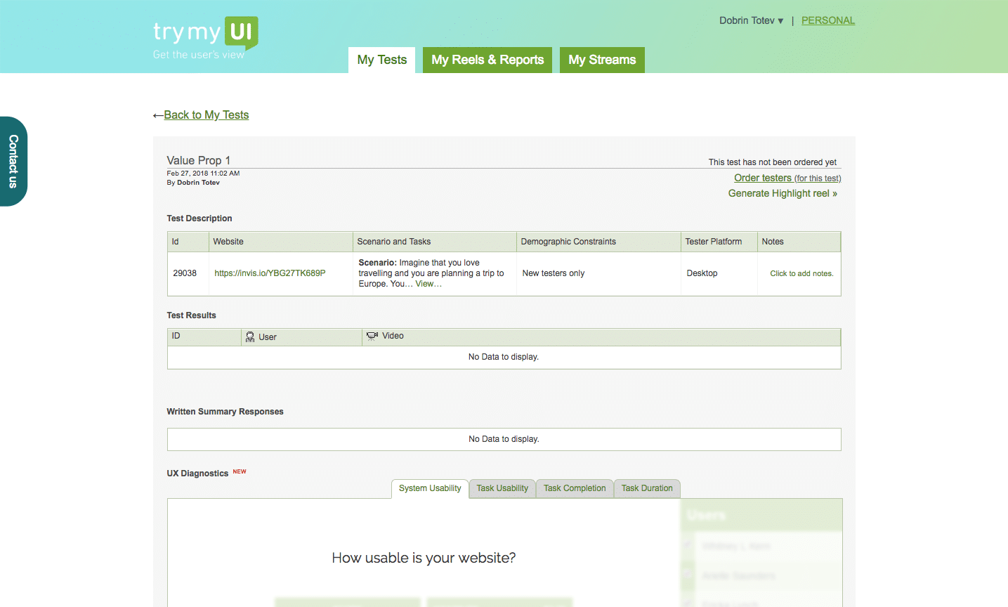
As part of your subscription, you also get participant screener questions. Choose the device you would like to test on - desktop or mobile. Choose the demographics of your participants - age range, country and more.
I tried to set up a study with these guys but the UI and the UX of their usability testing platform made me give it all up. It's quite slow and super difficult to use. I mean, setting up a study is hard on its own and you do not need the complication of a badly designed product to add more stress to that.
6. UserTest.io
Subscription Cost: None. Probably the first platform as of yet that doesn't require an annual subscription cost to use it.
Cost per participants: $21. Pretty good price! No catch!
Account access: 1 person. Only 1 person can access the account and run studies but you can run multiple studies at the same time.
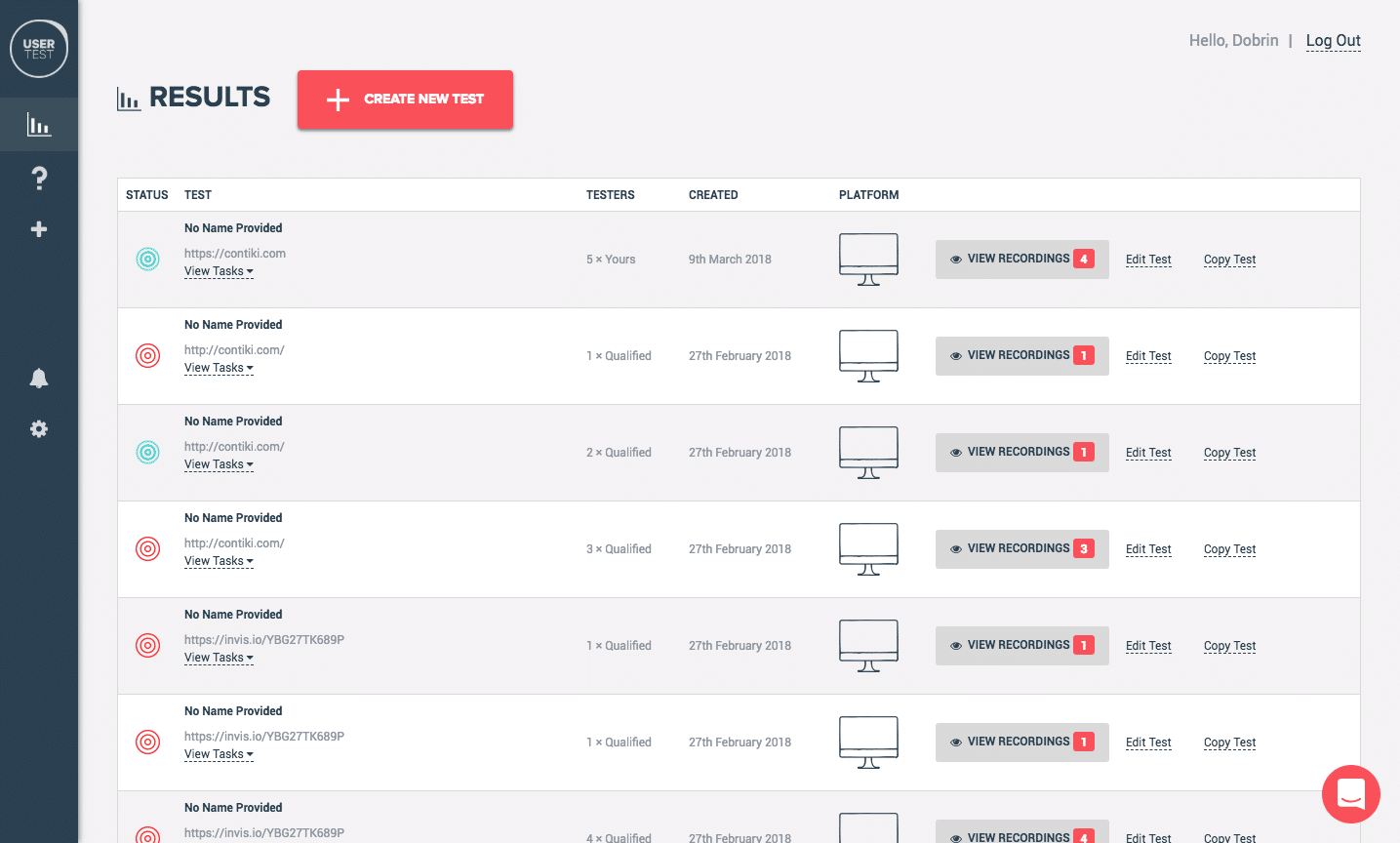
At the moment they do not offer anything but watching the videos. If you'd like to screen your participants you would have to contact their support to do it for you.
This platform was acquired by UserPeek.
Overall the usability testing platform has been working well but it has quite a slow turnaround time for videos. They have around 5k testers worldwide which reflects quite a lot on the timing of the tests. There is no option to screen your participants so for every test you set up you need to contact their customer support to do that for you, even though they are quite responsive sometimes your tests end up with people outside of your requested age range or screener requirements.
Read more about 10 Best Customer Experience Management Softwares of 2020
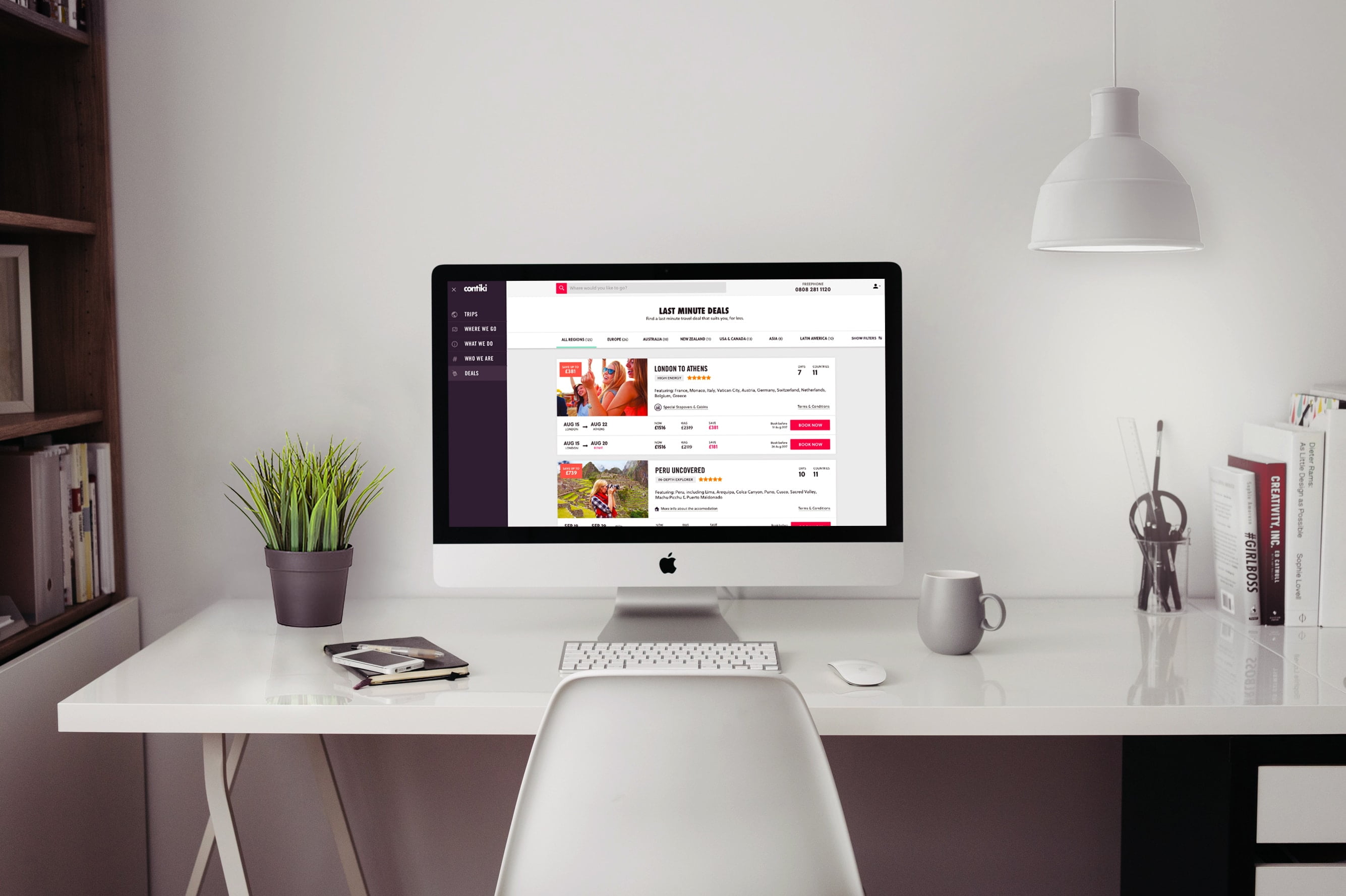
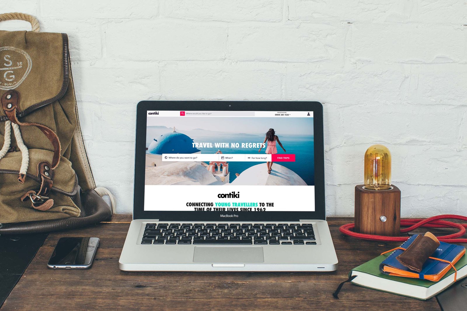
Redesign of a travel last minute deals and discounts page
Recently, I joined a business in the travel industry called Contiki. They offer guided tours and travel experience packages for travelers between 18-35 years old. As my first project as Senior UI/UX Designer at Contiki Marketing, I was assigned to redesign their existing last minute deals page. It is used to show trips that have discounted prices and are departing within the next month or so.
As every product evolves now and then it changes its overall design. Sometimes you can't transition all its features in one go, you have to do it step by step. The Last Minute Deals page's migration to the new design was one of these steps and it looked like this:

The Story Behind it
This page is a very important part of the product for selling to people who love discounts or would like to travel somewhere within the next weeks, the business has decided that we need to create an improved version of it.
Normally, if a person is browsing through the website the user journey of booking a trip would look like:
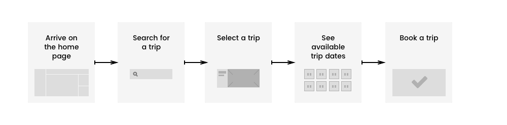
In the case of the last minute deals and discounts page, the individual trip page is meant to be secondary. Normally that page will contain all trip details including pricing and departure dates but in this case, a user is taken to the booking straight from the desired departure date.

Redesign Challenges
And here the first challenge of this redesign process arise:
What information should be shown about the product to motivate a customer to engage with the CTA and perform an action?
If you add all the information of a trip the card will become too overwhelming. It would have no greater value over the decision of the traveler compared to when the card would contain just the right information.
But how do you decide what is the right information?
- The answer is simple - just ask your customers.
Well, it's not that simple as just doing whatever your users might want, it's more about combining the customer's feedback with what the business wants to promote and then a good balance is found - you'd end up having a final functional design that satisfies the need of both sides - the business and it's customers:
The other challenge in this redesign piece was the layout of the card.
What should be the information hierarchy and the layout of the deals card? What would create that subconscious motivation in a traveler that will make him desire to book a trip?
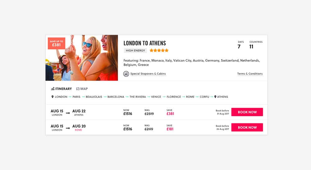
Since it's a page about trips and discounts the users have already a "preset" in their minds that they would expect to see trips at discounted prices. Because of that, I have put the savings value first, with an attention-grabbing design.
An interesting thing here was that through user testing I found out that if the savings amount is too large people start to confuse it with the price of the trip, therefore that label had to have very balanced design between attention-grabbing properties and significance.

Designing Variations
Before the final design of the card was chosen, I did spend some time in making different variations that I was testing with customers to get feedback. I also observed how they interact with the information presented on the card. For my tests, I used the remote usability testing platform UserTesting which is one of the 6 usability testing platforms I use.
Variation A
This version focuses on a large promotional image while combining the already existing sliding cards from the left to the right where they show information of the itinerary on a map view, as well as the locations, visited. But after testing and consideration, this version was ruled out as it was creating too much noise on the listing page where you need to discover things fast.
The user testing results on this card showed that:
Only 40% of the users saw the savings label and understood that this is a deal
Only 20% of the users felt confident to book a trip. For the rest was unclear what's included in their trip
Only 20% of the users used the map
Now 20% of the users are confused that the highlighted "SAVE" price is the price of the trip
Variation B
This variation was featuring the trip image on the left which is conflicting with the visibility of the savings label. Based on the research performed with the previous card layout, I have made a decision to put the map as a secondary option therefor it was added in a tab format with the ability to switch between the ITINERARY and the MAP.
Now 60% of the users saw the savings label and understood that this is a deal
Only 40% of the users felt confident to book a trip as they understand where the trip will take them. For the rest was unclear what's included in their trip.
Only 20% of the users used the map
Now 20% of the users are confused that the highlighted "SAVE" price is the price of the trip
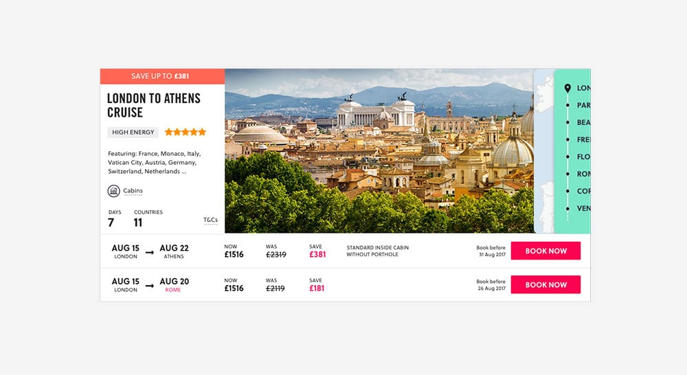
Variation C

This was the final design that was chosen for the layout of the card. The map and itinerary tabs were removed because that would clear the noise in the design.
Now 80% of the users saw the savings label and understood that this is a deal
Now 80% of the users felt confident to book a trip as they understand where the trip will take them and what's included in their trip. The rest felt uncomfortable clicking on a "BOOK NOW" button out of fear that the website will take their money before they can review their booking.
Now 80% of the users understand what is the trip's itinerary
The final design of the redesign
Through iteration and feedback, I managed to finalize the design for the page

I wonder in an A/B test which variation will perform better? Such was not performed in the design phase but I would be curious to find out with real numbers.