

Reinventing how we connect with the best Apple Wallet business cards
Remember the days of fumbling through your wallet or bag, searching for that one perfect business card? Maybe it was slightly bent from being in your pocket. Maybe you forgot to bring enough to an event. Or worse — you met someone important, reached into your jacket, and realised your cards were sitting on your desk back at the office.
Carrying physical business cards has always been a ritual of professionalism — but it’s also a hassle. They get lost, they run out, and they can’t be updated once printed. Yet in a world where our phones carry everything from our credit cards to our boarding passes, why should business cards remain stuck in paper form?
Imagine Your Business Card Living Inside Your iPhone
Now imagine if your business card lived right inside your Apple Wallet — always with you, perfectly designed, and instantly shareable. No more printing costs, no more waste, no more “I forgot my cards.” With a simple tap or scan, your digital business card opens directly on another person’s phone, saving your contact details instantly.
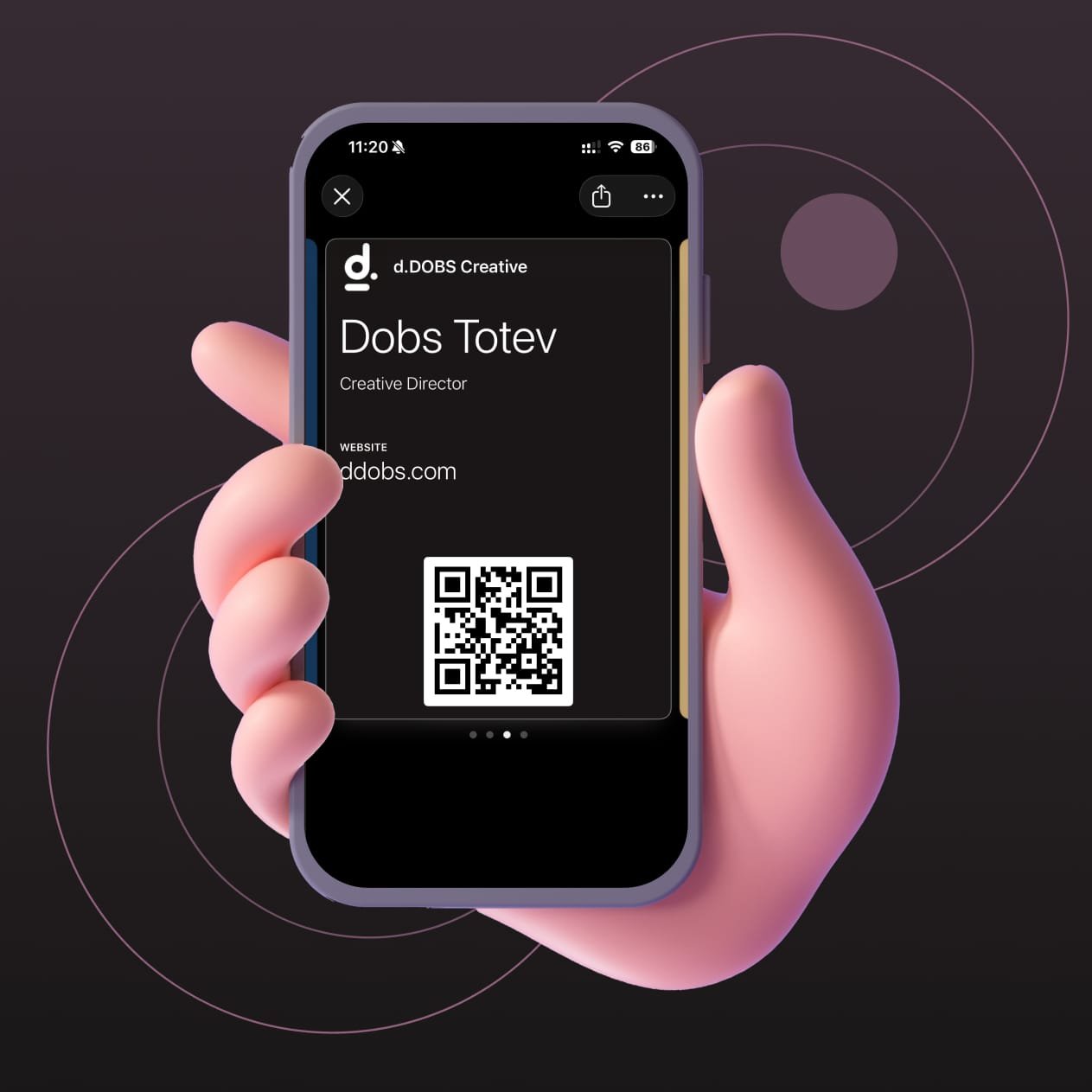
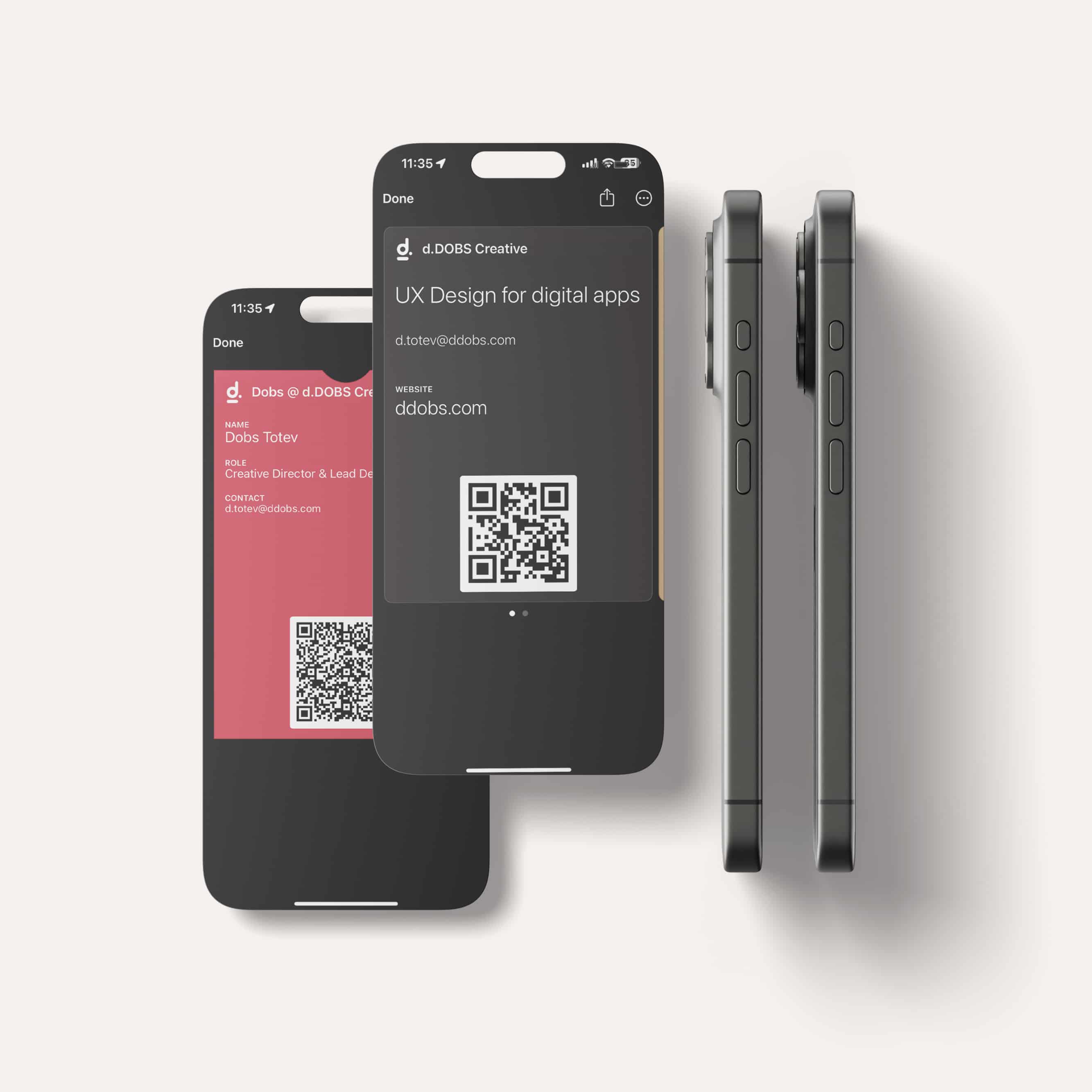
An Apple Wallet business card is a fully digital identity card, stored in the native Wallet app on iPhone devices. It supports everything you’d expect from a traditional card — your full name, company name, company logo, website, and email address — but it also goes far beyond that.
You can design a back side with additional links, detailed descriptions, or even a personalised message. It’s an elevated, interactive experience that turns a simple introduction into a seamless digital connection.
You can order your digital business cards for Apple Wallet from our Design Lab store
The Top 3 Benefits of Apple Wallet Business Cards
1. Convenience
Your business card lives on your phone — the one thing you never leave home without. Whether you’re at a meeting, conference, or even a casual dinner, your card is just a tap away. No need to reorder, reprint, or carry stacks of paper ever again.
2. Interactivity
Unlike a static printed card, an Apple Wallet business card can link directly to your website, social media, portfolio, or calendar. It’s not just contact information — it’s an entry point into your world. One tap can lead someone to learn more about your work, book a call, or explore your brand instantly.
3. Speed & Integration
When you share an Apple Wallet business card, your details can be saved directly into someone’s contacts in seconds. No manual typing, no scanning errors. It’s quick, native, and feels like the way networking was meant to work in the digital age.
Why DDOBS Makes the Best Apple Wallet Business Cards
At d.DOBS Creative, we’ve simplified what a business card should be — elegant, functional, and beautifully branded for the modern professional. Our Apple Wallet business cards are:
- Digitally delivered fast – you’ll receive your card design and Wallet file within days.
- Easy to buy – available directly through our Design Lab store, with no complicated setup.
- Beautifully branded – custom designed to reflect your style, with crisp layouts and premium visual details.
Isn’t it time to leave paper behind and step into the future of networking — where your first impression fits perfectly inside your phone?
Discover the best Apple Wallet business card at ddobs.com and experience the future of digital connections.

Analysis of consumer persuasion and behaviour principles in Amazon’s eCommerce platform
Persuasion in eCommerce platforms
Persuasion is the act of influencing others by shaping their beliefs or behaviours, encouraging them to adopt a particular position or consider presented arguments (Gass & Seiter, 2011). The rapid advancement of digital technologies, including the World Wide Web (WWW), the Internet, and smartphones, has significantly enhanced user accessibility and created vast opportunities for persuasive interactions. When the Web was first introduced by Sir Tim Berners-Lee in 1990 (Connolly, 2000), it had minimal reach. By the end of 1993, it remained relatively unknown, with only 50 web servers in existence. However, this number grew tenfold to approximately 500 servers, demonstrating the Web’s rapid expansion (Raggett et al., 1996). Today, globalisation has solidified the WWW as a fundamental component of modern life, providing instant access to diverse information sources (Wolf, 2014). Previously, people relied on newspapers, radio, and television for updates. Now, the Web allows real-time access to news, weather forecasts, and global events at the click of a button. With this digital transformation, establishing an online presence—whether through a business website or an eCommerce store—has become a necessity rather than an option. From small local businesses to major corporations, having a website enhances growth and visibility. A simple online search can connect users to a business within seconds. Companies like Facebook, Google, and Amazon have leveraged their official websites to communicate their mission and engage with customers. However, an eCommerce website is more than just an online storefront—it serves as a persuasive platform that attracts potential customers and fosters user interaction. The strategic integration of persuasive design elements ensures customer engagement, and builds trust, with the goal to drive conversions.
With the advancement of digital technologies and emerging eCommerce platforms, Amazon was founded by Jeff Bezos in 1994 as an online bookstore, capitalising on the emerging potential of the Internet to disrupt traditional retail models. Over the years, it expanded into a global eCommerce giant, diversifying its offerings to include electronics, apparel, cloud computing services, and even artificial intelligence-based solutions (Stone, 2013). Amazon’s growth trajectory was driven by its early focus on customer-centric innovation, leveraging data-driven decision-making and advanced logistics to optimise user experience. As with every corporation, Amazon’s goal is to grow profit, increase conversion, increase engagement and become the one-stop-shop for anything that customers might need to buy. To do that, one of Amazon’s key strategies is utilising consumer persuasion principles and conversion strategies with the application of psychological principles, rooted in behavioural economics and cognitive psychology.
As a long-term customer and frequent shopper of Amazon, I have observed that Amazon applies 6 psychological principles and theories from different psychological fields: The most evident one is Cialdini’s six principles of persuasion (Cialdini, 2009) which are the backbone of Amazon’s conversion strategies; the persuasive system design (PSD) model (Oinas-Kukkonen & Harjumaa, 2009) which helps with consumer shopping persuasive strategies; Fogg’s behaviour model (Fogg, 2009) which states that behaviour occurs when motivation, ability, and triggers converge; the elaboration likelihood model (ELM) (Petty & Cacioppo, 1981) by applying both central and peripheral processing routes in decision-making related to product descriptions and recommendations; loss aversion & anchoring (Tversky & Kahneman, 1979) to drive conversion; principles from the nudge theory (Thaler & Sunstein, 2008) to nudge consumers toward decisions that align with its business goals. In this analysis, I will focus on the two main psychological principles of persuasion:
Cialdini’s six principles of consumer persuasion applied in Amazon’s platform
Robert Cialdini (2009) developed six fundamental principles of persuasion that explain how people are influenced in decision-making processes. These principles—reciprocity, commitment and consistency, social proof, authority, liking, and scarcity—are widely used in various industries, particularly in eCommerce and digital marketing, to drive consumer engagement and increase conversion rates (Adaji et al., 2020). These psychological mechanisms shape consumer behaviour by subtly encouraging actions such as making a purchase, subscribing to a service, or engaging with digital content. Modern eCommerce giants like Amazon strategically incorporate these principles into their platforms to maximise user retention and sales. The first principle, reciprocity, suggests that people feel obliged to return favours or concessions. This principle is deeply rooted in human psychology, where individuals tend to repay kindness with kindness. In an eCommerce setting, Amazon uses reciprocity by offering free trials, discounts, exclusive content, or personalised recommendations (Cialdini, 2009). An example of this is Amazon’s Prime membership offers free shipping, early access to deals, and streaming services, creating a sense of value and obligation that encourages continued purchases (Kaptein & Parvinen, 2015). Similarly to how many online retailers provide free samples or loyalty rewards, which subconsciously push consumers to reciprocate by making a purchase.
The second principle, commitment and consistency, refers to the psychological tendency for people to stay consistent with their previous actions. When individuals commit to a small action, they are more likely to follow through with related larger actions to maintain internal consistency (Cialdini, 2009). Amazon effectively applies this principle through features like wish lists, cart reminders, and the “Subscribe & Save” program, which encourages customers to make repeated purchases. By getting consumers to add an item to their cart or subscribe to a product on a recurring basis, Amazon increases the likelihood that they will continue purchasing. Other platforms like eBay, for example, utilise bidding systems - something that Amazon does not have yet, where once a consumer places a bid, they are psychologically inclined to continue increasing their bid amount due to their initial commitment (Loh & Abdul Hamid, 2021).
The third principle, social proof, emphasizes that people are heavily influenced by the actions and opinions of others. This is based on the idea that individuals look to others—especially in uncertain situations—to determine how they should behave (Cialdini, 2009). Online reviews, star ratings, and testimonials are critical examples of social proof in eCommerce. Amazon prominently displays user reviews, best-seller rankings, and “Customers who bought this also bought” recommendations, leveraging peer influence to encourage purchases. Research has shown that consumers are significantly more likely to trust a product with high ratings and numerous reviews over one with little or no social validation (Adaji et al., 2020). Additionally, platforms like Walmart and Alibaba use real-time purchase notifications - something that Amazon doesn’t yet have, that inform users when others have recently bought a product, reinforcing its popularity and desirability.
The fourth principle, authority, highlights that people are more likely to trust and follow recommendations from experts or credible sources (Cialdini, 2009). In eCommerce, this principle is applied through expert endorsements, verified seller badges, and influencer marketing. Amazon, for example, uses the “Amazon’s Choice” badge to signal high-quality and well-reviewed products, leveraging its authority to guide purchasing decisions (Kaptein & Parvinen, 2015). Many eCommerce platforms also collaborate with influencers and industry experts to endorse products, capitalising on their credibility and large audiences to persuade consumers. An example of this is Amazon sellers reaching out to people to offer them a discount code in exchange for a product review.
The fifth principle, liking, suggests that people are more easily persuaded by individuals or brands that they like or relate to (Cialdini, 2009). This principle is leveraged in eCommerce through personalised recommendations, brand storytelling, and engaging social media interactions. Amazon, for example, personalises the shopping experience by curating product and content recommendations based on user behaviour, making the platform feel more tailored and user-friendly (Loh & Abdul Hamid, 2021). Additionally, eCommerce platforms can excel in social media marketing by cultivating relatable, friendly brand personas, engaging directly with customers, and fostering community-driven marketing efforts. Currently not something employed by Amazon since they are a huge globally recognised brand. But something like this would create a sense of connection and trust, which leads to increased conversions and brand loyalty.
The final principle, scarcity, is based on the idea that people place higher value on items that are perceived as limited or exclusive (Cialdini, 2009). Amazon frequently uses time-sensitive deals, flash sales, and stock availability indicators to create urgency and encourage impulse buying. Amazon’s “Only a few left in stock” notification is a classic example of scarcity in action, triggering fear of missing out (FOMO) and prompting customers to act quickly (Adaji et al., 2020). Similarly, limited-time promotions like Black Friday and Cyber Monday leverage scarcity to drive massive sales spikes. Additionally, luxury brands such as Rolex and Supreme intentionally limit product availability to increase desirability, reinforcing the idea that exclusive items are more valuable.
The persuasive system design (PSD) model and its application in Amazon’s eCommerce platform
The Persuasive System Design (PSD) Model, developed by Oinas-Kukkonen and Harjumaa (2009), provides a structured framework for designing digital systems that influence user behaviour. This model has become a foundational concept in eCommerce, digital marketing, and user experience (UX) design, guiding businesses in creating platforms that encourage consumer engagement, trust, and conversions. Unlike traditional marketing techniques, which rely on explicit persuasion, the PSD model embeds subtle psychological nudges and behavioural triggers into digital environments, ensuring that users voluntarily take desired actions. The model is structured around four main categories of persuasive design principles: Primary Task Support, Dialogue Support, System Credibility Support, and Social Support. These principles play a crucial role in Amazon’s eCommerce platform in optimising user experience, increasing engagement, and driving sales (Loh & Abdul Hamid, 2021).
The first category, Primary Task Support, focuses on making it easier for users to accomplish their objectives. In eCommerce, this means simplifying the shopping and checkout process to reduce friction in transactions. Amazon, for example, integrates one-click purchasing, tailored product recommendations, and AI-driven search optimisation, allowing users to find and buy products effortlessly. This category also includes personalisation, self-monitoring, and task automation, all of which enhance the efficiency of digital interactions. Features like saved payment methods, purchase history tracking, and automated subscription models (e.g., Amazon’s Subscribe & Save) ensure that consumers can complete repeat purchases with minimal effort. These features align with Fogg’s Behavior Model, which suggests that making an action easy to perform increases the likelihood of user compliance (Fogg, 2009). Other platforms might use tunnelling techniques, where users are guided through a sequence of steps in an optimised way, reducing decision fatigue and encouraging conversions (Loh & Abdul Hamid, 2021) but it’s not something Amazon does specifically.
The second category, Dialogue Support, focuses on interactive elements that engage users and reinforce their actions. This includes features like positive feedback, reminders, rewards, and tailored suggestions, all of which enhance user motivation. Amazon, for example, rewards customer engagement through exclusive Prime deals, loyalty programmes (gift cards), and dynamic discounting strategies, creating a sense of value and exclusivity. Many eCommerce websites send cart abandonment emails and push notifications, reminding users about items left in their shopping carts, leveraging both commitment and loss aversion psychological principles. Chatbots and virtual assistants, such as Amazon’s Alexa and customer support AI, also play a role in dialogue support by providing real-time assistance, answering user queries, and guiding decision-making processes (Adaji et al., 2020). The use of gamification is also applied—offering rewards, countdown deals, and streak-based discounts—to create excitement and urgency, further motivating user action.
The third category, System Credibility Support, ensures that users perceive an eCommerce platform as trustworthy, reliable, and secure. This is critical in online shopping, where consumer trust directly impacts conversion rates. Features that establish credibility include secure payment gateways, verified product reviews, expert endorsements, and transparent seller ratings. Amazon applies credibility-enhancing strategies through “Amazon’s Choice” badges, verified purchase labels, and clear return policies, reassuring customers that they are making safe purchasing decisions (Loh & Abdul Hamid, 2021). The presence of SSL certificates, two-factor authentication, and fraud prevention mechanisms further enhances system credibility and enhances cybersecurity, reducing user hesitation in sharing sensitive information. Additionally, third-party endorsements and authoritative reviews—such as celebrity collaborations and influencer marketing—strengthen brand reputation and encourage user trust.
The final category, Social Support, focuses on incorporating peer influence and community engagement to persuade users. This principle leverages the idea that people are more likely to adopt behaviours when they see others doing the same (Cialdini, 2009). eCommerce platforms apply this through customer reviews, user-generated content, peer recommendations, and social media integrations. Amazon’s review system, for instance, features verified customer feedback, Q&A sections, and “Customers who bought this also bought” suggestions, reinforcing social proof and making decision-making easier for buyers (Adaji et al., 2020). Amazon also encourages social interaction through flash sales, referral programs, and group-buying discounts, where users benefit from purchasing together. Many eCommerce sites now integrate live streaming shopping experiences, where influencers showcase products in real time, allowing customers to make informed purchasing decisions based on community-driven engagement.
Cialdini’s Six Principles of Persuasion and the Persuasive System Design (PSD) Model serve as foundational psychological frameworks that significantly influence consumer behaviour and decision-making in eCommerce. Companies like Amazon strategically apply these theories to enhance trust, drive engagement, and maximise conversions. By implementing reciprocity, commitment and consistency, social proof, authority, liking, and scarcity, Amazon creates a psychologically compelling shopping experience that keeps customers engaged and fosters brand loyalty. Simultaneously, the PSD Model provides a structured approach to integrating persuasive design elements, ensuring that users experience minimal friction while shopping and are subtly encouraged to interact more deeply with the platform.
As technology continues to evolve, artificial intelligence, machine learning, and predictive analytics will play an even greater role in refining personalised shopping experiences. Amazon and other eCommerce platforms will likely leverage real-time behavioural analytics and adaptive persuasion techniques to enhance consumer interactions. However, as persuasive systems become more advanced, it is crucial to address ethical considerations surrounding their use. Future research should investigate the balance between personalisation and consumer autonomy, ensuring that persuasive technologies enhance user experience without exploiting psychological vulnerabilities. Issues such as data privacy, algorithmic transparency, and potential manipulation should be examined to build consumer trust in AI-driven persuasion. By incorporating ethical AI practices and transparent communication, Amazon can continue to innovate while maintaining consumer confidence, setting industry standards for responsible and effective persuasive design in eCommerce.
References
Adaji, I., Oyibo, K., & Vassileva, J. (2020). E-commerce shopping motivation and the influence of persuasive strategies. Frontiers in Artificial Intelligence, 3, 67. https://doi.org/10.3389/frai.2020.00067
Cialdini, R. B. (2009). Influence: The psychology of persuasion. Harper Business.
Connolly, D. (2000). A little history of the World Wide Web. World Wide Web Consortium (W3C).
Fogg, B. J. (2009). A behaviour model for persuasive design. Proceedings of the 4th International Conference on Persuasive Technology, 1-7.
Gass, R. H., & Seiter, J. S. (2011). Persuasion: Social influence and compliance gaining (5th ed.). Pearson.
Kaptein, M., & Parvinen, P. (2015). Advancing e-commerce personalization: Process considerations and experimental validation. Information Systems Research, 26(3), 476-488.
Loh, Y. X., & Abdul Hamid, N. A. (2021). The evaluation of online persuasion criteria on e-commerce websites using the Persuasive System Design (PSD) model. International Journal of Business and Society, 22(3), 1143-1157.
Oinas-Kukkonen, H., & Harjumaa, M. (2009). Persuasive systems design: Key issues, process model, and system features. Communications of the Association for Information Systems, 24, 485-500.
Petty, R. E., & Cacioppo, J. T. (1981). The elaboration likelihood model of persuasion. Advances in Experimental Social Psychology, 19, 123-205.
Raggett, D., Le Hors, A., & Jacobs, I. (1996). HTML 3.2 reference specification. World Wide Web Consortium (W3C).
Stone, B. (2013). The everything store: Jeff Bezos and the age of Amazon. Little, Brown and Company.
Tversky, A., & Kahneman, D. (1979). Prospect theory: An analysis of decision under risk. Econometrica, 47(2), 263-291.
Wolf, M. J. (2014). The entertainment economy: How mega-media forces are transforming our lives. Crown Business.
Thaler, R. H., & Sunstein, C. R. (2008). Nudge: Improving decisions about health, wealth, and happiness. Yale University Press.

Developing ideas with purpose and value (d.Dobs Framework)
In the fast-paced world of building digital products, developing ideas is not just about creativity but about creating solutions that hold purpose and value. It’s easy to get caught up in brainstorming sessions, producing a myriad of concepts, but the real challenge lies in ensuring that these ideas align with the needs of the users, the goals of the project and current business objectives.
Developing ideas with purpose and value requires thoughtful consideration, user empathy, and a clear vision. Team-wide buy-in is essential, achieved when members contribute during the idea development process. Unfortunately, lengthy workshopping sessions are often a luxury teams cannot afford in today's corporate environments. Balancing speed with delivering meaningful solutions is a challenge digital teams must navigate with agility. Efficiently cultivating ideas can make all the difference in delivering products that resonate with users and drive business success.
As a creative myself, my mind often scatters across multiple ideas, every day, for various projects, businesses, and fields. This constant flow of ideas is exhilarating, but it can also be overwhelming. That’s why a framework like this is so valuable—it has personally helped me focus, add purpose, and ensure that what I come up with is worth pursuing. It brings structure to my creativity, allowing me to validate each idea and determine whether it aligns with my or my clients' goals and that it makes sense to invest time and energy in.
In the last months, I have spent time refining a framework that can help fast-paced and dynamic teams create tangible ideas that can be easily implemented and tested, while having a clear definition for success, aligning with the business goals and priorities. But before I share a FigJam template for this framework, I wanted to introduce you to some of the sections that need to be uncovered.
This framework is about helping established businesses develop and grow digital product ideas that might achieve certain goals (such as increasing revenue, increasing engagement, increasing app usage, etc.). To create or conceptualize business ideas there are other frameworks and templates more suitable for that. A good one for a business or a start-up idea is the Business Model Canvas, which helps better visualize what a business needs to get started.
Download the Ideation Framework Template for FigJam for FREE!
About the framework for developing ideas
While many frameworks exist, the one I've developed draws from years of experience, incorporating elements of the Design Sprint framework and the Business Model Canvas, both integral to design strategies and planning. This framework is designed to be self-facilitated, eliminating the need for an external facilitator as typically suggested by the Design Sprint approach. Additionally, it is structured in a highly time-efficient manner. It requires:
'30m Pre-Workshop Preparation
2h Workshop Session
'30m Pos-Workshop Debrief

Tools to get started
To get started with our framework, we recommend using Figma's FigJam for collaboration. FigJam offers an intuitive and flexible platform that supports real-time teamwork, making it ideal for our needs. However, other tools like Miro can also be used effectively. The templates linked below are specifically designed for FigJam, ensuring a seamless and efficient setup for your team.
FigJam or ProCreate on iPad or traditional pen & paper
Get the workshop board template for FigJam
The template to help you run this workshop is available to download for FREE and can be used with FigJam.
Download the Ideation Framework Template for FigJam for FREE!
Structure for efficient, valuable and fast development of ideas
Pre-workshop preparation
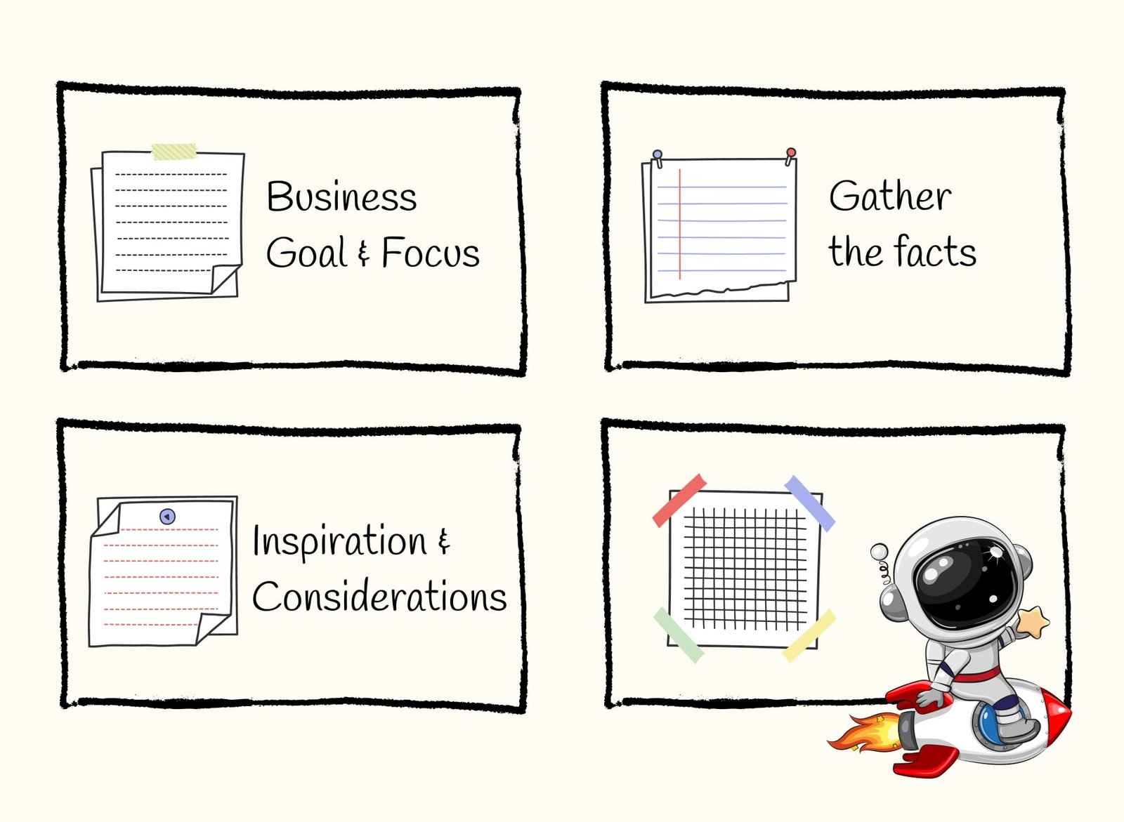
Part 1: Focus, goal, business problem
To ensure the success of the idea development, a couple of foundational elements are essential. First, a broader business goal must be selected. This could be where the ideator, product owner, stakeholder or business owner envisions the business heading or a specific target to achieve. Once the broader goal is established, it needs to be narrowed down to a focused problem or goal that requires solving. This focused approach ensures that the ideas generated are directly aligned with the business's strategic objectives. By the end of this framework, you'll have a set of ideas ready to be tested as viable solutions to the focused business problem.
If the focused goal is still unclear, some brainstorming and discovery work is necessary before starting this idea development framework. This preliminary work is best handled by Product Owner consultants and Business Analysts. While these professionals can be part of the business they also can be found on various platforms, TopTal remains one of the top choices for hiring skilled experts.
I now have my focused business goal clear and can start making magic
Part 2: Involvement of the right people
Asking the question, “Who do you need to make this idea happen?” is the second step of the framework's process. This could involve anyone with the skills to develop and deliver the idea within the organisation, as well as experts from specific areas of the business who have knowledge and insights into the day-to-day operations. It's also equally important to include key decision-makers in the process. Their involvement ensures that the idea is aligned with the business objectives and increases the likelihood of gaining support for the investment of time to build it. When stakeholders are actively engaged from the start, they have a sense of ownership. They are more inclined to give the green light for further development and implementation once the idea has been tested and proven viable.
For example, I ran something similar as a workshop on brainstorming and identifying key social features for an app I was working on and we had a product director, an ios developer, a UX designer and two product managers, it wasn't exactly this framework but was similar and can give insights on the importance of the right group of people.
Part 3: Gather the facts
Before diving into the ideation process using the framework, it’s helpful to gather all relevant facts, customer and client insights, and any available data, such as engagement rates, page views, screen views, and app user statistics. Having this information at hand allows you to paint a clearer picture and focus on the ideas that truly matter. These insights often come from daily interactions with customers and the feedback received through various channels, including support tickets, chatbots, active interviews, and focus groups. By grounding the ideation process in real data and customer feedback, you're more likely to develop ideas that address actual needs and resonate with your target audience.
Part 4: Considerations & Limitations
When developing ideas, it’s important to consider any business, operational, or external factors that might impact the feasibility of your concepts. While blue-sky thinking is encouraged, adding value and purpose to an idea often requires acknowledging the limitations that come with it. Understanding these limitations—whether they pertain to regions of operation, market conditions, the existing tech stack, or the investment required—helps ensure that your ideas are grounded in reality. To identify these factors, it may be necessary to speak with people from different departments or consult with stakeholders. By doing so, you can ensure that the ideas you pursue are not only creative but also practical and aligned with the business’s capabilities and goals.
Part 5: Examples & Inspiration
Gathering examples and inspiration isn't a requirement for developing an idea, but it can be incredibly valuable. Seeing how others in the market are addressing the problem at hand can provide a useful preview and spark new ideas. When reviewing examples, it’s helpful to identify which aspects resonate with your business and why, as well as which parts don’t and the reasons behind that. This analysis can then serve as both inspiration and a guiding point, helping you understand industry trends and what could work best for your specific context. By learning from others' successes and shortcomings, you can refine your own ideas to be more innovative and effective.
I now have everything and I am ready to start generating ideas on how might we solve XYZ problem
Day of the workshop
Recap of all the findings (10 min)
This workshop is intended to be no more than 2 hours. So start by dedicating 15 minutes to recap all the information gathered before the workshop and answer any questions that the participants might have.
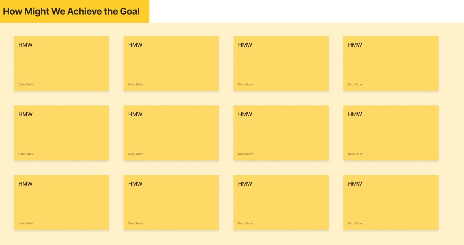
Writing the initial activities/ideas in a "How Might We" format (15 min)
Once the business goal and focused problem have been reviewed, and all relevant information has been recapped, participants can begin generating ideas using the "How Might We" format. This approach encourages thinking in a solution-oriented way by framing challenges as opportunities. For example, instead of asking, "What can we do to improve customer engagement?" you might ask, "How might we enhance customer engagement through personalized experiences?" This method helps participants think creatively while staying aligned with the business objectives. By starting with "How Might We" questions, the team can explore a range of potential solutions that directly address the focused business problem, leading to more targeted and actionable ideas.
For example, a normal idea would sound like "We should create a mobile app feature that sends users notifications about upcoming sales.", but when it's turned into the How Might We format, it reads as "How might we use mobile notifications to increase user engagement by informing them about upcoming sales?".
Picking three "How Might We" notes that stand out the most (5 min)
After generating a variety of "How Might We" ideas, it's time to narrow down the options to those with the most potential. Workshop participants can do this by voting for the three "How Might We" notes that stand out the most. This selection process should be guided by data, customer insights, and a deep understanding of the business context. By considering these factors, participants can make informed decisions about which ideas are most likely to address the focused problem effectively and align with the broader business goals. This collaborative approach ensures that the chosen ideas have strong support and are grounded in both creative thinking and practical business considerations.
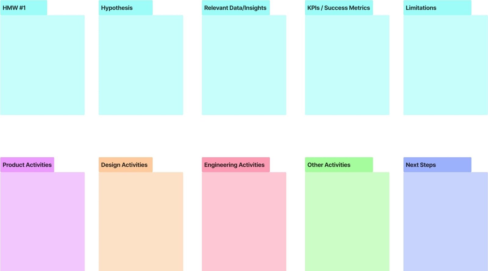
The Idea Generation Canvas. A structured format on presenting the ideas (90 mins)
Each concept should begin with a "How Might We" note as its foundation. This helps ensure that the idea is directly addressing the problem at hand. Next, a hypothesis should be formulated, such as, "If we implement this idea, we expect to see an increase in user engagement or app usage." Supporting data and insights should be included to validate the idea’s potential impact, drawing on relevant research or past experiences. It’s also crucial to define clear success metrics, such as specific targets for engagement or app usage, to measure the idea’s effectiveness. Additionally, any potential limitations or challenges should be identified upfront, whether they’re related to resources, technology, or market conditions. Each participant should outline the activities they need to undertake to make the idea a reality, including who will be responsible for what tasks. Finally, the idea should include a plan for testing, along with the next steps required to move the idea from concept to reality, ensuring a clear path toward implementation or further validation. All of this is visualized in the Idea Generation Canvas, where each idea has its canvas.
This represents the first version of my idea generation canvas within the d.DOBS Framework and it's currently being tested across various organizations. As I continue to gather feedback and suggestions for improvement, we'll continue to refine and enhance the framework. Our goal is to create a tool that truly meets the needs of fast-paced, dynamic teams, enabling them to generate and validate ideas with purpose and value. Stay tuned for an updated version, incorporating insights and learnings from real-world applications to make the framework even more effective.
If you have found this framework useful or have ideas and suggestions for its improvement, don't hesitate to send Feedback & Suggestions from the Design Lab Support Page.


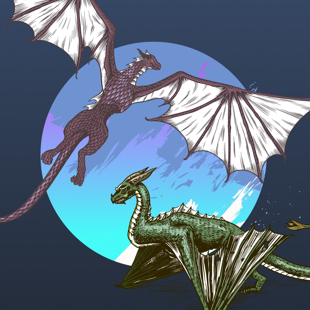
The Dance of Digital Titans (A division to defend or oppose the remote work)
Imagine a realm where epic battles of ambition and ideas unfold mirroring the civil war known as the Dance of Dragons, as written in George R.R. Martin's book, "Fire and Blood,” which recently formed part of the TV series House of Dragons on HBO MAX. This titanic clash of loyalty and innovation resurfaces in our modern times of remote work. Much like the Targaryen Dynasty's struggle for supremacy, the digital landscape is witnessing its own riveting spectacle – the Dance of Digital Titans, or in layman’s terms..the Dance of Digital Tech Professionals.
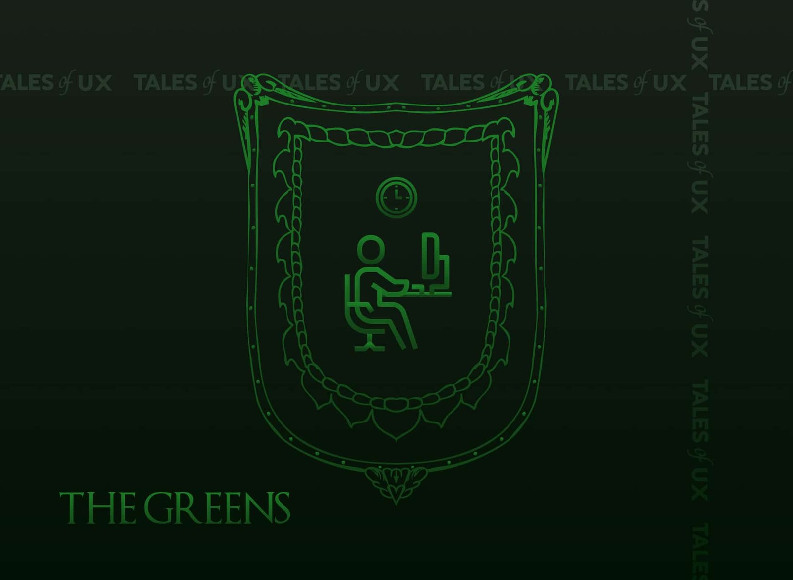
Who will triumph: The Greens Vs. The Blacks
The Greens - I am a supporter of the 9-5 office rat race
The Blacks - I am a defender of high quality of life and remote work

Note: For those who have not seen House of Dragon or read the books, I promise this story will still make sense.
The inception of the Dance in Digital Tech remains somewhat of a mystery to me but perhaps its arrival came when the 2020 global pandemic took the world by storm. As our world braced itself for the unknown, an unexpected truth emerged, casting a spotlight on the possibilities of work: the undeniable triumph of remote work on both business and individual scales.
We could indeed thrive while working remotely!
No one knew how long this different world would last, but we adapted. As the curtain rose on this unprecedented act, a collective of stories unfolded - tales of resilience, innovation, and a drive to succeed despite the odds.
Traditional norms shattered like glass, as even the biggest advocates of in-person work were forced to reevaluate their perspectives. Businesses were faced with either going remote or letting their business die. This meant making way for the birth of new businesses, and ideas and the blossoming of remote work culture. In the midst of this transformation, a remarkable discovery was made, a precious jewel in the rough:
- the elusive work-life balance.
For many, this newfound equilibrium was an uncharted territory, a revelation that resonated deeply. Imagine escaping the daily grind of a lengthy 3-hour commute, relishing the joy of being present with loved ones, and savouring the luxury of focusing on well-being. From cooking wholesome meals to enjoying the moment in unhurried lunches, the possibilities were as limitless as they were liberating.
The benefits extended beyond the personal realm, rippling through the fabric of society. Transportation costs dwindled, dining out took a backseat, and the environment rejoiced in the decreased carbon footprint. The chorus of advantages was harmonious and far-reaching, painting a vivid portrait of a life unburdened by the constraints of convention.
As a new way of living evolved, the Dance in Digital Tech unfolded, it became a dance of liberation and we had to adapt. The very essence of work was reinvented, and a transformational journey began. Little did we know, this was only the beginning, setting the stage for a grand performance that would redefine the future of how we work and live.
“Ah, so this is what freedom could look like,” whispered many of us.
But then something in the air changed. What changed? If everyone loved working remotely, why did the supporters of The Greens grow? (The Greens refers to people supporting a return to the office, to the 9-5, 5 days a week standard of working).
- Big business leaders particularly those in tech started to speak up against remote work and started forcing their staff to come back or face losing their jobs like Elon Musk, the CEO of Tesla did
- Meta announced a change in policy for office-based workers to return to offices for at least 3-days a week
- Zoom, the company that grew to new heights and became synonymous with video chats also wanted staff who work within 50 miles of a company office, to come back two days per week according to Business Insider
In a way, we could make some sense of why a “big boss” would want their staff to return to the office, but what is strange is that to the side of The Greens, many employees have joined to support. There are countless LinkedIn discussions happening about whether people should work remotely or come to the office.
We speculate that people insisting on returning to the office are trying to escape their home environment due to housemates, noise or kids or they don’t trust enough in their skills and discipline to do work outside of the office or want to be seen by their managers.
The most frequent arguments to defend working from an office:
- Better productivity and ability to assess people’s performance
- There are concerns for younger and new employees not having access to meeting people, being onboarded & being trained
- Create team culture and build human connection in person
- Combat loneliness and improve cognitive performance
- Validation that a person has worked if they’ve come to the office
The 9-5 work model needs to continue to evolve and adapt for remote work
Jumping back to the 19th century - 9 to 5 was created to prevent the exploitation of factory workers and since then that way of working has been kept, maintained, and preached in support of. I am sure it was a great thing during its time but those times have come and gone and now in the 21st century have changed with technological innovations, people’s livelihoods at stake and digital transformation (hello, AI).
Make it make sense.
2020 was a window of opportunity for change and evolution as humans craved more meaning in their personal and professional lives. As a professional creative nomad, I hope to be part of this change, and momentum and redefine the future of work as it stands today. In a way, I’ve taken it as a personal mission to educate and help people and businesses to understand the value of remote work.
Now let’s turn our attention to The Blacks (The Blacks referring to. - people supporting remote work). Why do we think people supporting working remotely are continuing to do so and strongly protecting their set-up:
- To preserve work-life balance
- Flexibility as a lifestyle choice and the power to be able to choose how they spend their time and where they get to live
- Control over health, happiness and well-being
- Increase in employee engagement which means higher retention & happier employees
- Saving cost on offices
- Higher productivity observed from State of Remote Work reported that 90% of people surveyed in 2020 felt higher levels of productivity when compared to an office
Truthfully, The Blacks defend the future of work for the people and The Greens once they come to realisation but I can’t help wondering if the pullback towards the traditional 9-5 office model is underpinned by a complex interplay of physiological and social influences. We are so conditioned to conform and attached to our work identities that, for many, the daily commute and physical office space could serve as markers of our identity.
But not all is lost.
Many businesses are supporting The Blacks - Zapier, Airbnb, Toptal, Spotify, Slack, Buffer, and Coinbase to name a few in favour of flexibility, increased productivity, cost-savings, and maintaining work-life balance.
Is hybrid the answer?
Now let’s look at The Turn Cloaks (which refers to people who switched from fully remote to support a hybrid model). We can’t argue that hybrid is here to stay with benefits like cost-efficiency, redefining collaboration and communication, maintaining work-life balance and so on. The allure of hybrid is promising but we’re not fully convinced either.
Difficulties to transition to fully remote, corporate management that is unwilling or any other reason that it might be a new middle ground was found of hybrid working.
Hybrid does not stand for 4 days a week in the office!
Traditional work models cannot meet employee and customer demands for smarter, frictionless experiences. Organizations need integrated, connected and secure solutions for modern work challenges, such as hybrid work environments.
The true meaning of a hybrid is an offspring of two things of different natures that inherit random, unplanned, uncontrolled qualities from each of its parents. It doesn’t have a set preset, it is a work of nature.
Hybrid working is an adaptable way that serves as the middle ground for employees and employers and is something that is shaped on an individual basis depending on one’s role in the business they work with.
Many reports from studies are already coming out that hybrid working will be adopted by 75% of companies by 2025.
For businesses who want to go remote
In today’s competitive landscape, your organization will simply miss out on talented digital tech professionals by not offering remote work. And if you're adopting a hybrid model but not finding ways to integrate your remote staff in important business decisions, you are also bound to lose this dance.
For employees who want to work remotely
Stand unwavering in your pursuit of remote work. Don’t stop challenging the status quo now. Do not simply “bend the knee” to go back to the old antiquated ways of working. Recall the days when the digital tech realm was in disarray and people were clearly unhappy, overwhelmed and unfulfilled. We were all shown a way forward to achieving more work-life balance and entering a new paradigm beyond work - what are we all so afraid of?
The Dance is not ever yet, how do you think it will end? Which side would you be on? Share your thoughts on social media with #danceofdigitaltitans
Sources:
- https://finance.yahoo.com/news/bosses-fed-remote-4-main-193500794.html
- https://www.mckinsey.com/industries/real-estate/our-insights/americans-are-embracing-flexible-work-and-they-want-more-of-it
- https://www.bbc.com/worklife/article/20230206-the-companies-backtracking-on-flexible-work
- https://www.foxbusiness.com/lifestyle/wall-street-ceo-backs-post-pandemic-push-employees-back-office-2023
- https://www.linkedin.com/pulse/who-win-remote-vs-office-outprof/
- https://www.gartner.com/en/podcasts/thinkcast/the-secrets-to-implementing-a-successful-hybrid-work-model

How I started a successful UX career without realising it
I was fascinated with the world of digital technologies since the day my parents bought my first computer. I was the age of 12 and my curiosity was endless. Every day I was discovering new things that you can do with a computer from watching movies, skyping with friends, and browsing the web to more advanced things like video editing, video effects, music production, and music composing. Yet I had never imagined that I would end up having a career in UX.
But, what is UX?
UX is shorthand for User Experience. It's a relatively new field that came about as a result of advances in technology and our understanding of how people interact with technology. UX designers are responsible for creating products and interfaces that are both usable and enjoyable for users. They take into account the user's needs, wants, and constraints when designing an interface or product. But that's not all.
UX has existed since the day humans started interacting with physical man-made objects it's just it wasn't science on its own. I remember reading a great book showcasing the core of UX which was called "The Design of Everyday Things by Donald A. Norman". From that book I remember, a simple example of how door handles are designed according to the perception of how a door opens contributes to great or bad UX. There are doors in the world where people expect them to do one thing, and the door opens in a completely different way. In these cases the door handle is serving as a subconscious signifier to tell your brain how the door is expected to function and when it doesn't work as expected - that's bad UX.
A career in UX can be extremely rewarding, both financially and personally, but it's not for everyone. A lot of great UX comes from designers who can feel higher levels of empathy, behavioural understanding, and general psychology of the target audiences that they are designing for. Of course, the theoretical part of UX can be learned through courses and online lessons but what needs to come from within is that special power of human understanding and being able to draw a mental journey on which a UX designer plans to take the users.
Taking my first steps into a UX career without realising it
When I was 15 I designed and developed a game based on an all-favourite sci-fi tv show. The game was a companion experience for the fans to be able to have an interactive experience with the show while they were watching it. It wasn't the only one on the market, though.
There was already another game that was offering a very similar experience and fans were playing it. What motivated me to create my version was the fact that every time I was suggesting ideas or giving feedback to the creators, they were shutting me down by saying:
"We know best what we are doing, we don't need someone's suggestions".
This is what doomed their project and lost the fanbase's favour.
Little did I know, that my game will become extremely popular among the same fans who decided to leave my competitor.
In those times, community forums were a thing. After setting one up, tons of suggestions, feedback and critics about the game started coming in and I was determined not to make the same mistake that doomed the game of my competitor.
I was taking the time to respond to every email, feedback message or feature request. I was prioritizing the features, running votes to see which ones my players love the most and for upcoming versions planning to include in the roadmap the top 3 most voted feature requests. Without realising my players grew to 50,000 / month and they are willing to pay for my product, requesting frequent updates and talking about it on other forms, communities and platforms.
Without realising I had naturally dived into the foundation of creating great user experience for my players. Receiving all those positive comments and feedback was my soul food back then, and it is my soul food today. Building an experience from your heart and the people loving and using it is the most rewarding piece of the UX career.
My game is called AISNSim and today, it still gets downloads with 100-200 monthly players - 16 years since the project retired.
Evolving my UX career through the years
Realising at such a young age what I wanted to do when I grow up, gave me the focus and ability to prioritize what's important to know in life to constantly change, grow and improve my UX career. Every step I have taken has led to the evolution of my knowledge and skills, from finding mentors through being part of the UX community to moving to a city that is a tech hub for UX. Each bit taught me important lessons for my career growth.
Finding a mentor
When I first started, I didn't know much about the theoretical part of UX. Thankfully, the first Head of Design had great knowledge of UX and she was a natural. She became my mentor. She taught me everything I needed to know about the industry and shaped me as a UX designer.
Getting involved with the community
There's a great community of UX professionals out there who are always willing to help each other out. Get involved in slack groups, attend meetups, and participate in groups and discussion boards. This has helped me learn from others, exchange experience and make connections within the industry.
Staying up to date with the industry
The world of UX is constantly changing and evolving. I constantly read articles, blog posts, and case studies about UX. follow leaders in the field on social media, and attend conferences and workshops. This helped me stay ahead of the curve and prepared me for whatever challenges come my way.
Tips I wish professionals in the field had shared with me
There are a few but most are things that one needs to experience for him/her self. It is what shapes one as a UX designer.
Here are the 5 tips I think every UX new starter should hear:
1. The field of UX is constantly changing and evolving, so it’s important to keep up with the industry and technologies. One can do it by reading industry publications, attending conferences, and taking online courses.
2. Don’t be afraid to ask for help or advice from more experienced professionals. There are many online communities and social media groups where you can find support and advice from other UXers.
3. When starting, it’s helpful to shadow or work with a more experienced designer to learn the ropes. There’s no substitute for real-world experience, so try to get as much hands-on experience as possible.
4. Be prepared to be patient and not rush things up. Take the team for proper research and validation of your ideas. The field of UX is competitive, and you need to make sure you are delivering the best for the needs of the project you are working on.
5. Don’t give up! It takes time and perseverance to build a successful career in UX, but it’s achievable if you’re passionate about the field and willing to work hard.
What defines a successful mobile app design?
It's no secret that mobile apps are everywhere. Whether you're an entrepreneur, business owner, or just a casual app user, chances are you've seen firsthand the impact of mobile apps in the digital world. But what defines a successful mobile app design?
The different types of mobile app design
There are three types of mobile app design: native, web-based, and hybrid.
Native
Native apps are those that are designed specifically for a certain type of mobile device. They are written in the language of that device’s operating system (OS), and they take advantage of the OS’s features and capabilities. Native apps usually provide the best user experience because they are designed specifically for a particular type of device and can take advantage of all its features. However, they can be more expensive to develop than other types of app design.
Hybrid
Hybrid apps are a combination of native and web-based apps. They are written in HTML5, CSS3, and JavaScript, but they also include some platform-specific code that takes advantage of the specific features and capabilities of each type of device. Hybrid apps provide a good user experience because they combine the best aspects of both native and web-based app design
External Resource: Hire from the top 3% of professional app developers from Toptal
Web-based
Web-based apps are designed for use on multiple devices, including desktops, laptops, smartphones, and tablets. They are written in HTML5, CSS3, and JavaScript, and they run on a web server. Web-based apps can be less expensive to develop than native apps because they only need to be written once in HTML5, CSS3, and JavaScript. However, they may not provide as good a user experience as native apps because they don’t take advantage of the specific features and capabilities of each type of device.
External Resource: Hire from the top 3% of professional front-end developers
Defining success for a mobile app design
The success of a mobile app design can be defined in many ways. For some, it may simply be about creating an app that is easy to use and navigate. Others may focus on creating an app that is visually appealing and catches the user's attention. There are also those who focus on creating an app that is functional and meets the needs of the user.
No matter what your definition of success is for a mobile app design, there are certain elements that should be included in order to make your app successful. These elements include:
- A clear purpose or goal for your app
- A well-designed interface that is easy to use
- Appealing visuals that catch the user's attention
- Functionality that meets the needs of the user
At d.DOBS Creative can help you define your product and set you up for success.
Making the user experience positive
A good mobile app design is all about making the user experience positive. That means creating an intuitive interface that is easy to use and navigate. It also means having features that are designed to meet the needs of your target audience. When you focus on making the user experience positive, you will be well on your way to designing a successful mobile app.
Creating an effective user interface
When it comes to creating an effective user interface for your mobile app, there are a few key things to keep in mind. First and foremost, you want to make sure that your app is easy to use and navigate. This means having a clean and intuitive design that users can easily understand.
Another important aspect of an effective user interface is making sure that your app is responsive. This means that it should work well on all devices, regardless of screen size or operating system. Your app should also load quickly and be free of any bugs or glitches.
Finally, you want to make sure that your user interface is visually appealing. This means using attractive visuals and graphics that will engage users and keep them coming back to your app.
By following these tips, you can create an effective user interface that will help ensure the success of your mobile app.
Example project: Soho House App
The importance of typography in mobile app design
The average person spends over four hours a day on their mobile phone, and even more, time looking at screens overall. That’s a lot of time spent looking at words, so it’s important that those words are legible and easy on the eyes.
Enter typography. The art and science of arranging type to make text readable, understandable, and visually appealing are essential to any good design, mobile or otherwise. But because we view screens differently than we do print material – often closer up and for shorter periods of time – typography for screen needs to be approached differently.
Here are a few things to keep in mind when designing with type for mobile:
- Size Matters: When it comes to body copy, bigger is almost always better on mobile. Consider using a font size of 16px or above; anything smaller will be hard to read on a small screen.
- Line Length Matters: Line length (or “measure”) is the width of a column of text. On mobile, line lengths should be shorter than they are in print; around 30-40 characters per line is ideal. This makes the text more readable and easier to scan.
- Leading Matters: Leading is the vertical space between lines of text. On mobile, the leading should be slightly larger than it is in print; around 120% of the font size is a good rule of thumb. This extra space makes the text more legible and easier to read
Designing for different types of devices
Different types of mobile devices have different screen sizes, resolutions, and input methods. As a result, designing a successful mobile app requires taking these differences into account.
Screen size is one of the most important factors to consider when designing for mobile devices. Different devices have different screen sizes, and your app needs to be able to scale accordingly. Resolution is another important factor; you need to make sure that your app looks good on devices with different resolutions. Input methods are also important; on some devices, users can only input text via a virtual keyboard, while on others they may be able to use a physical keyboard or other input methods.
When designing your app, it's important to keep all of these factors in mind in order to create a successful design that will work well on all types of mobile devices.
Example project: Contiki
Hire a remote mobile app designer
There are a number of websites that specialize in connecting businesses with remote mobile app designers, such as Upwork, Toptal, and Guru. What's important is to build trust with the brand and the designer that you will work with.
There are a few key things to look for when hiring a remote mobile app designer:
- Make sure that they have a strong portfolio of previous work. This will give you an idea of their style and skills.
- Check their reviews and testimonials from past clients. This will give you an idea of their work ethic and how easy they are to work with.
At d.DOBS Creative we have that and more - we will support you throughout the entire process from planning to app delivery!
Hard or soft CTA would drive higher progression into a booking funnel?
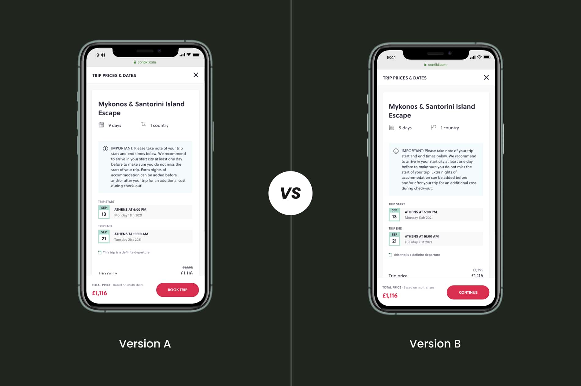
Choosing between hard or soft CTA
In this ab test, we are trying to determine if a hard or a soft CTA would drive more people to progress along the booking funnel. Our hypothesis is that if we use a soft CTA labeled "Continue" more people will be willing to progress to the next stage of the booking process. We think that the Contiki customers are less likely to press on a "Book Trip" CTA at this stage as it is unclear if you will be asked to make a payment immediately after tapping on the button or what exactly is supposed to happen.
Environment
- UK Market
- 18-35 year-olds
- 123k recorded sessions
- 1.5 months of data
The objective of the AB test
To see which CTA label drives to more progression into the booking funnel and increases conversion.
As part of the test we also wanted to monitor the Bounce Rate from booking calendar pages, as well as the user exit rate. The idea is that a soft CTA would also improve the bounce and exit rates since people would be more curious to proceed/stay in the funnel instead of leaving it.
RELATED: With or without price display on a travel product eCommerce card would perform better?
Analyzing the results of the test
The winning version in this test is Version B. Even though both versions perform almost equally, the version with the soft CTA drives 1.7% more traffic into the booking funnel. Consequentially, the second version of the test has also lead to a 0.07% increase in the overall conversion rate.
Highlights of the soft CTA winner
| Bounce Rate | -2.3% |
| Exit Rate | +1.4% |
| Returning Users | No change |
| Users proceeding into the booking funnel | +1.7% |
| Conversion Rate | +0.07% |
Although with the label change there is a small increase in the exit rate, we still consider it to be the winning version as it improves the overall booking flow performance.
What is it like working at TopTal as a freelancer and how to get set for success
TopTal is a community of freelance designers, developers, financial experts, product managers, and product owners. It houses the world's top 3% of best freelancers that companies and clients can contract with ease. I found the platform very randomly by searching on Google for remote working opportunities which lead me to apply for working at TopTal.
First impressions
I joined the network as a designer in early 2018 and the first thing I noticed was that the platform was very well organized. I had HR reaching out to me with my TopTal contract, the accounts department reaching out to help me set up my payment methods, people responsible for talent skills growth and learning reaching out to let me know of available TopTal sponsored courses. Everything was set up as if I was starting to work at one of the San Francisco-based tech companies.
Flexibility and independence while working at TopTal as a freelancer
When they approved my account, I ended up becoming part of the freelancer network and the marketplace. In it, clients can browse and choose who to work with based on their rates, years of experience, and strength of the portfolio.
The best part for me was that there was no commitment to start working until I felt that I am ready to pick up a new project and yet at the same time, being part of TopTal with an approved account did give me more credibility within the industry as I was still able to link to my public profile when needed.
Working at TopTal, as a freelancer, I am able to decide my hourly rate, how much I'd like to work, and at what times. The important thing for me was after committing to a project to stay focused and deliver as promised.
My first gig
In reality, I didn't start working through the platform until the COVID-19 pandemic started. With many businesses changing their times and strategy, some of my time was freed up. I had nothing else to fill my time with therefore a part-time gig sounded like a good idea to pass time and yet be productive.
I set myself as available for work on the TopTal platform and within few days, client managers started emailing me about potential interviews with clients and future gigs.
Yes, that's right! Even if you are part of the network, you get to do an interview with potential clients for both parties to see if there is a match of vision, design style, ideas, etc. As a freelancer, you can decide that a client was not a match for you or a client can decide that they would prefer a different freelancer, but in the end, throughout the whole process, everyone is very friendly and very professional. Even if you don't end up landing your first gig, there is another potential one that awaits in the platform.
Failing an interview is not the end
I landed my first project with TopTal on my third client interview. The first two were just not the right match. I had only part-time availability at the time and the length of the projects felt too long.
I've been working with that same client for almost a year on the same project to what initially was supposed to be a 3-6 month commitment and I have to say - I do enjoy it a lot.
TopTal handles all the legalities, all the paperwork, all the payments, and management. As a freelancer, I was able to only focus on design and building great digital experiences. I could easily say that
Working at TopTal has allowed me to take control over my work-life balance. It gave me the power of full flexibility and freedom.
Professionalism and really great people while working at TopTal
The people I've been working with from the network have always been very nice and very professional. I worked on a few projects with TopTal developers and everything has been fantastic. I didn't have to explain everything in detail, the developers were understanding everything at our first meeting. They took great ownership over their work as any senior person would do.
Is there a key to being successful?
I generally believe that if you are approved to work at TopTal, then you are already successful but at the same time, it is important to remember that it is still a marketplace. You still need to able to sell your services to TopTal clients and convince them why they should hire YOU at that rate and not hire someone else. Doing a few not-so-successful client interviews does actually help. You learn what clients are looking for and how they expect you to sell yourself.

With or without price display on a travel product eCommerce card would perform better?

About this AB test
In this ab test, the element in question is a product card, displayed on the search results page while people are looking to purchase a travel product. There is a hypothesis that, if people are not seeing the price on this search card, they would be more likely to browse through more trips that might be of interest to them. After that they choose a product, they would be able to see the price inside the individual trip product page.
Environment
- US Market
- 18-35 year-olds
- 80k people participated
- 123k recorded sessions
- 525k pages have been read
- 2 months of data
The objective of the AB test
To analyze which version would lead more people to make a purchase in the US youth travel market.
We also wanted to see the user's exit rate from the search results page and how many of them would proceed further in the conversion funnel. Firstly by seeing a trip card on the search results. Secondly selecting a trip and learn more about it.
RELATED: Hard or soft CTA would drive higher progression into a booking funnel?
Analyzing the results of the test
The winning version in this test is Version B. Even though both versions perform almost equally, the version without a price seems to lead to 0.28% more bookings made and 3.46% more leads submitted via the Request More Info link. Also, the version without a price reduces the user's exit rate from the search results page by 4% while increasing the people that proceed from the Search page to a Product page by 0.9%.
Highlights of the Winner
| Bookings Made | +0.28% |
| More Info Form Submissions | +3.46% |
| Exit Rate from the Search Results | -4% |
| Users proceeding in the conversion funnel | +0.9% |
Overall, these numbers make sense as if a user doesn’t see the price they are more likely to move through more pages looking for it or submitting a Request More Info form to enquire about pricing while the exit rate improves.
See the winning version implemented on contiki.com
What is AB testing?
An AB test is essentially an experiment where two or more variants of a page or an element are shown to users at random, and statistical analysis is used to determine which variation performs better for a given conversion goal.