


About the project
This project is about creating a digital product from an idea concept to a fully functional app all the while keeping the users and their needs in mind.
As the lead of the design process and owner of the app, I performed the initial market and competitor research to understand the habits of customers (which were mainly in Europe) but also to conduct a bit of research on a global scale.
A journey roadmap and wireframes were created which later on were shown as a prototype to real people to hear their thoughts and feedback. This feedback was then used to improve the app’s experience.
The final design of the MVP (minimum viable product) was created based on the user-tested wireframes, design experience, and business goals. During every step of the design, there has always been the thought of the growth of the features and how they can be accommodated in the UI at a later stage.
Once the design was done, it was validated by potential customers through remote usability testing software and face-to-face customer interviews.
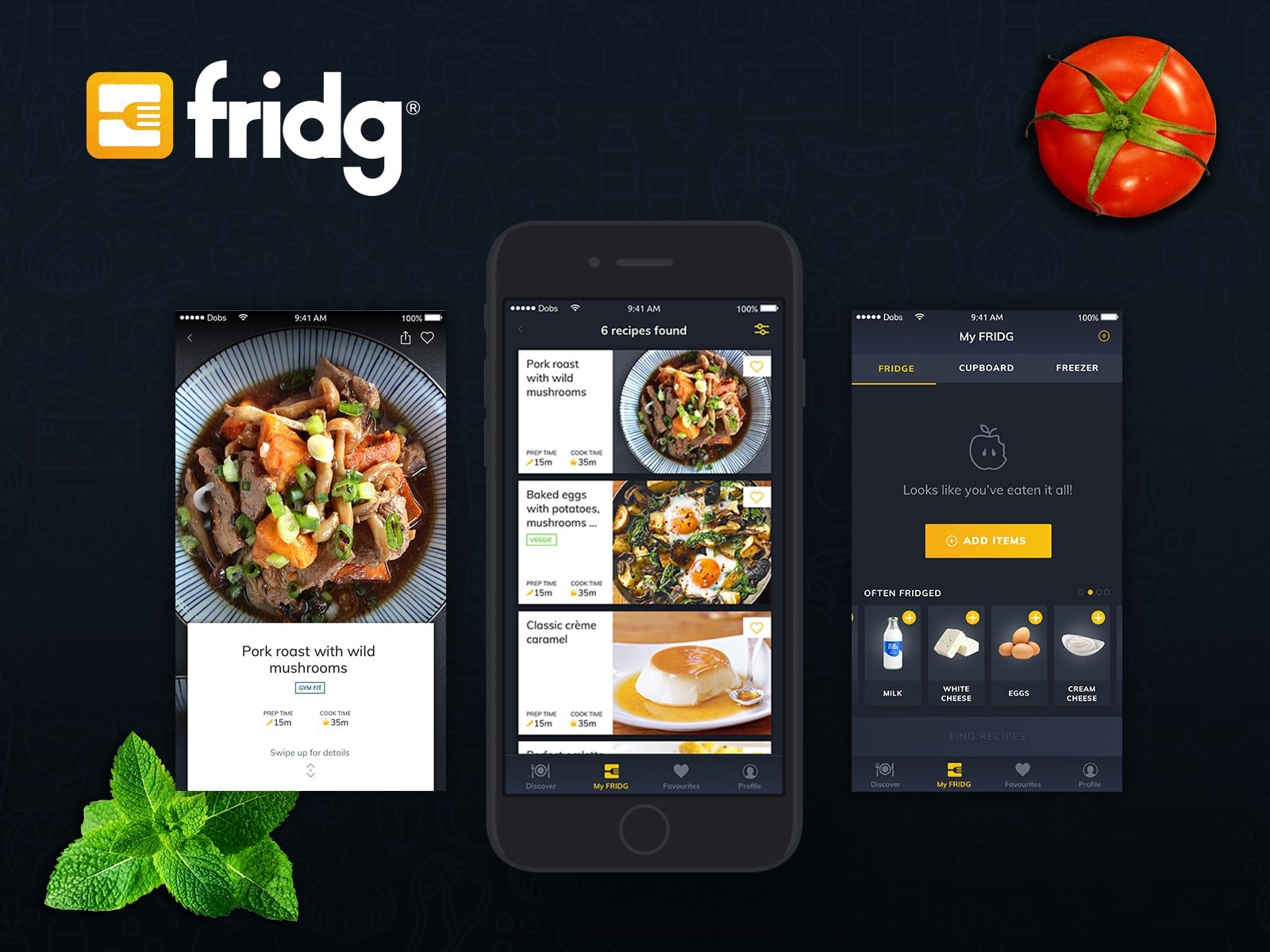
Client: d.DOBS Creative Date: July 2018 Tools: Sketch App, Adobe CC, Principle Skills: User Interface (UI), User Experience (UX) Website: fridgapp.com
Research
Competitors
Since I came up with the idea for FRIDG App one early morning before I began doing any work I wanted to see who would be my competitors, what do they offer, how are they performing and even does it makes sense to create something new?
To begin my research, I started to look at similar platforms, analyzing UI, User Experience, User flow, IA and key features. I won’t go into much detail about the research but the bottom line was that there wasn’t out there an app like FRIDG App, so that was a green light to proceed to the next step.
Customers
The second step of my research was to run a survey to learn about people’s cooking and grocery shopping habits. To find out how often they cook at home, how much of the cooked food is healthy/gym fit food and how much people are willing to cook at home with the idea to improve their health and wellbeing.
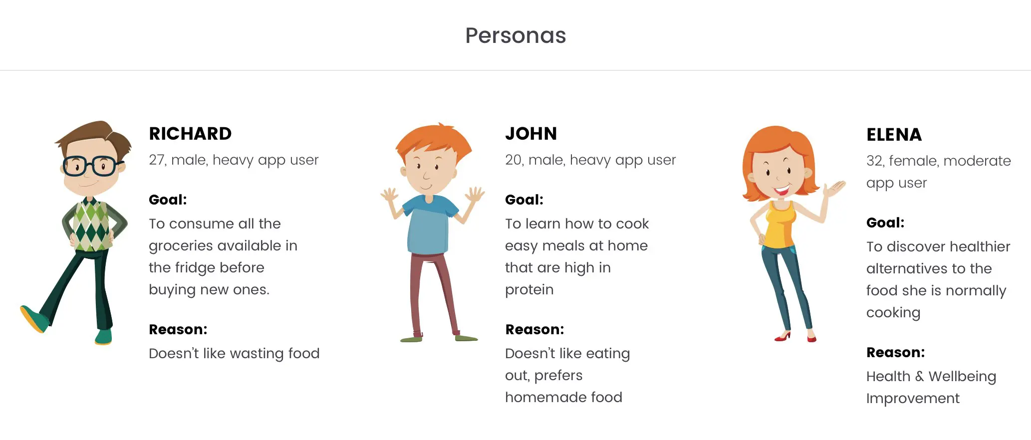
User Persona
Based on my findings in my research, I defined 3 main user personas that I would create my design solution for.
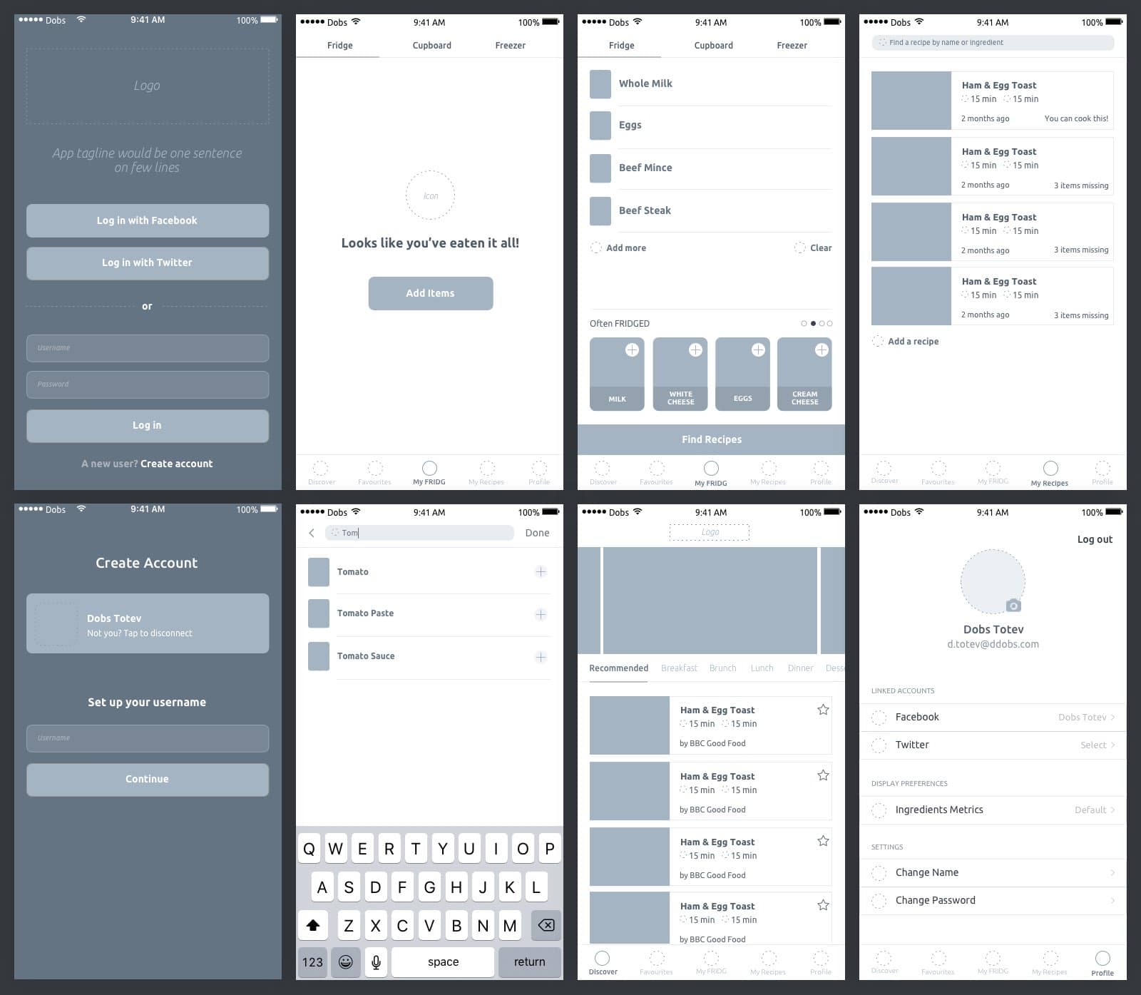
Wireframing & Validating
After I have all the info I needed to start the project based on my research, I started by creating a low-fi wireframe prototype of the app, that on a later stage I wanted to show in front of people and find out of the suggested approach would satisfy the needs of my potential customers.
Design Solution
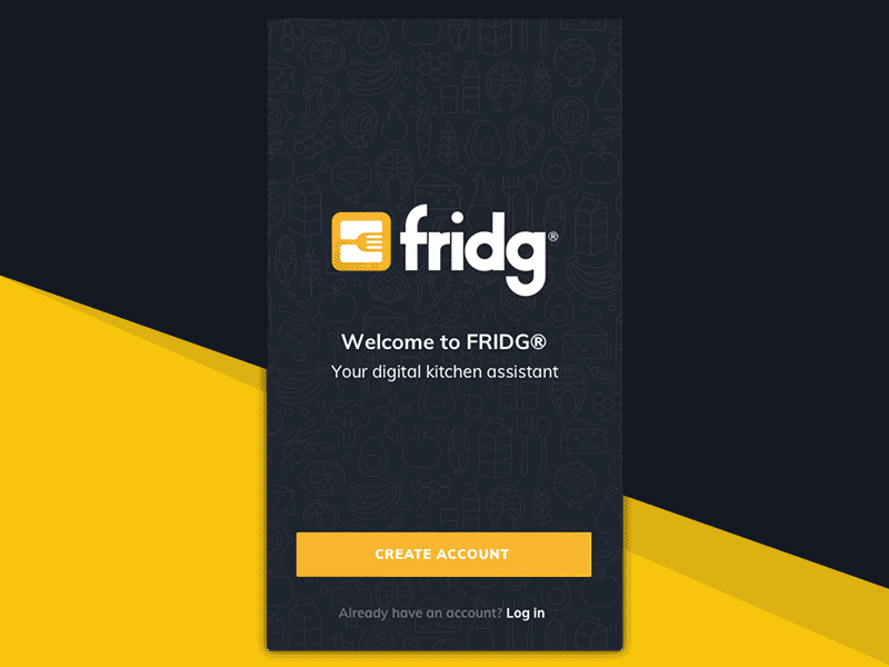
Starting Screen
Simple SVG animation for the log in screen of the app with a focus on new users acquisition therefor the “Create Account” button is the primary one.
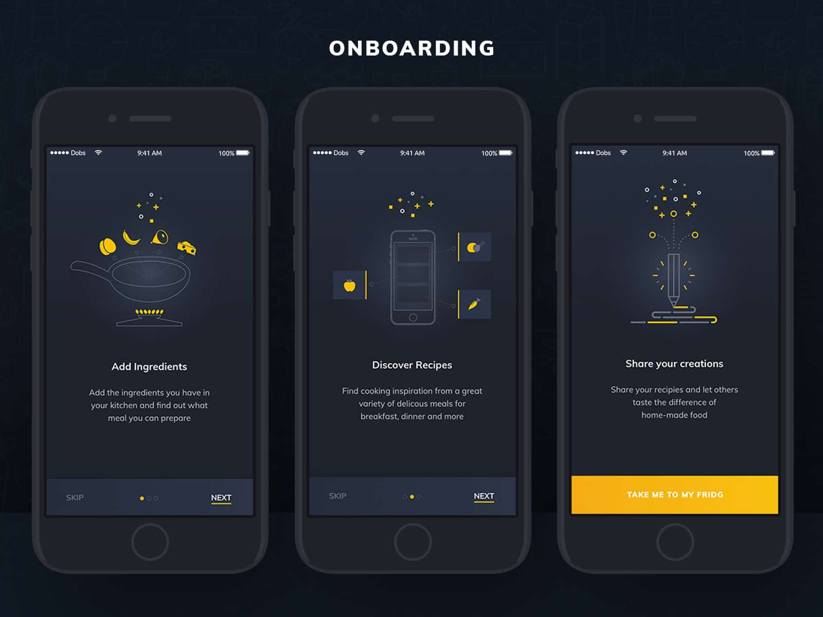
Onboarding
The onboarding screens of the app describing what a person can do with it. It shows only when a user opens the app for the first time and once he goes through it will disappear.
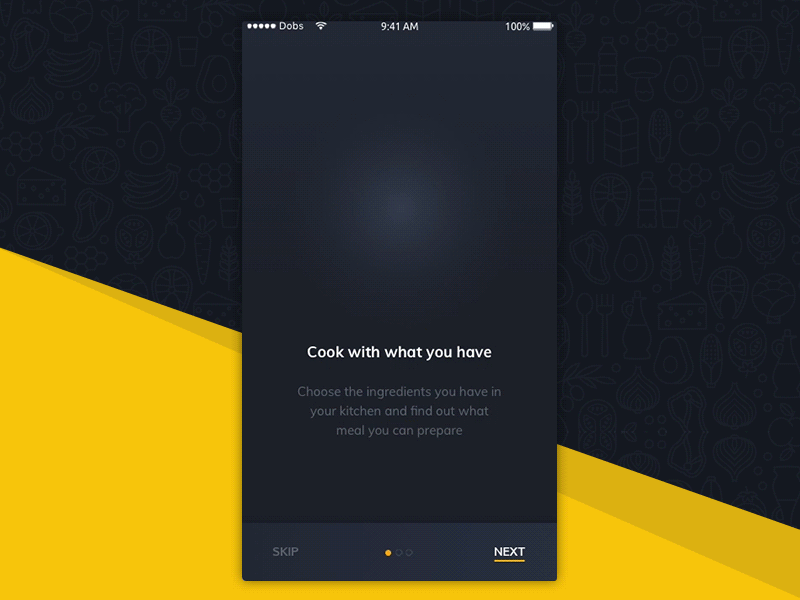
The animated SVG icons bring the final touch the onboarding experience.
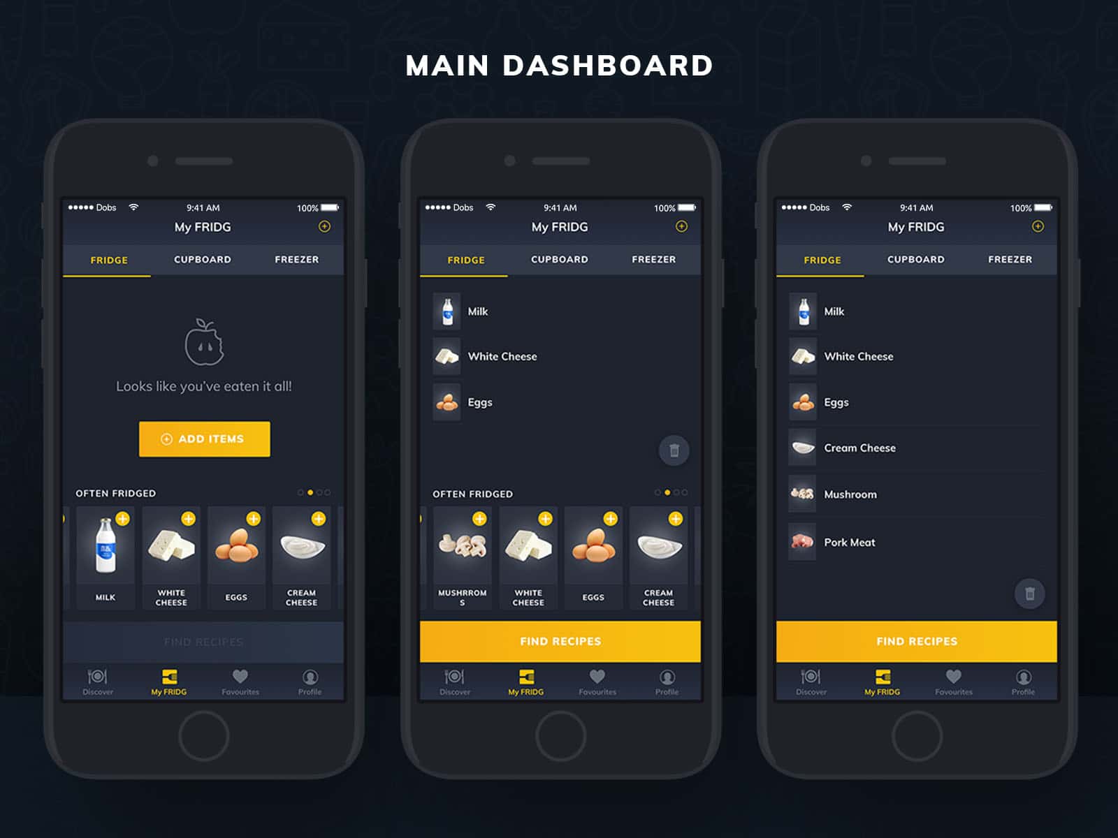
Main Dashboard
Once you create an account or log in, a user arrives at their main dashboard where they can add ingredients.
The first screen shows the case where there are no items added yet but the user can either add items or use the suggested ones below to add items.
The last screen showcases the app’s behavior when you have a longer list of items added—the suggested products disappear so a person can more easily see what they’ve added.
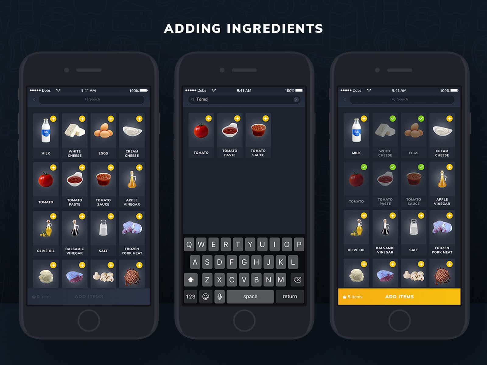
Adding Ingredients
The problem with adding ingredients was that I wanted to avoid the situation of the screen closing after the user added an item and then the user having to open it again by tapping on the add button.
Instead, I decided to make the adding ingredients flow all happen within the same view.
From here, a user can search for the ingredients and as he searches, the results below filter dynamically. Once you add an item, you can continue to search for other ingredients.
Once a user decides that he is done with adding items, they can return to their dashboard and find recipes.
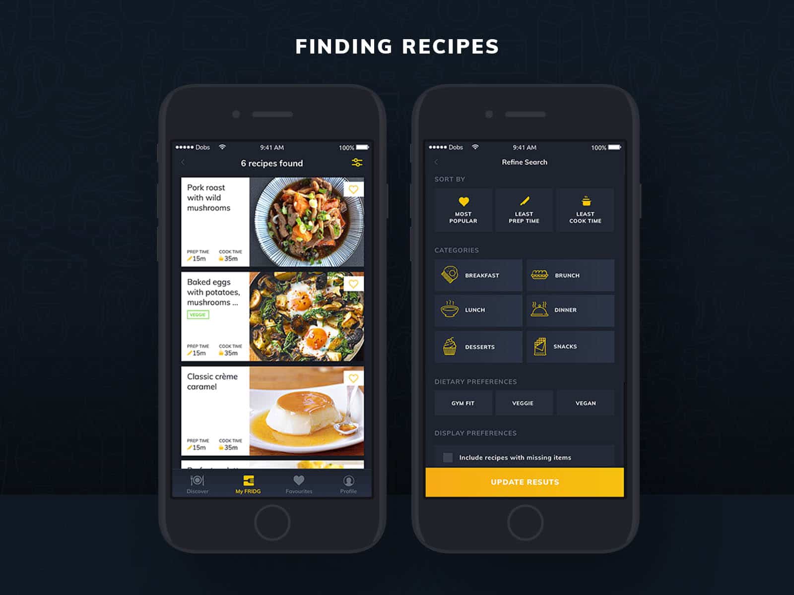
Finding Recipes
With her/his added ingredients, a user can find recipes that she/he can cook out of them.
Since it’s quite possible to end up with many search results, a user can use filters to narrow down the search to her/his preferences.
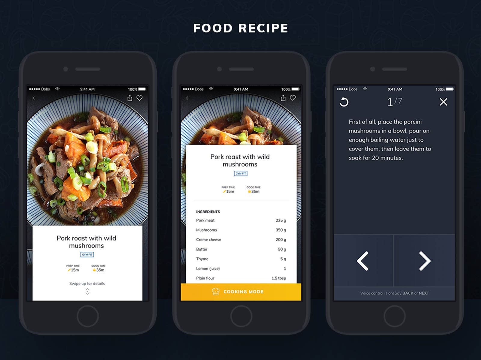
Food Recipe
There is a problem with every cooking app/website that a person experiences—how to navigate their device while having dirty hands.
To work around a solution to this, I came up with the concept for a recipe to have a cooking mode where the steps of the cooking process are placed in a different UI that was optimized for readability from afar but was also optimized for navigation with just a fingertip or voice commands.
Discovering & Favoriting
The app also offers recipe discoverability feature for people who are unsure what ingredients to even buy in the first place.
User Testing & Customer Feedback
After I created the design solution for the FRIDG App, I did once again a test with real users, this time using the UserTesting.com platform. Of course, there are other platforms too that one might use. See 5 User Testing Platforms rated best to worse.
I ran the test remotely with 5 people while guiding them through a script, where the common feedback was considered and changes were made accordingly to the design.