


About the project
Soho House is a global hotel network & private membership club originating in London, and now operating across Europe, the United States & Canada.
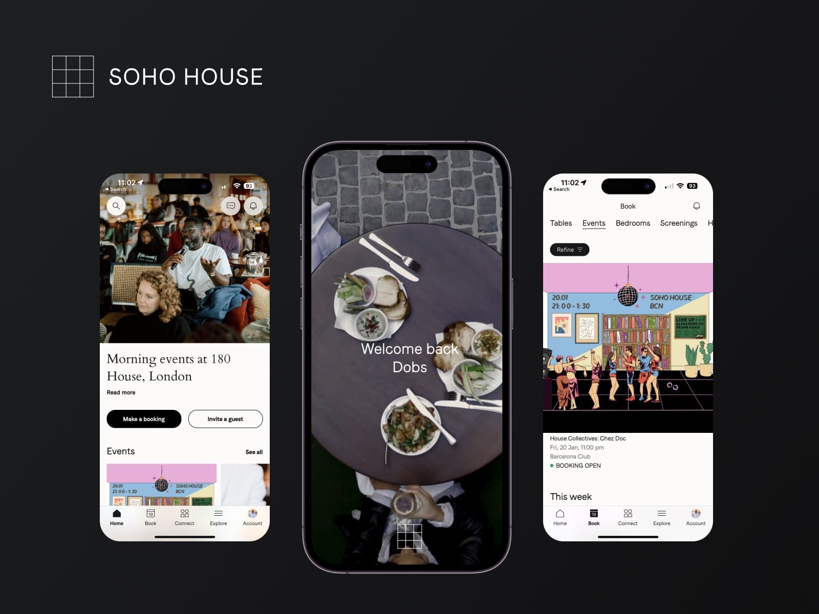
The member’s app is used by over 90% of the entire membership to see what events are coming up, to book events and bedrooms, to make table reservations, and to discover and connect with other members around the world.
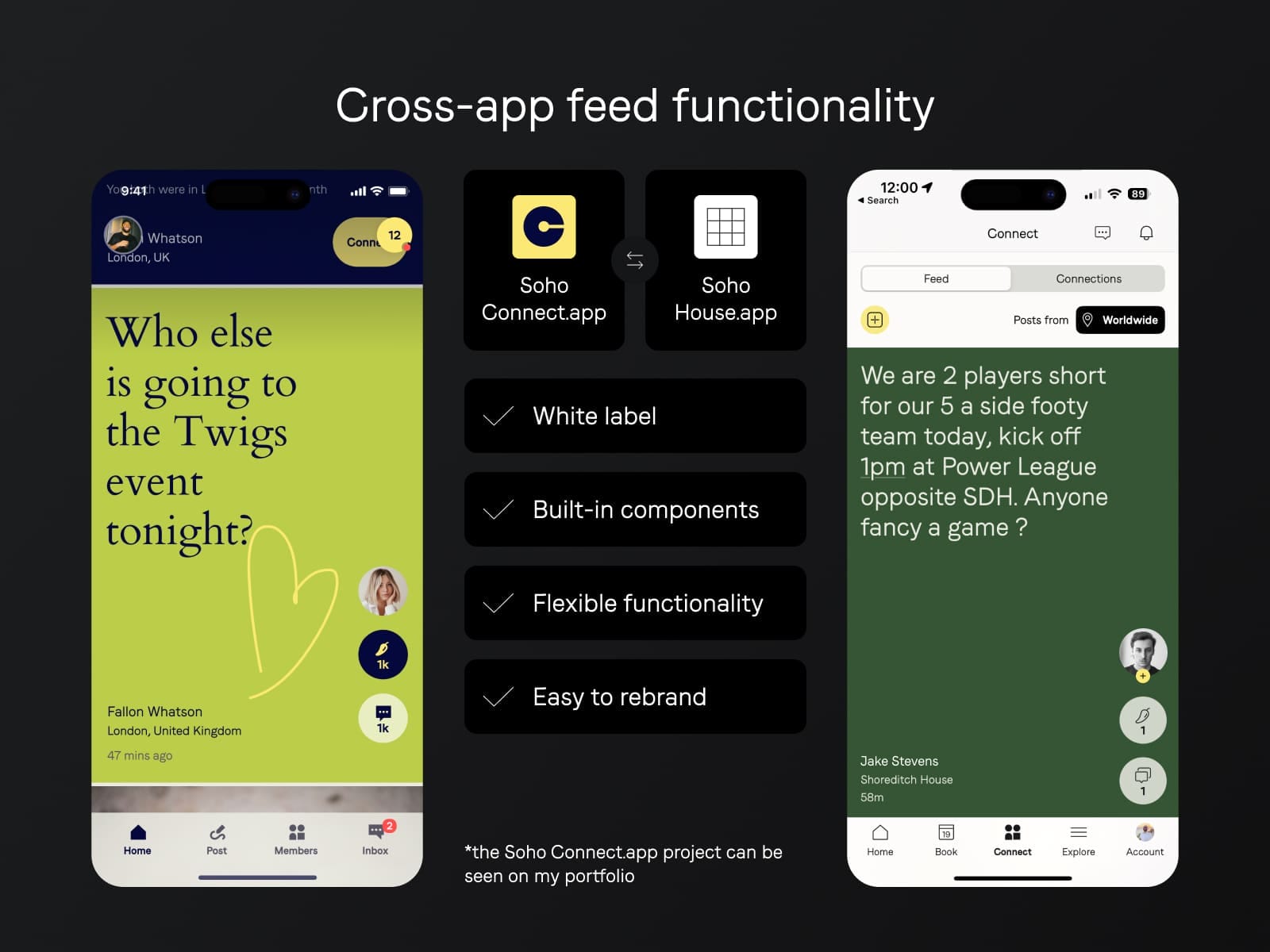
I joined the project as the Lead User Experience designer on the Social Networking features that tackle not only the member’s app but also other app projects by Soho House such as The Ned Hotel and Soho Friends.
Client: Soho House & Co Date: April 2022 Tools: Figma, Adobe CC Skills: User Interface (UI), User Experience (UX), User Research, Design Validation, Customer Interviews, Product Strategy Website: sohohouse.com
What was I involved with?
The app as a whole is created with the joint efforts of the product design team, brand & creative team, content team, and product development teams.
As UX lead on the project I was involved with:
Social networking features
Social product strategy
Member chat & messaging
Member profiles
Member engagement & gamification to increase daily app usage
Design systems & white labeling
In-app content creation experience
In-app content browsing expereince
Member discovery & Connection
App navigation
Events member attendance
Improving the experience for members in the physical houses
The app's history
By the start of 2021 (the time when I joined the project), the app was already functioning and was serving its core purpose – to be a companion utility app to the Soho House membership.
Members were able to do their membership admin like inviting a guest, booking events, reading the news, book bedrooms, and potentially hosting live rooms for video call conversations with other members which already had started to die out after the post-pandemic reopening of the houses.
The app was faced with a lot of bugs, friction in the user experience and navigation and negative comments on the app store.

— App navigation & home screen 2019 – 2021
The app transformation
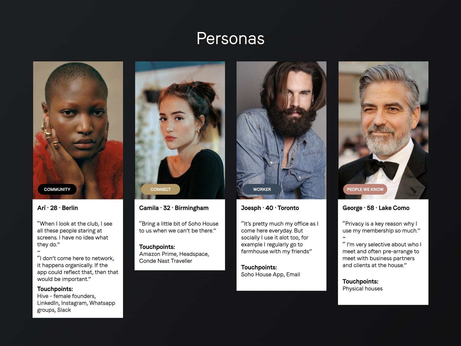
With a shifting focus on social connections, conducting user interviewers, and building features into the app that members want, the app started to take a new shape.
One of the first things we did was to review our user personas and remind the team who we are designing the product for. To do that we gathered a selected group of members in focus group sessions and asked them questions about their behavior, house attendance, app usage, and what they use the app for. Apart from that, we checked these responses with the Analytics data that we have at our disposal.
Alongside the product team and our CTO, we planned out the roadmap of new features that were based on member feedback, business goals, and analytics data.
The core navigation UX update
The second thing that I had to address was to change how members would navigate through the app.
- Achieve as native iOS experience as possible.
- Achieve an experience where the user shouldn’t think about where to find specific features.
- Create an experience that is intuitive and allows quick access to the top most used features in the app.
- Create an adequate information architecture of how the menu’s are structured.
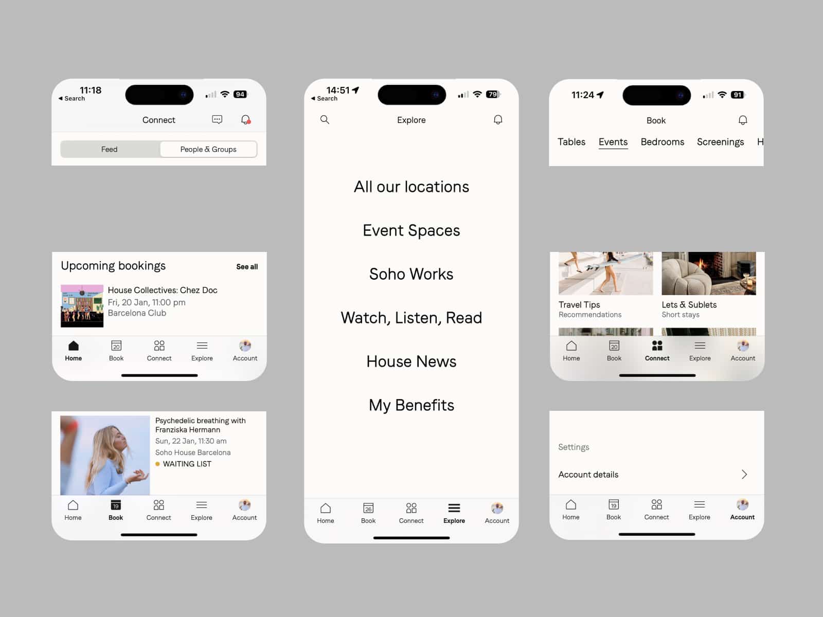
— App navigation 2021 – present
Validating the change
To validate this change, during our user interview sessions we asked our members “How confident do members feel that they can find what they need in the app”, and the response was 90% – Very confident.
Design Solution
Splash & Log In screens
In order to sign-up and use the app, a person must apply for membership. Once they are approved they can download the app and sign in with their account.
When members log in, they can immediately see their membership card and the expected house rules. They can also add the membership card to their Apple / Google wallets as they would need it for later when they have to check in to the houses.
The main goal here is for members to have a smooth house check-in experience when they arrive at any of the physical locations, hence when they download the app, the login flow is trying to encourage them to prepare their membership cards into their digital wallets.
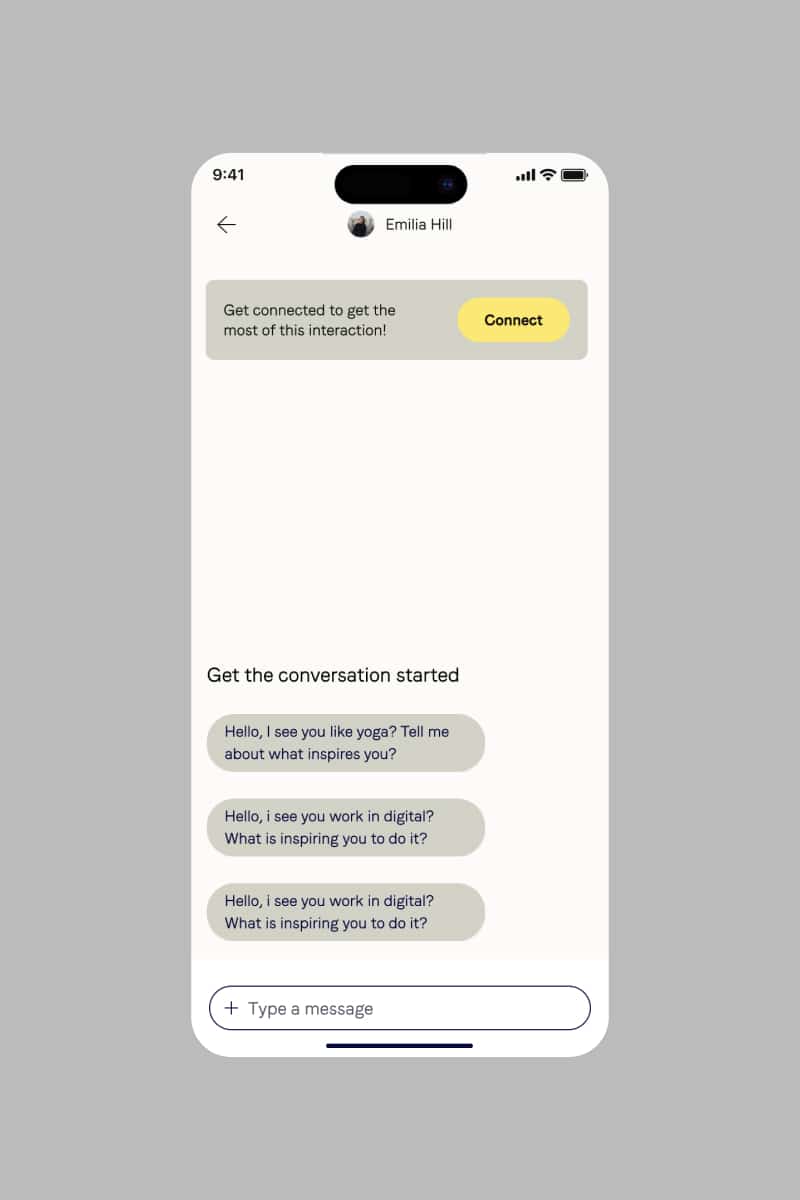
Connect with members
The foundation of Soho House is to be a private space where creatives can connect, collaborate and discover new relationships.
I was tasked with bringing that physical interaction into the digital world of Soho House. As a new connect social feature inside the app, the main goal is to present members with the opportunity to connect and express themselves in front of members from around the world.
As a secondary objective, the connect feature is there to serve as an ice breaker when members do meet in person in the houses.
e.g. A member sees content created by another member on the connect feed, once they meet in-house they can recognize each other from their in-app social profiles and have an immediate topic to talk about.
This way in-person interactions are made easier, and we have helped thousands of members find new friends that normally would be shy or intimidated to approach.
Apart from that the experience of the feed being in a vertical scroll has improved the app engagement and daily visits, as members would like to see what is the latest from fellow members in other cities.
To expand on that feature we also introduced groups focused on the most discussed topics on the feed. The groups serve as an easy access way to certain content and members who are interested in that.
Create content
The members of Soho House are predominantly creative, open-minded individuals, and creating content on the Soho House App had to reflect that.
A key problem that I was faced with was “Why members would want to create content inside the Soho House App when they already do it on Instagram and TikTok”
Neither the business nor myself could answer these questions hence I conducted research with a selection of members to identify their motivators as to why they would want to create content on the app. I’ve asked questions about app usage, frequency of use, top features and if they had the opportunity to post on the app what would they post about?
The research gave me the 3 main posting topics: flat swaps, collaborations, and organizing to meet with other members.
Based on that, when creating a post I identified what features that experience needed to have like: post location, the ability to attach media, and the ability to express yourself through different font sizes and post colors when creating a post. Members could choose from a range of colors based on how visible/important they want their post to be.
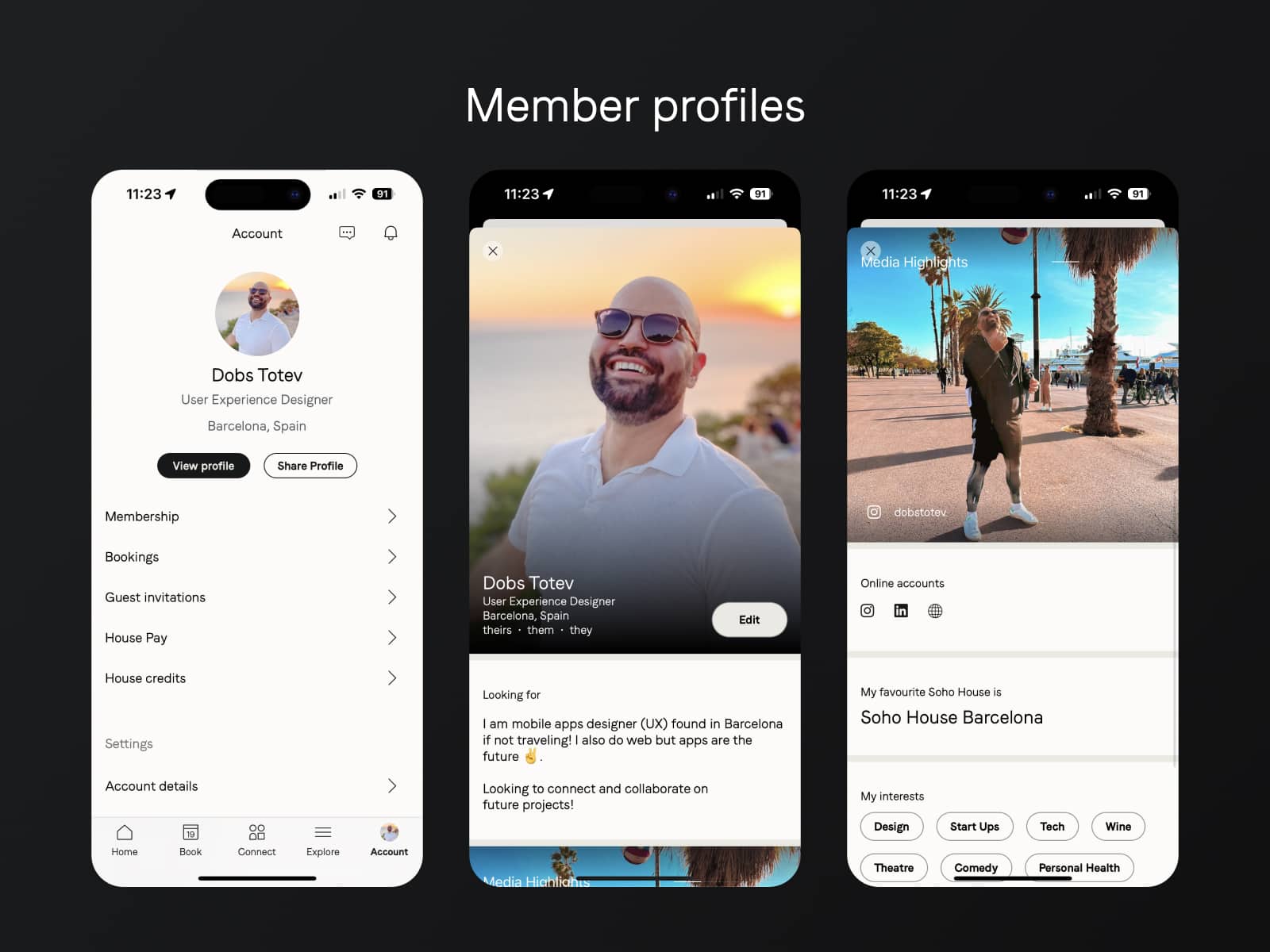
Member Profiles
Personal profiles are a way in the app for members to express themselves, feature their highlights, and connect their social media accounts.
When meeting someone virtually, profiles are the digital presence of a person, hence I wanted to create a member profile experience that can capture people’s attention.
The original version of the profiles had a suite of features including showcasing your projects, recording a voice note answering a question, and displaying hidden interests that only members who have them selected will be able to see on each other’s profiles. All of that had the goal to create a really engaging presentation and to help people break the ice in reaching out to each other.
These ideas were validated through remote user testing with a selection of existing Soho House members where the goal was to identify what makes an engaging profile that a member feels comfortable connecting with another member.

— Concept ideas for components on Member Profiles
The actual build’s current version has a more limited suite of features due to technical constraints but the vision for future updates remains.
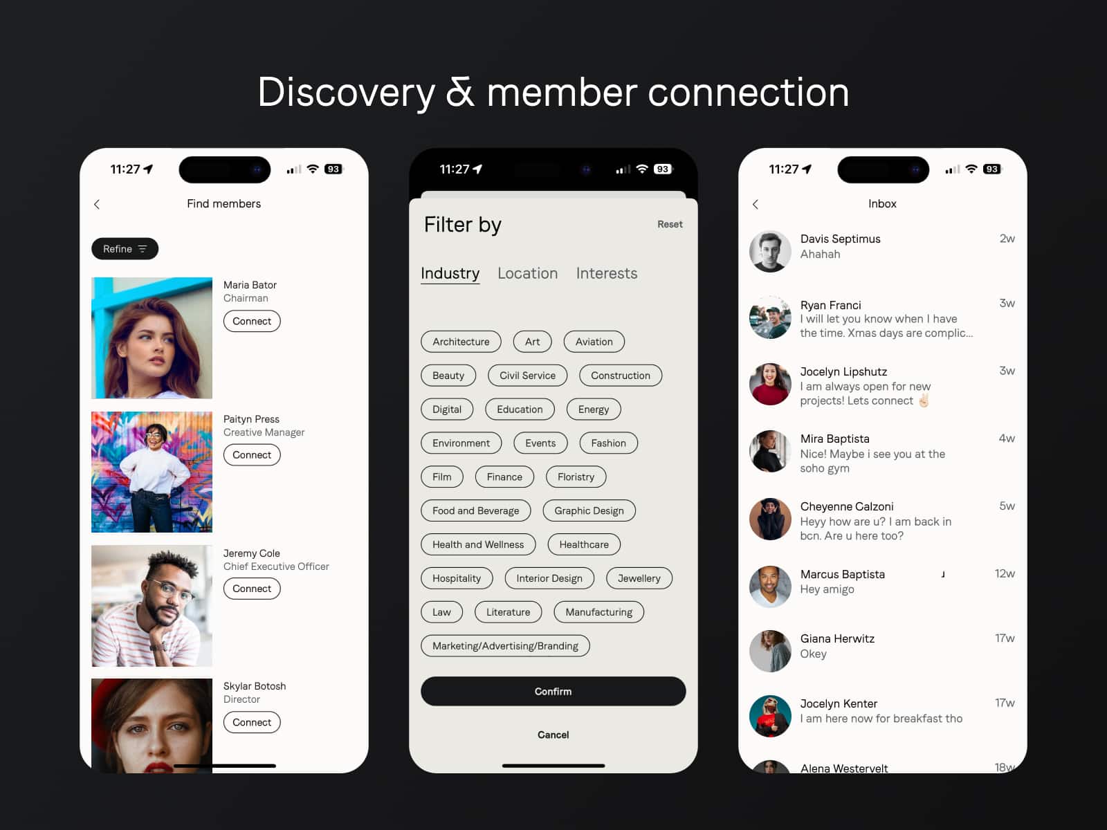
Discovery & member connection
As part of the Social features suite, I’ve created a way for members to discover each other either when they are in the houses by being able to see who has checked in into a house or by simply getting a preview of suggested members that they can filter by industry, location or interests.
The challenge of member discovery has always been about privacy – how to show members without compromising their privacy.
Because of that challenge, we currently do not have a way in the app to search for members by their names. Instead, in order to still have a working member discovery feature we’ve collaborated with our data team to create an algorithm that would identify the profiles that a member is most likely to connect with and present them as Member Suggestions. In the list of member suggestions, members can filter down the suggestions to get even more specific results almost as good as a search functionality.
Once a member has identified people they want to connect to, they can send them connection requests and direct messages to start the conversation.
As part of the member-to-member communication, I have also worked on an ice-breaking experience, which gives first-time direct messages a set of questions that members can send out with one tap if they are unsure how to begin the conversation. Through research, I have identified that this feature will increase the direct messages exchanged by connections and more members will be chatting to each other.
— Ice-breaker questions in first time direct messages

Events discovery & bookings
Events are one of the app’s most used features. It allows for members to see what’s happening next, book events, and see who is attending.
I was responsible for integrating social features into the events. Once again the challenge faced with this feature is the privacy of members, as there are people who don’t want to be shown.
My original plan was to have a global privacy toggle for the privacy of visibility of members on events, but research has shown that at some events members want to be seen that they are going and at others, members would prefer to not be shown, hence the approach I took was to have a privacy toggle per event. After a member has booked the event, they can also choose if they want to be shown. Meanwhile, they can see who else is going, but only people who have their toggle on are displaying.
Apart from that I have supported the work on events discovery and filtering, which allows members to filter the events by location & date, and have proposed the separation of events into This Week, This Month, and In the future instead of being one long list.

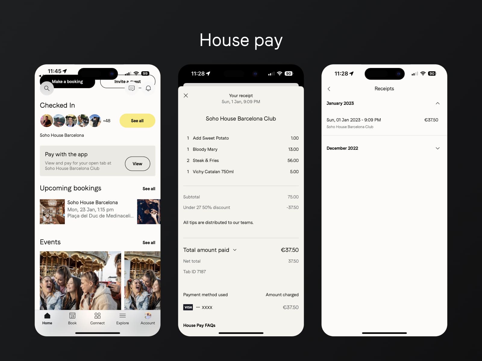
House pay
With house pay being a fintech project on its own inside the Soho House app, it allows members to open a tab in the physical houses, to see what is their current active order and make a payment from the app without having to wait for a server to bring the bill and charge them.
This experience has reduced the workload of servers and waiting times to get the bill when someone is in a hurry to leave, which on its own has reduced members’ frustration and overall impression of the service.
I have supported the team working on the house pay feature by assisting in the user journey and reviewing how the house pay feature would affect the in-house experience of members. As part of my supporting role on this feature, I have collaborated with developers and product owners to polish the product and update it to keep it relevant.
Apart from that, when I am in the houses, I conduct guerilla research with members sitting near me on the reason why they use or don’t use House Pay to pay for the bill and also observe the in-house behavior of how servers would use the admin of the feature.
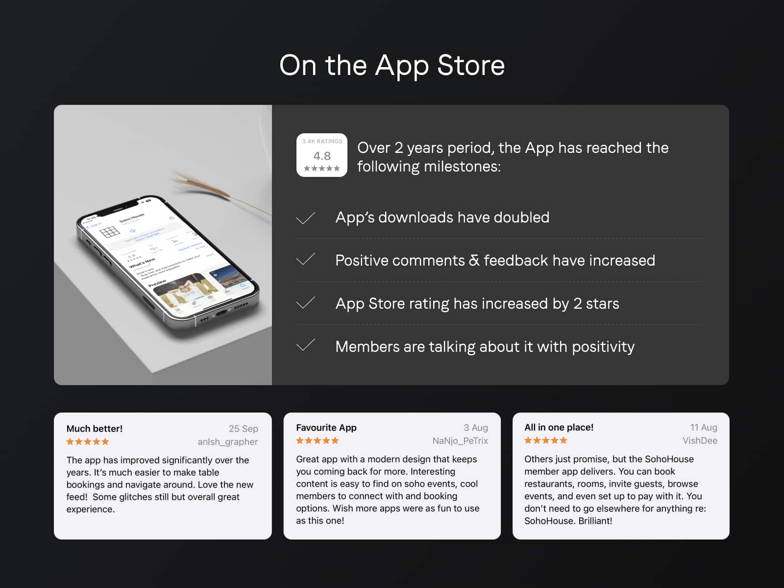
On the App Store
The app’s evolution has been tremendous over a 2 year time period, with many colleagues and team members working on it.
With each one’s individual contributions from tech, development, design, user experience & user research we have:
- Increased the downloads of the app
- Increased the positive comments and feedback from members
- Increased the app store rating by 2 stars
- Members are talking about the app in a very positive way
The app has brought value not only to members but also to the business by providing a world-class and one-of-a-kind digital experience for a Luxury Hospitality brand.