About the project
Soho House is a global hotel network & private membership club originating in London, and now operating across Europe, the United States & Canada.
My team was tasked with creating a social app for Soho Houses, where after members are approved, they can download it and make use of the social features of the Connect product.
The product allows members to connect with each other regardless of where they are in the world, to exchange direct messages, to share in which city they will be, and to express themselves in a creative feed by sharing stories, posts, media, and other content that they’d like.
Apart from that the app has a powerful recommendations engine that would allow members to discover new connections and make long-lasting relationships.
Client: Soho House & Co Date: April 2022 Tools: Figma, Adobe CC Skills: User Interface (UI), User Experience (UX) Website: sohohouse.com
Initial research & learnings
The foundation of the learnings for this project came from the Soho House core app, which has been used by thousands of members, with the social features being in the top 3 most used features.
Apart from that since this is an entirely new type of membership we identified that the type of members that would make the most use of such a product are people in large cities that do not live close to a Soho House or do not have a Soho House in their city to make use of the house physical spaces.
The research was done by running focus groups with members who are currently on the Soho House’s waiting list and are not members yet.
Design Solution
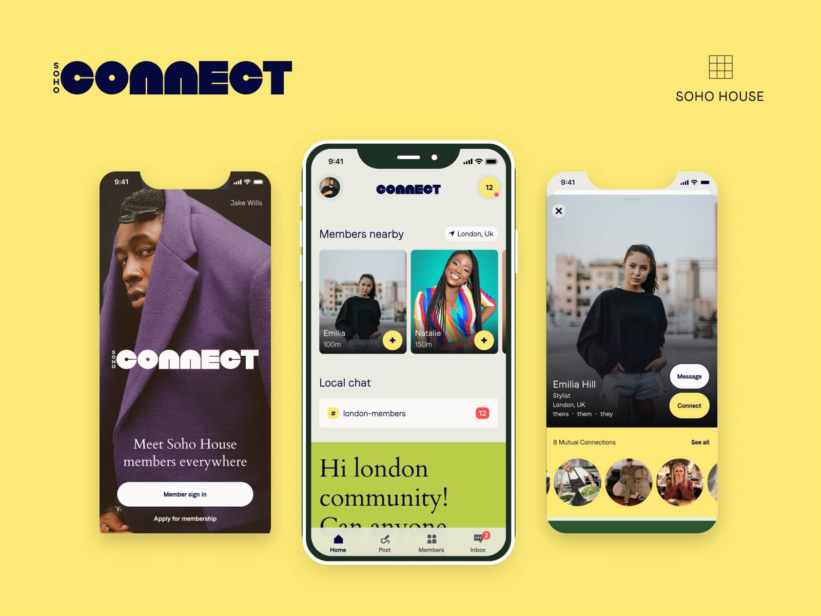
Splash & Log In screens
In order to sign-up and use the app, a person must apply for membership. Once they are approved they can download the app and sign in with their account.
The app itself does not offer a membership application flow for its MVP therefore at present this flow is linked to a web form that opens in-app in a modal view.
The login screen is meant to showcase profiles of the app’s top community contributors as part of the community recognition & gamification program.
Home Screen / Social Feed
The home screen is the hub of the app that hosts features like member discovery, city chat, and one of the most used features – the social feed.
Every time a member lands on the home feed, it will update to the latest post. It allows users to interact with other people’s content by commenting or reacting to the posts.
The challenge here was to create a feature that is built for user retention, hence I chose to create a vertical scrolling for the feed taking the know-how and research of apps like TikTok.
City check-in
One of the core features needed for member discovery is the City Check-in. It allows members to “announce” when they arrive in a city so they can be discovered by other members who are already there.
The challenge for this feature was to manage the member’s privacy, hence we explicitly have prompts for members to agree to share their location or to become visible in a certain city.
Member profiles
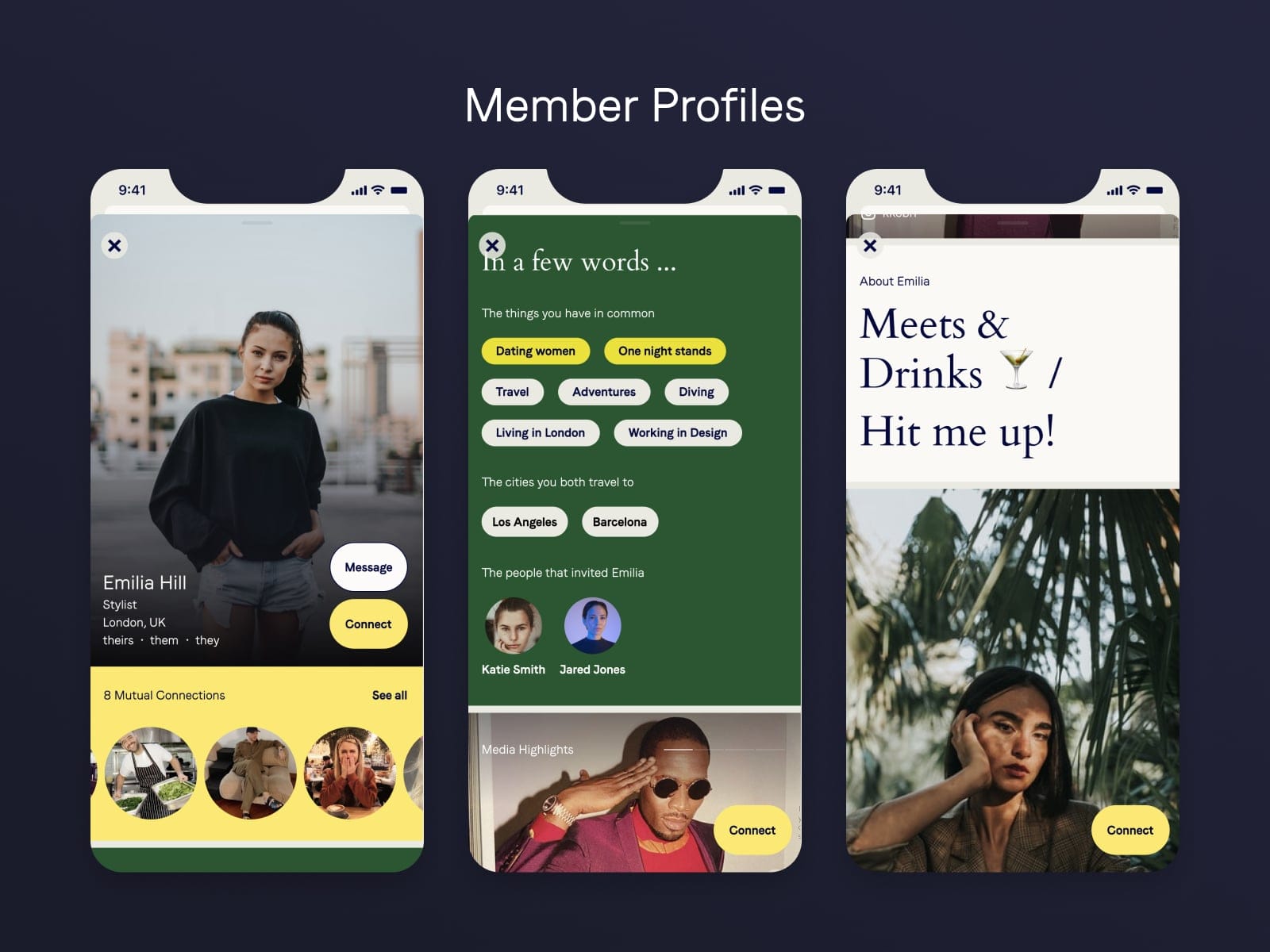
Since this is all about digital membership, the member’s profiles are the most up-close introduction experience that a person can come to. It is the deciding factor for members if they will connect, meet in real life or ignore each other.
I wanted to show as much relevant information as possible and most importantly highlight what are the shared interests and activities that members have with each other when viewing one’s profile.
I played with large profile pictures and multiple imageries and inline integration of social media like Instagram and TikTok.
Member Discovery
The member discovery features allow people to find and explore new connections, see where people hangout out on a map view, and if a member is new to a city decide in which areas/places to go out to.
Again for this feature I have taken the member’s privacy settings into consideration and only people who have agreed to show to which places they go will be shown on the map view.
Apart from that, we have a discovery for new members, and a spotlight on interesting member profiles identified by a matching algorithm that a member is most likely to connect with.
Inbox & Activities
As a social app, one of the core MVP features the direct messaging. Allowing people to talk to each other, and send images and text messages is core for building long-lasting relationships and discovering new connections.
Personalization for MVP
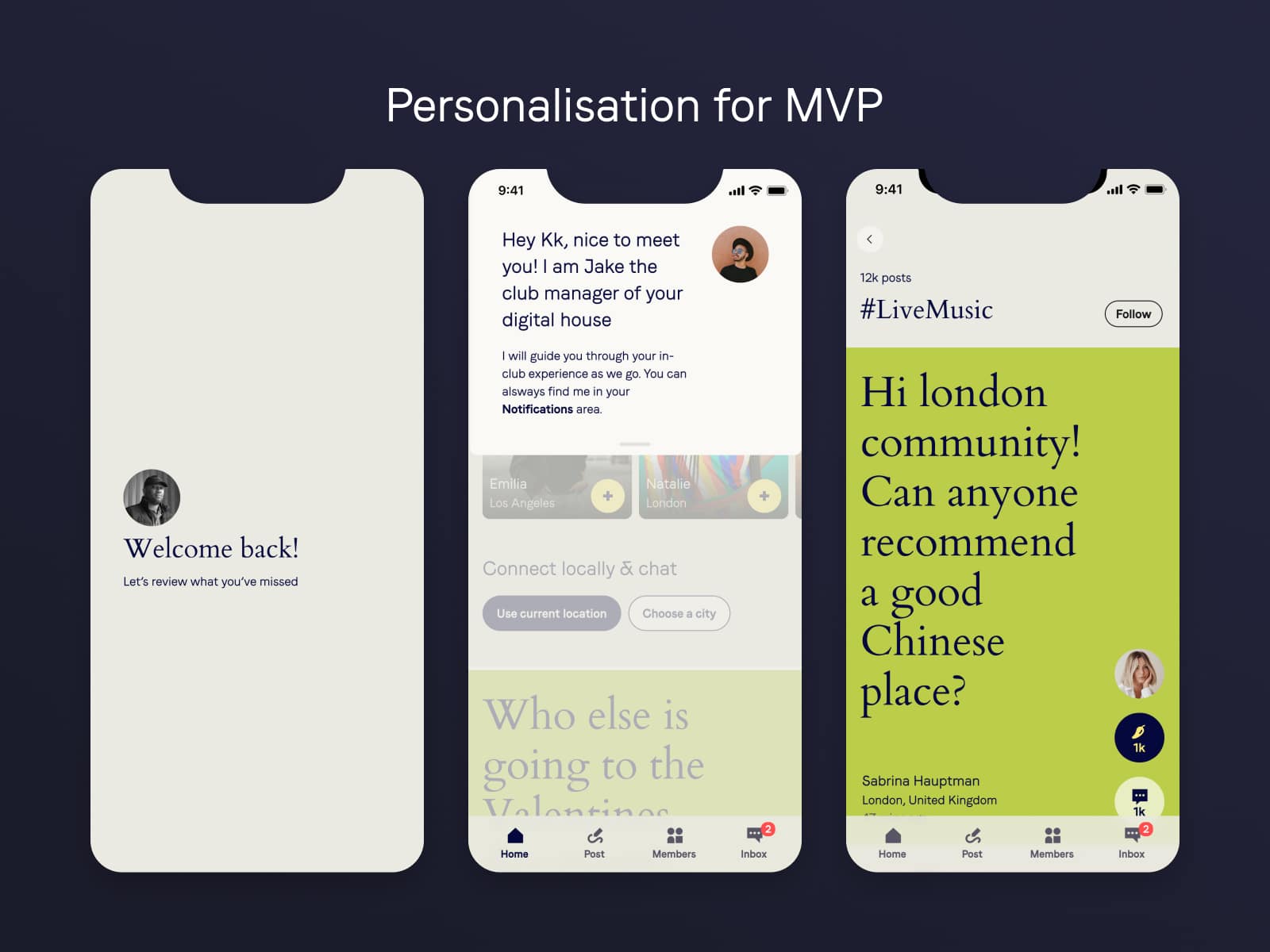
Approaching this app with the vision that everything that is shown on it must be personalized for the user gave the start for the initial MVP personalization features that the team was able to each.
A personalized welcome screen when a member opens the app, special notifications from the “digital club manager” that address the member by name and then introduce them to a feature or news that is relevant to them, and the ability for members to follow different hashtags so they can get notified about future activities and happenings around those hashtags.
Beta 100 focus groups & research
Before the official launch of the app, we launched the app to 100 people who were from the Soho House membership waiting list.
After they used it for 2 weeks, we invited the people to the office for a focus group style debrief where they were asked questions about how this digital product fits in their daily life, what the likes and dislike, what they had a challenge with, and how they see this product evolving in the future.
User Testing & Design Validation
The beta 100 launch was one of the biggest user tests that we did for this app, but apart from that during the design process, we were holding mini-sessions with potential members about different social features that we were planning to build.
Once those were identified and initial designs were made we ran an in-house usability test where 20 team members were playing with the app’s prototype and helped us identify a few usability issues that were updated before it was sent for development.


