


About the project
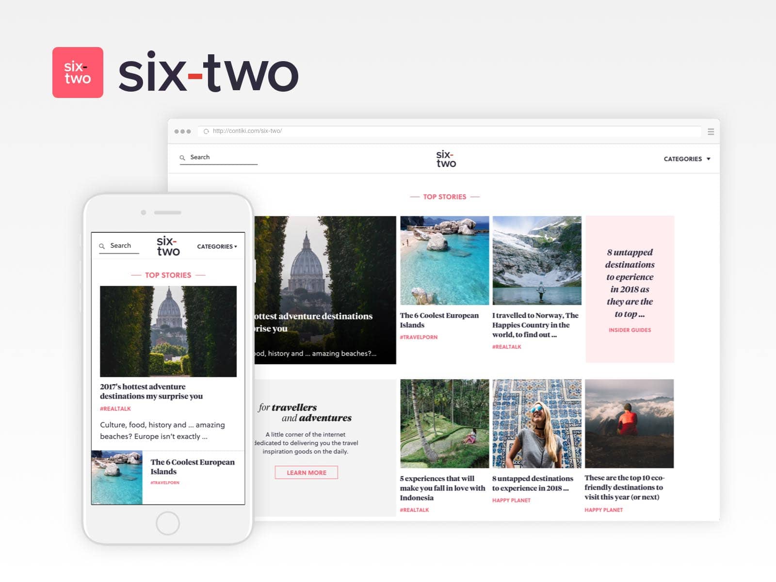
The project’s objective is to redesign the editorial website of Contiki and improve user experience, readability, and information architecture.
My involvement in the project has been from start to end as the lead designer, working alongside two other designers for a short time and then carried on the design till it was delivered to the team of developers.
Client: Contiki Date: Feb 2018 Tools: Sketch App Skills: User Interface (UI), User Experience(UX), Customer Interviews Website: contiki.com/six-two/
Research
Customer Survey
The editorial website Six-Two was already existing and since the task was to redesign it and improve the UX before any work was started, the team & I conducted a survey with the blog’s readers. In about a week we managed to collect around 200 responses which gave me insights on the following subjects:
- Who are the readers? Their age, how often they visit the site, where they normally browse from?
- What makes people return to the website?
- Do people have problems finding what they are looking for?
- What other websites do they read most often?
- How did they discover Six-Two?
In the end, we also asked how people think Six-Two should be improved, which gave more insights into what people might want.
I’d address that final piece of feedback as “might” because in most customer interviews I have conducted what people consciously want is not necessarily matching what they actually expect.
Contributors Survey
Apart from the survey with the website’s readers, I’ve also conducted a survey with the blog’s contributors, asking very similar questions to what customers were asked.
User Testing with the existing design
The final step in the research was to identify what are the usability problems the current website is experiencing. To discover that I performed a remote usability testing with people who can be potential readers of the website and I found out that about 85% of the existing website is generally liked by the people.
One part of my research report is to create a “tag cloud” that shows highlights of what people like and dislike while they browse the website.

Ideas Research & Sketching
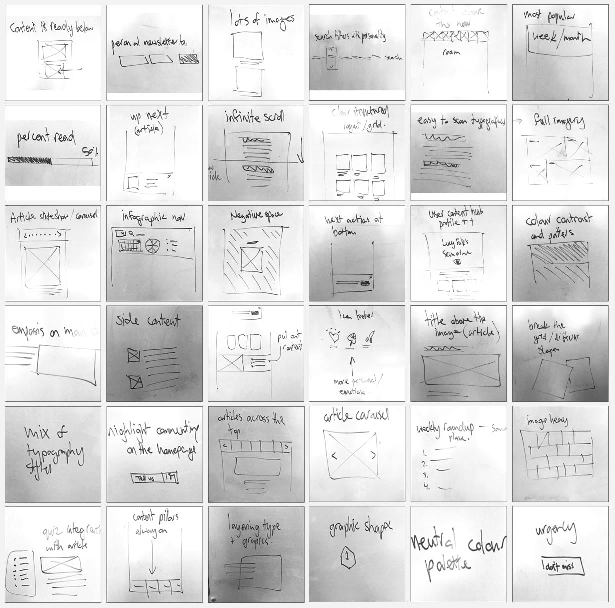
In this step of the process, I took the structure of Day 2 from the Sprint Book where we came together as a team – designers and stakeholders to review the websites of competitors and others we found inspirational in order to record in sketches which ideas we think are cool and would fit well with the new product we are creating.
At the end of the day, we had a whole wall of sketches with UX and experience elements that we have collected from the web.
Design Solution
Navigation UI
The UI for the main navigation took quite some time to get it right because the problem that I was facing is that readers do not understand what each category is. They could’t infer that simply by just looking at the title and they were expressing no interest in clicking on it.
The solution to this was to come up with a way to show the category and description together in the navigation menu.
On a mobile device, the screen takes up your entire screen where on the desktop the menu opens from the side and you can’t interact with anything else until you choose something from the nav sidebar or alternatively close it.
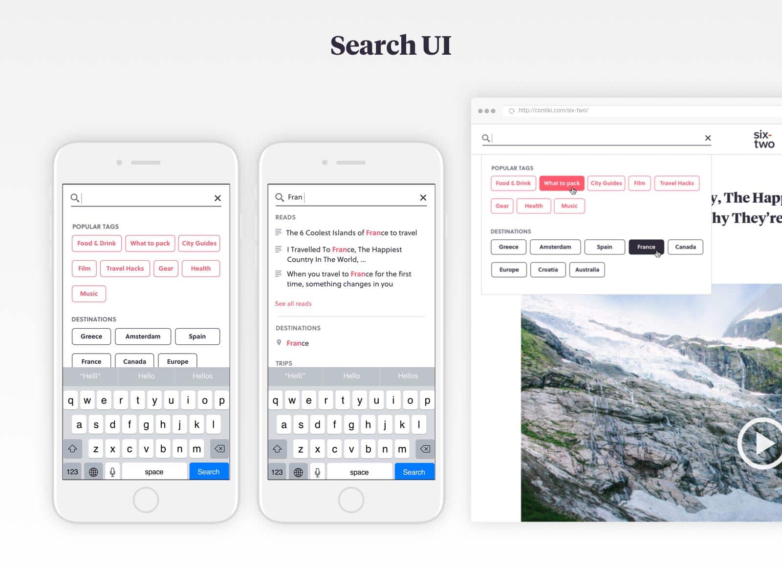
Search UI
The objective of the search interface was to improve the way people discover relevant content.
An idea on how to do that is to create a logic for predictive search. When a reader starts typing, he is able to see instantly search results for articles, destinations, and even trips which link to travel products offered by the business.
This way of promoting a product is non-intrusive and relevant for the user.
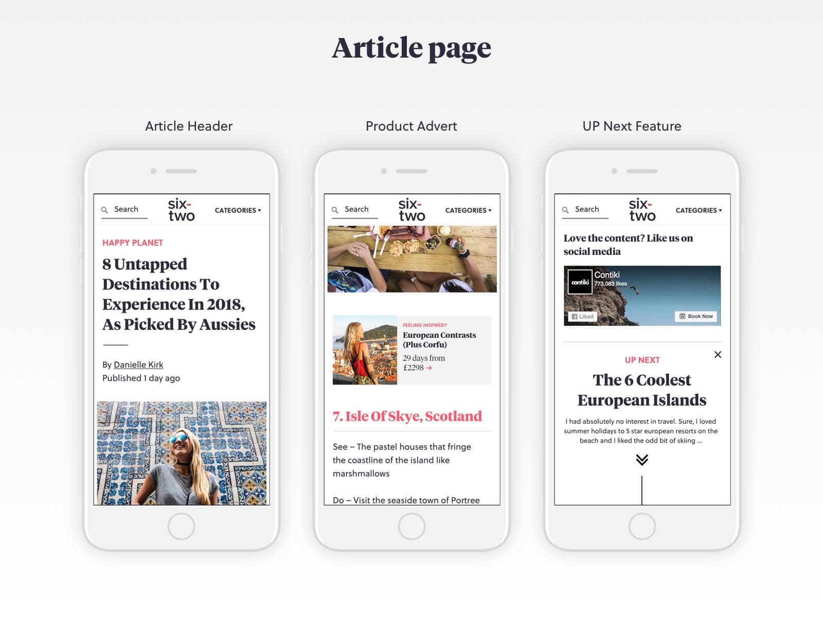
Article Pages
Based on Google Analytics, I discovered that the article pages are the most visited pages on the editorial website which made them the main section to focus on.
Observing the analytics for these pages, it seemed that people visit an article from social media, read it, and then leave the website. Because of that, an objective was set to find a way to keep people reading throughout the website.
Solution 1: For people who leave the website, after they have read the article, I’ve added a section at the bottom called “Coming Up Next” which naturally as they scroll to the bottom it would just phase into the next article.
Solution 2: For people who would leave the article page because they are not interested in the reading, I have added a section with recommended reads just after the first paragraph. Based on my research, I discovered that the readers of this editorial website on average decide if they are interested in the article or not after reading the title, seeing the image and reading the first paragraph.
Among other things, based on a request from the business, I have also introduced links to travel products sold by the company appearing in-content.
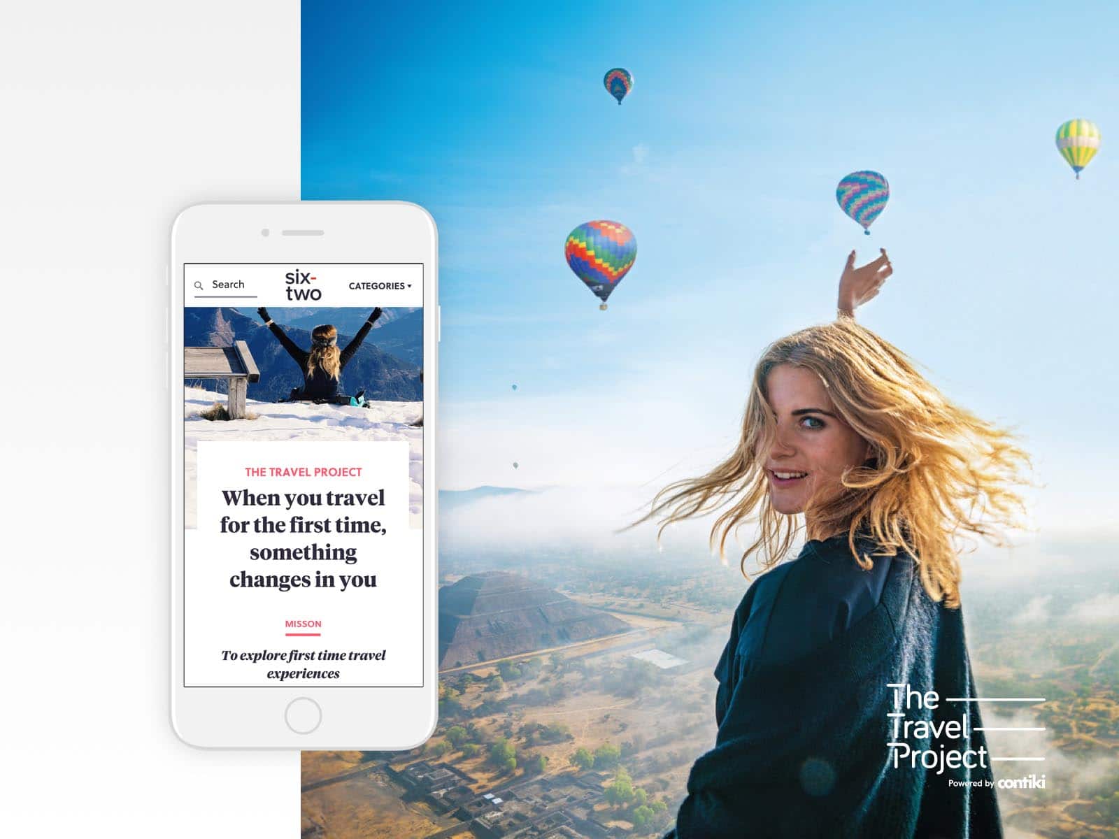
The Travel Project
The Travel Project is a section of the website that has the objective to be the most impactful of all because the content written in those sections is actually done by travel influencers.
Keeping in mind that there were a number of solutions, I wanted to make this section stand out with:
– A different layout and visual style to the rest of the articles.
– Personal branding across the site (articles, landing pages and travel influencer profiles).
– A standing out link to the travel project in the navigation menu.
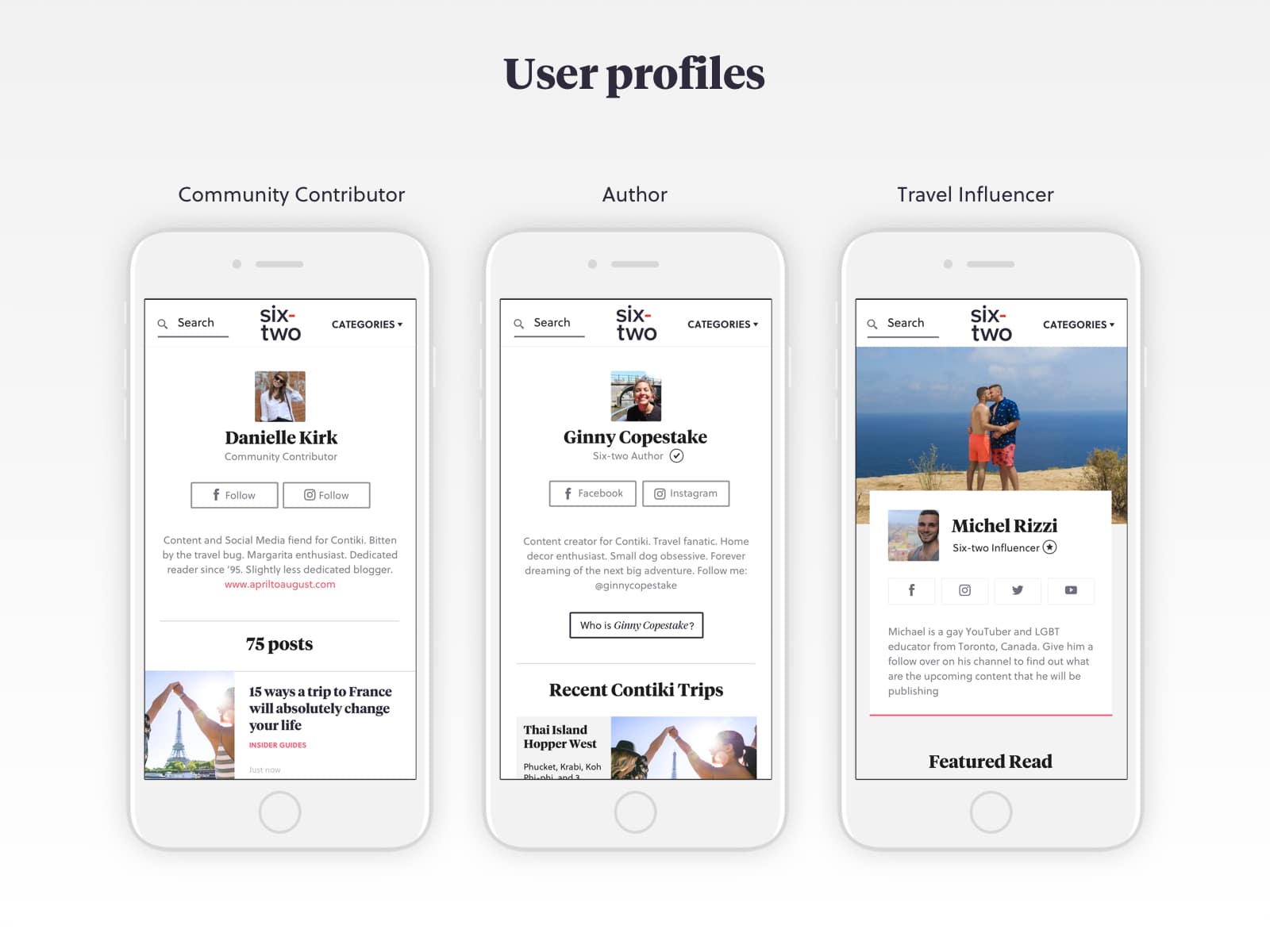
User Profiles
The site has three types of users who can create content. Because of that, there is an objective that the user profiles should be different from each other.
The challenging part here was to make the profiles different but yet keeping them a part of the same family so that they don’t look like a separate website.
To design these profiles, I followed a logic of gradually increasing the level of information that each group has.
The base profile (community contributors) features just the user information and her/his articles.
The writer’s profiles include everything that the community contributors have but also they have the option to feature Contiki trips that they have been to as well as favorite destinations.
The travel influencers have all features that the other user profiles have but also they have the ability to create “Featured Reads” and on top of that, they carry the branding of the Travel Project since they are part of it.
Category Pages
Each category has its own listing page combining all articles relating to that subject.
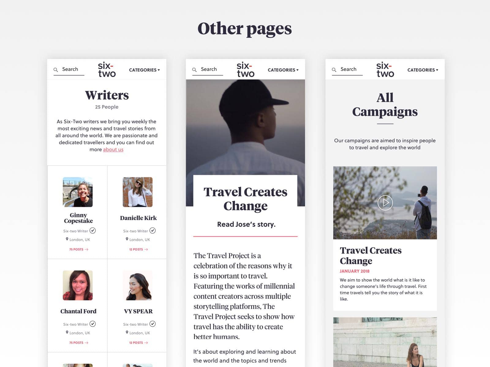
Other Pages
Apart from the editorial content, the writers of the website have the ability to create travel project campaigns.
The requirement here was to build a way of showcasing the campaigns and list ing them in a way so that people can see past campaigns as well.
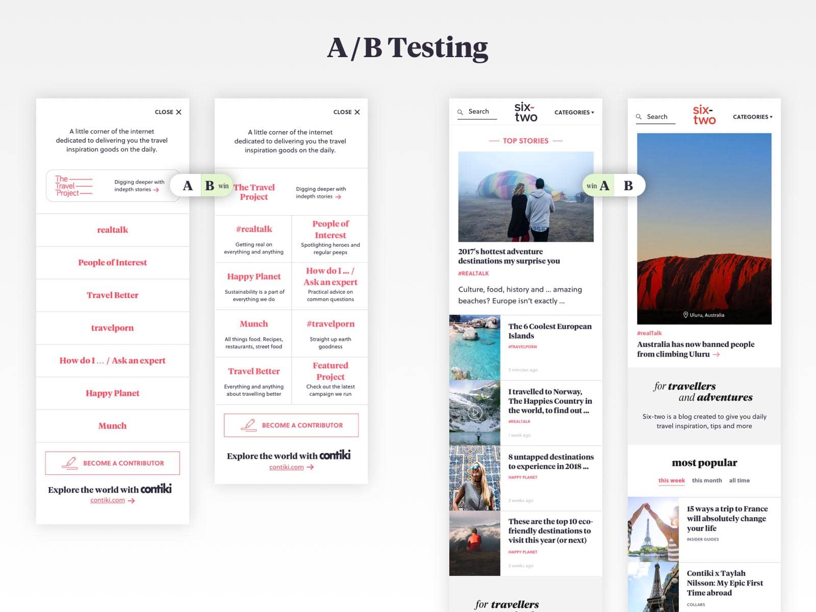
A/B Testing
On a number of occasions during the project I wasn’t sure about which design we should go forward with and since the business owners as well could not reach a decision an A/B test was in order.
It was performed with 5 people who can be potential readers of the website and they were shown the prototype with both variations were based on their browsing experience was clear which versions are the winners.
Style Guide
As part of the project handover to developers, I put together a style guide document of about six-to-seven pages describing everything regarding the styles and the product implementation.
User Testing & Customer Feedback
After I created the design solution to validate the designs and observe how a person might navigate through the site I performed another usability testing using a fully active inVision prototype.