About the project
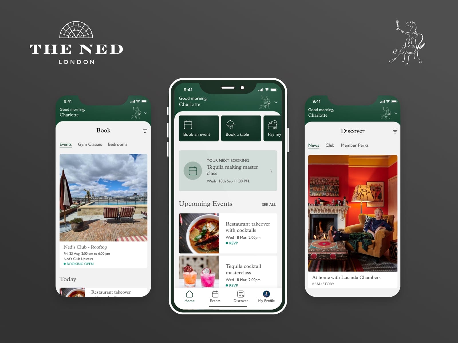
The Ned’s Club app is created to help members of The Ned’s hotel stay up to date with the latest happenings in the club – latest events, latest news, members stories, and membership perks.
Apart from that, the app allows you to manage your bill when you drink and eat in the hotel’s restaurants.
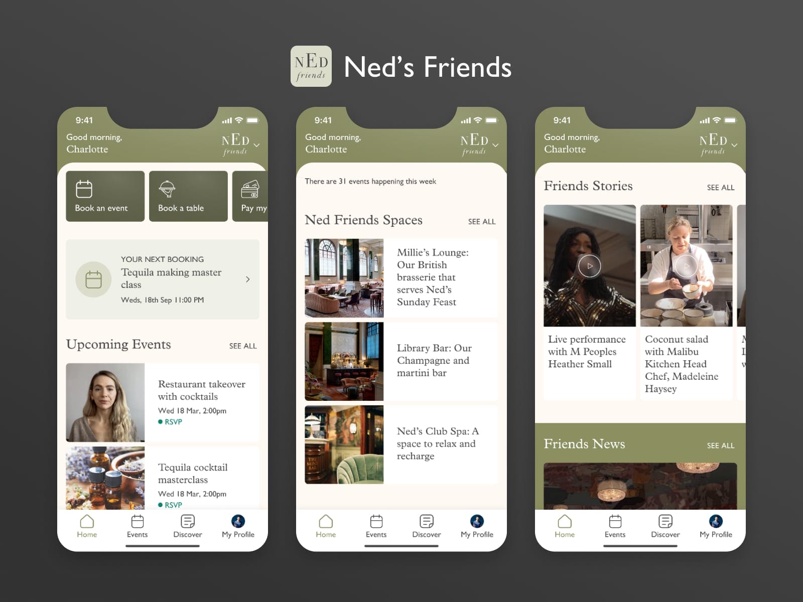
The app is created as a white label project since there are 2 types of memberships that people can apply for. A full Club member or a Ned Friends member. The two different membership types allow for different activities to be done in the app and they needed to have different branding for a clearer separation between the two membership types.
The log-in screen is global for all membership types and depending on the user’s membership type, the app look changes.
Client: Soho House & Co Date: June 2021 Tools: Figma, Adobe CC Skills: User Interface (UI), User Experience (UX) Website: thened.com
Inspiration and Learnings
The app is the third app in the series of apps from Soho House & Co used to facilitate a better membership experience.
The one for the Ned was based on learnings from the Soho House’s main members app combined with the needs that the members of the Ned have and the technical capabilities of Soho House’s back-end system,
Design Solution
Onboarding
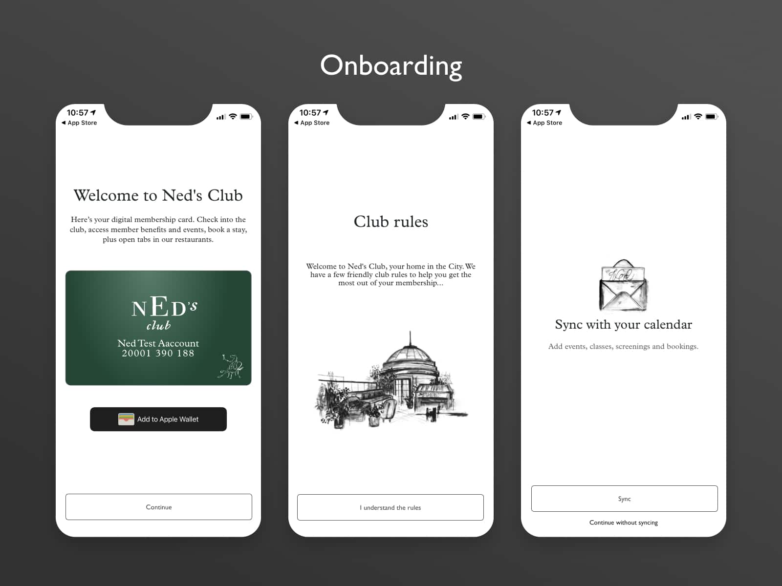
After loging-in in to the app, members are able to see straight away their membership card and have the option to add it to their apple-wallets.
Upon continuing with the onboarding members are obligated to review the house rules and have the option to sync their calendars with the app so that they can stay up to date with any future event bookings.
Home Screen
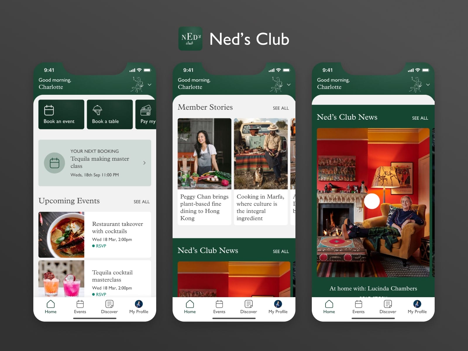
Once members login into the app, they are taken into the main home screen. There they can find everything that will help them administrate their membership. Book events, book rooms, request Spa appointments.
The app also servers as a great content and news distribution platform where members can use it to stay up to date with whats happening within the Ned’s Club
Depending on which type of membership a user has, the app will automatically present the correct design theme and functionality to that group of people.
Ned Friends members have a different tier of functionality and options within their app and also they would see the app with different branding.
The challenge here was to clearly distinguish who is a full Club member and who has the more limited version of the membership. This was achieved through differentiating design and visual style while keeping the same back-end.
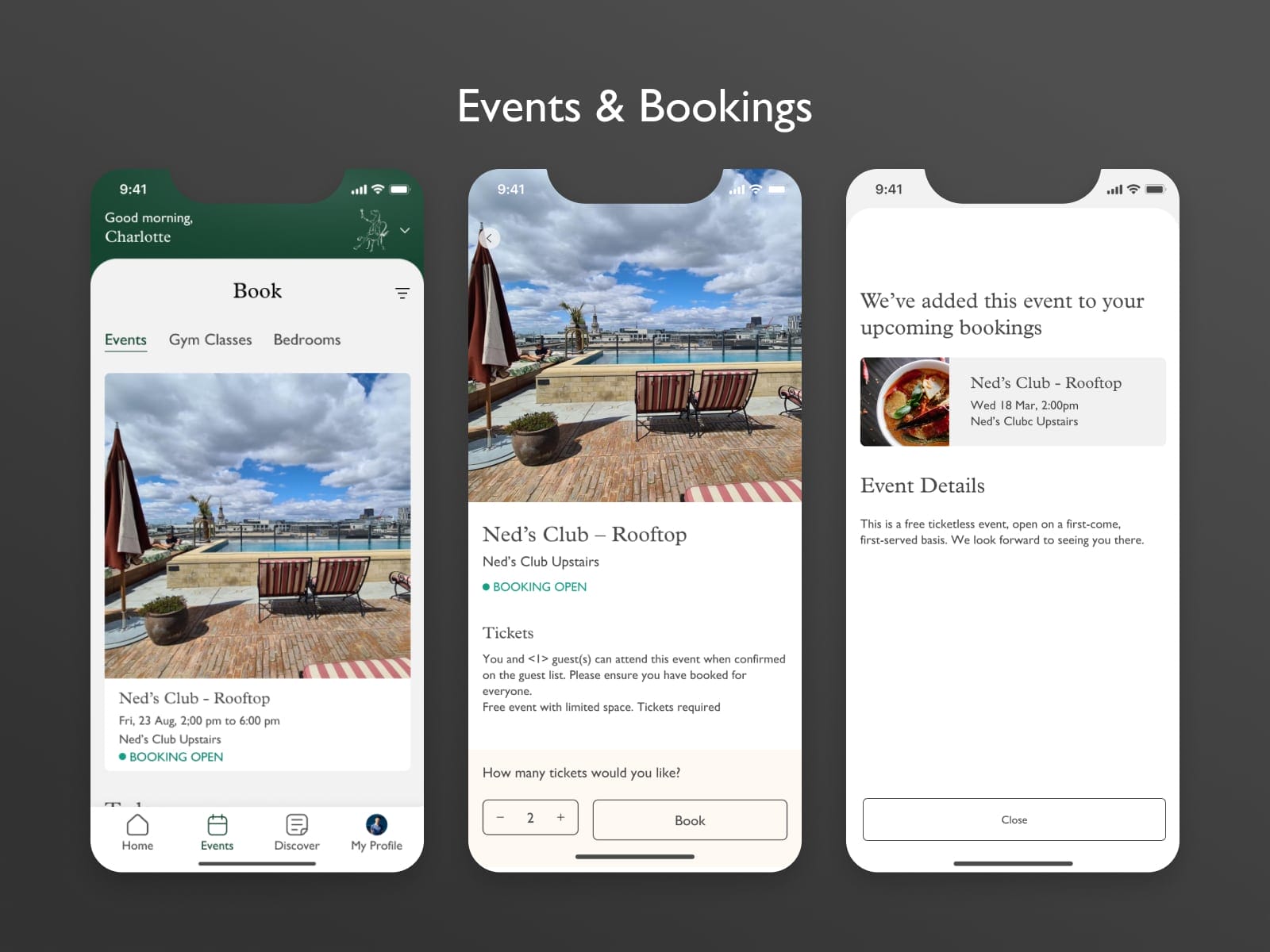
Events & Bookings
We wanted to create a very simple experience to discover an event and make a booking for it. In order to do so, once a member has liked an event can simply tap on it, choose how many tickets they would like for that event, and place the booking.
The event would then be added to their upcoming events and also show on their home screen.
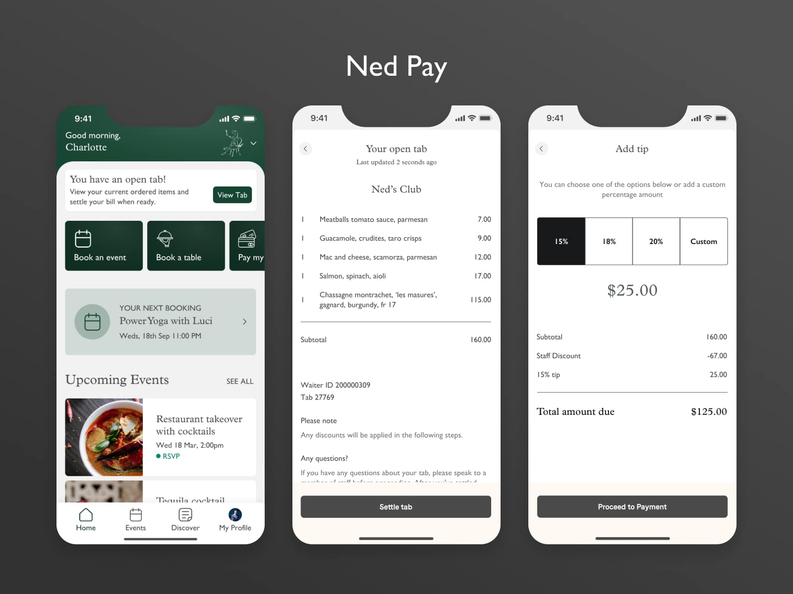
Ned Pay
As a member, it has been a hassle to wait for your bill to arrive on the table, or having to waste time to pay it. The member’s app offers a solution where once a member has a tap opened on their name, they can follow their order through the app and when they are ready to leave to settle their bill directly from the app without waiting for a waiter to come.
From a UX point of view, the challenge here was how to offer members the ability to tip and apply their membership dependant discounts.
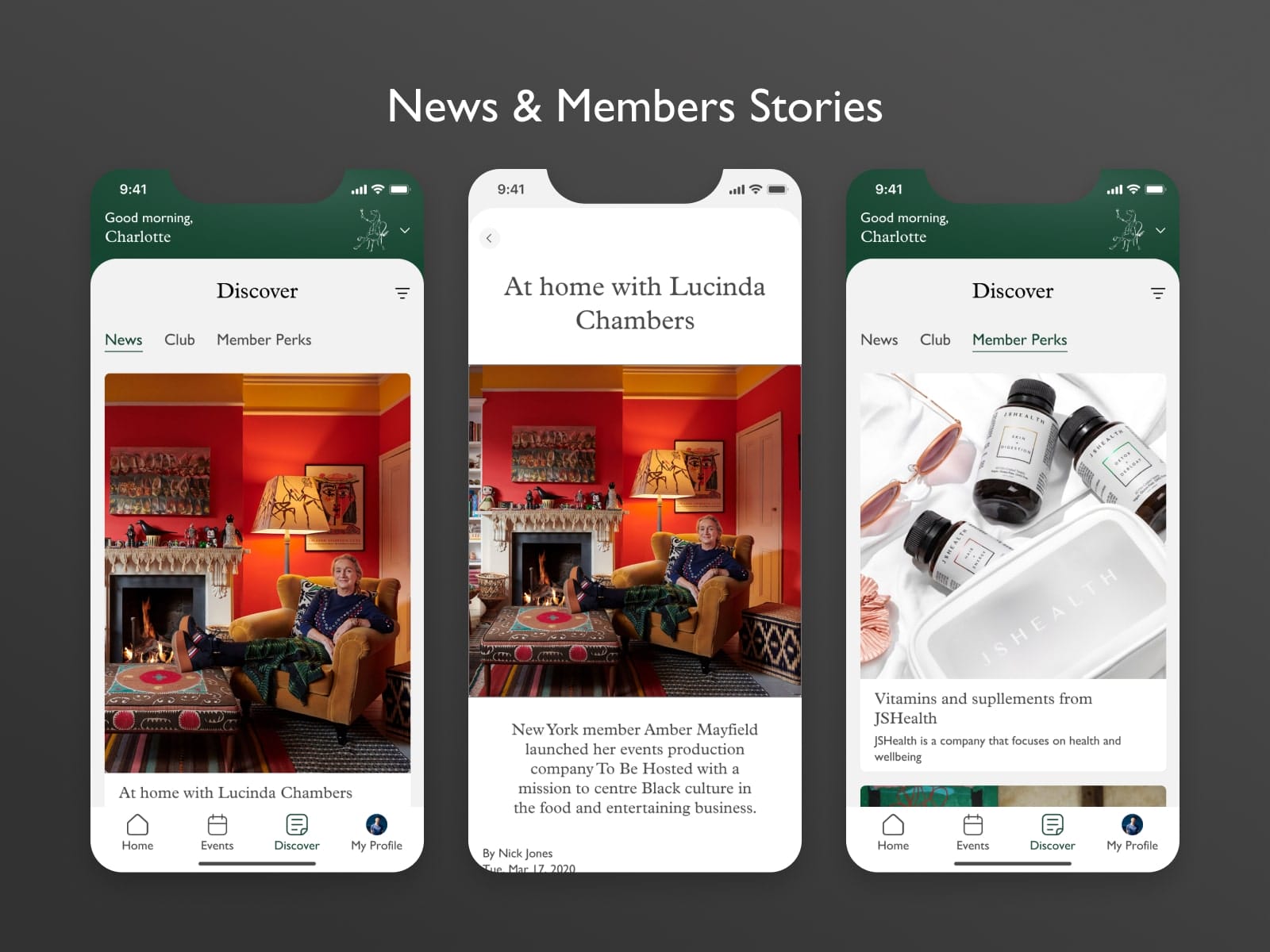
News & Member Stories
The other aspect of the app is to be a content consumption platform. Users are able to discover and read stories and news from their membership club as well as share those stories with other members.
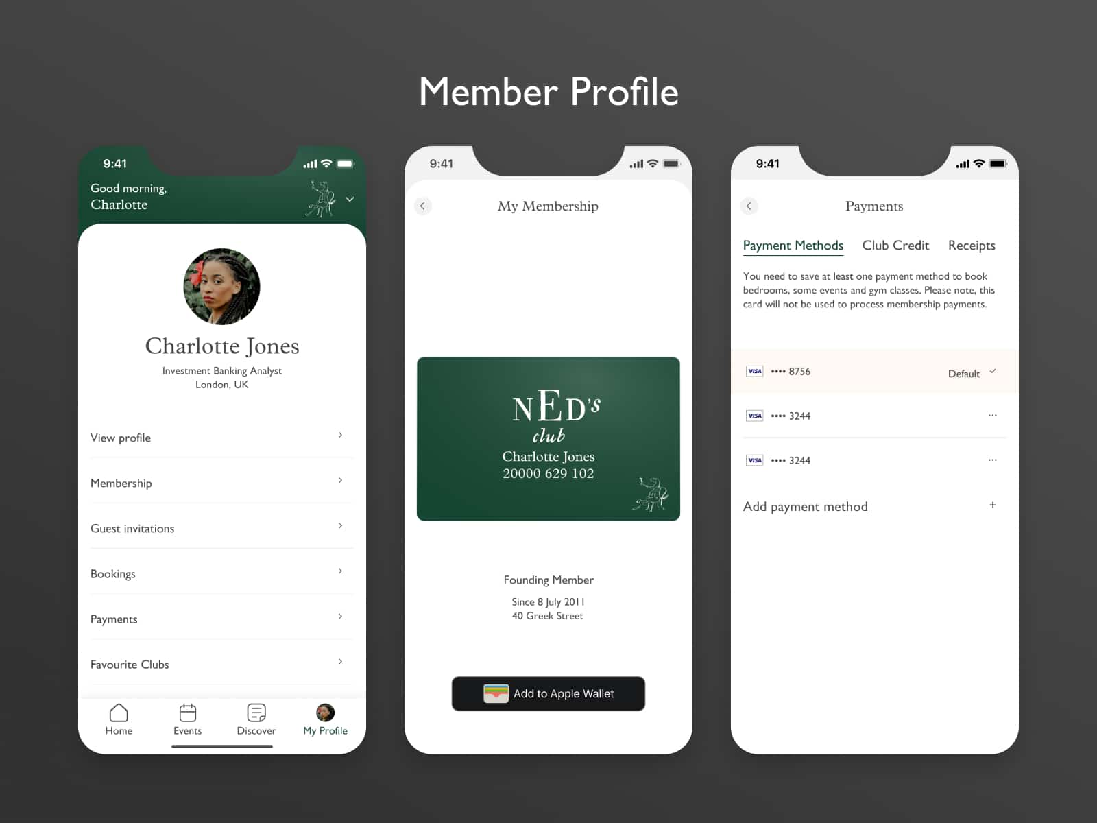
Members Profile
This is the administration hub of every member. From here users can manage their membership, payment details, view their receipts from Ned Pay transactions and create invitations for their guests in the Club.
White Label Properties
As a brief for the app was to be created as a white label product that can be applied to any private membership club. The UX challenge with this is:
How do you create an experience that can serve a target audience we might not yet know about?
The approach I took on this is to create the functionality and experience that would suit Ned’s Club and Neds Friends while creating two different brand themes for each of the apps. The components are designed in a such way that can be adapted for future membership programs as well as the Brand Style Themeing is created to be scalable in the future.
Brand & Styling
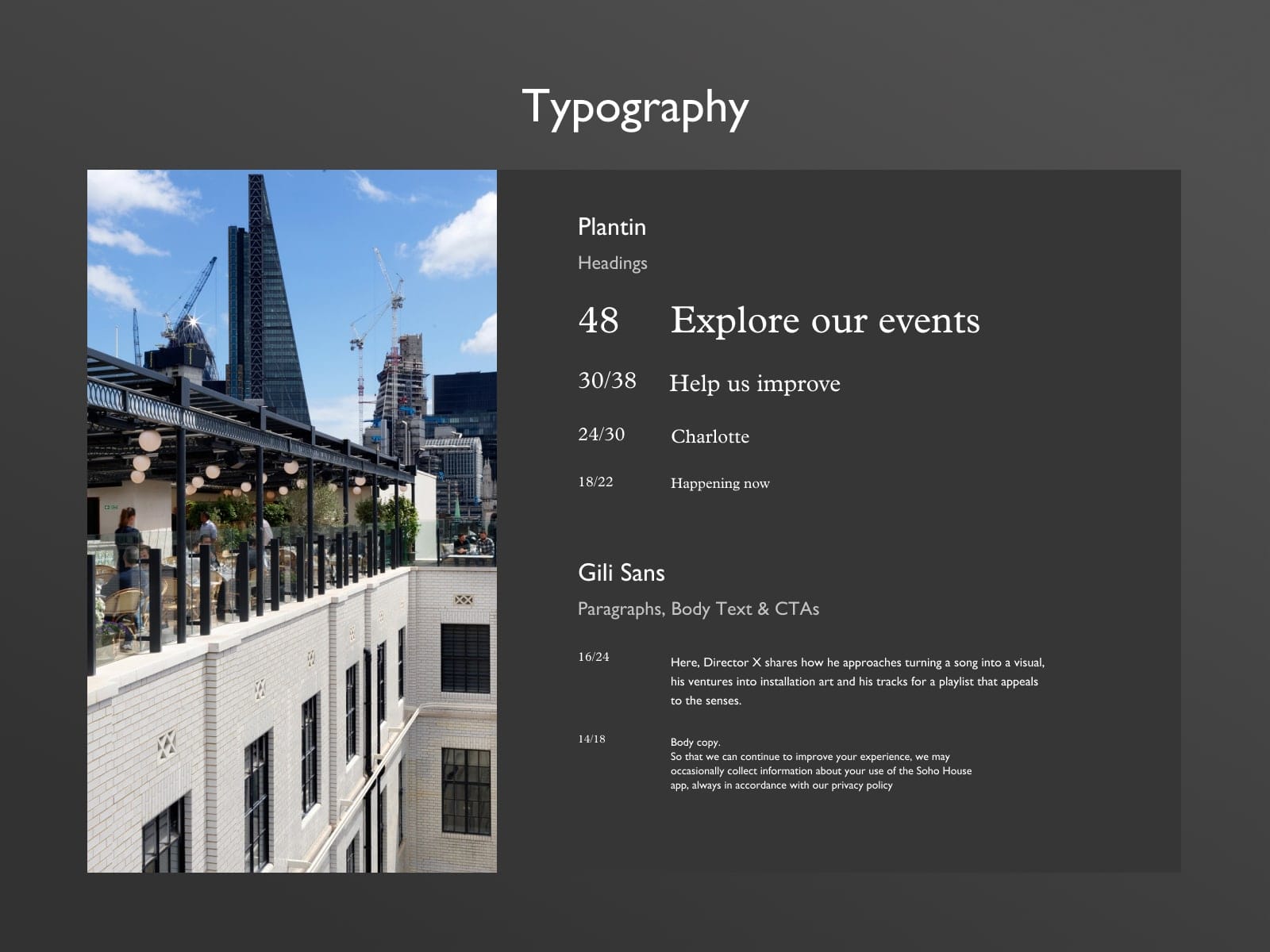
Typography
The typography used is the main “The Ned Hotel London” brand guide used across all their comms and digital products.
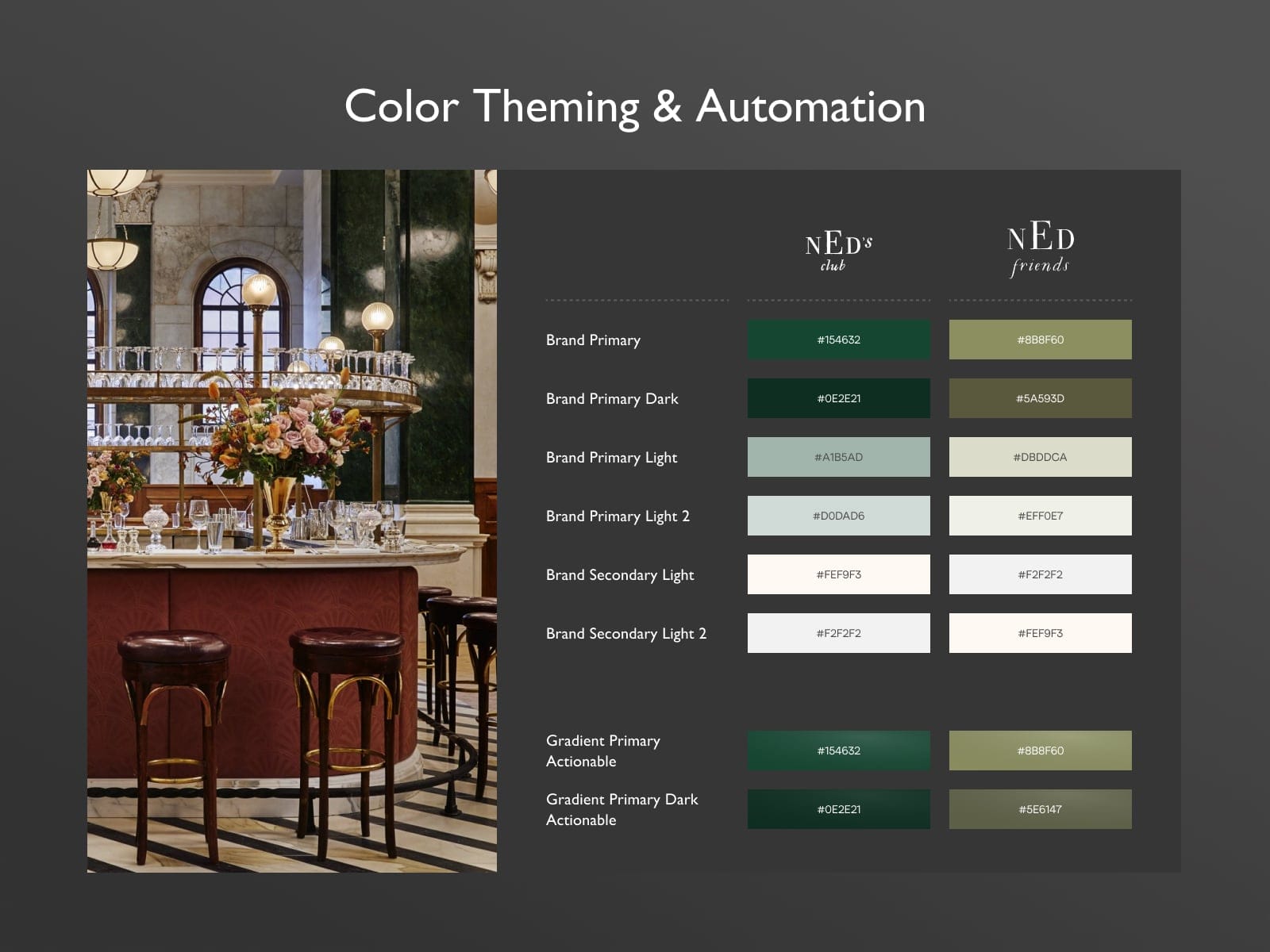
Color Theme & Automation
The branding and colors used for the Ned’s Club are aligned with the type of members that attend this private club as well as the branding provided by The Ned.
The primary color for Ned’s Club is this deep dark green which symbolizes power and wealthiness where the primary color for Ned’s Club is a much softer version of that green since the Friends membership has fewer perks than the full membership.
User Testing & Design Validation
Due to the nature of this app, the validation and testing happen directly on the live app product with the real members.
Because members do not directly pay for the usage of the app, but the app serves as a tool to manage their membership, it was decided that the app can be tested on the go, directly with the real members.
We gather data insights of the app’s usage as well as direct customer feedback on certain features and in-app experiences.
Live App
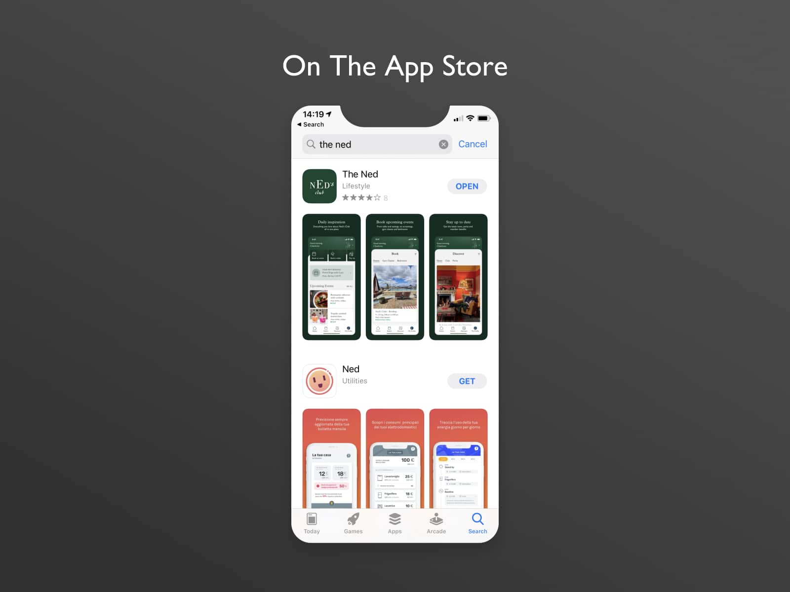
The app is currently available to download on the App Store for all Ned’s Club & Friends Members.

