


About the project
I joined the Contiki marketing lab’s team as a senior UI/UX designer working alongside a global team split between London, Madrid, Delhi, the US, and Australia.
My main focus has been to improve conversion through usability research, customer interviews, and an improved UI on pages and elements across the digital platform.
During my time with them, I established a design process that looks into the journey of building a digital product from concept planning through user research, usability testing, wireframing, design, and developer handover.
Client: Contiki Date: Ongoing Tools: Sketch App, Adobe CC, VWO, CartoDB Skills: User Interface (UI), User Experience(UX), Customer Interviews Website: contiki.com
Requirements Gathering
Before any work on a new project is started a kick-off meeting is arranged either over Skype/Slack/Google Meet or in-person with business stakeholders to talk about what would be the end goal of the new product or feature we are about to design.
Based on that I would give my input on how I see things and think about what other information or features I can introduce to achieve a complete experience.
Since I have been with Contiki for over a year, I know well the business and how the product is built so I am able to make conscious suggestions of potentially cool and inexpensive to build features.
Design Solution
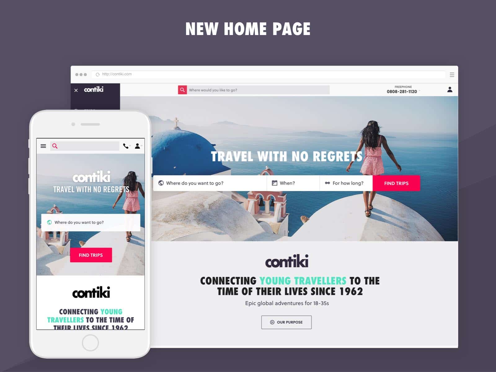
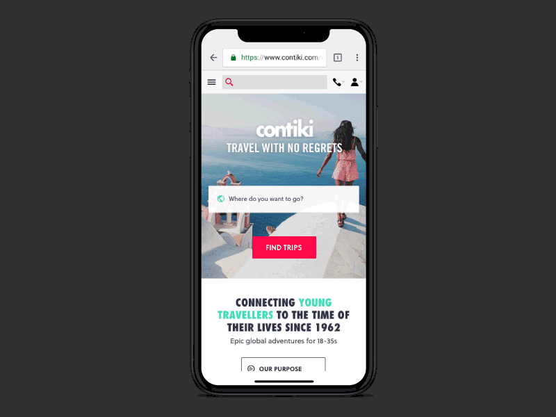
New Home Page
As part of the businesses’ annual update, one of the projects I worked on was the updated design of the homepage. It’s the front face of a business and it needed to feature a showcase of what is being offered, and how traveling with Contiki works.
To do the redesign, I gathered a team of experts in different areas from around the business and we ran a 3-day Design Sprint.
Generally, the design sprint is a 5-day process that helps businesses figure out complicated solutions in minimal amount o time. Since I’ve been with Contiki for more than a year now and the business is pretty well established we had the initial foundation of knowledge for our design sprint.
The goal of the redesign was to create an engaging and interactive showcase of what Contiki is all about and how easy is to travel with them.
As part of the process, there were a lot of interviews with experts who told the story of the company’s marketing, goals, and income sources. That helped shape a user journey path and gave answers to what we would like the users to do after they have seen the information on the page.
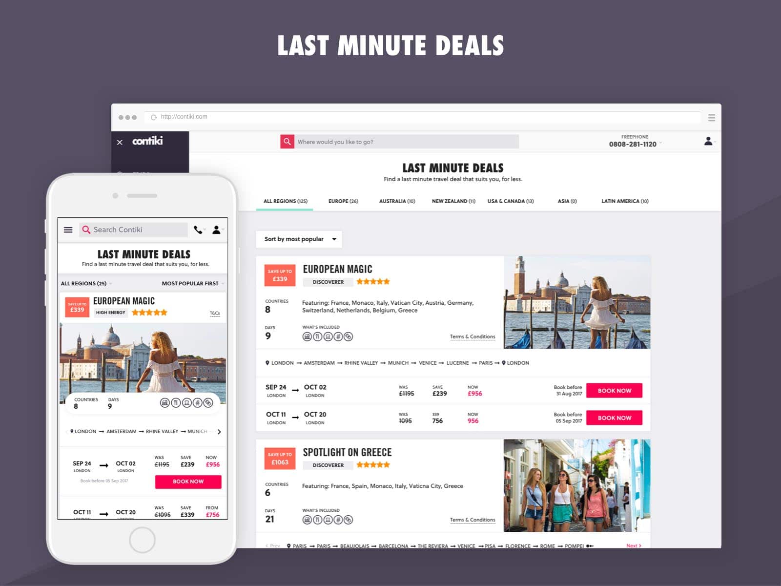
Last Minute Deals
Last Minute Deals was an already existing page on the website and a redesign was requested. During the redesign process, I took the existing design and conducted interviews with the business to gather requirements on what and why they would like to change.
As the second stage in my research, I did a usability test on the existing design to see what comments and feedback potential customers might have.
As the third stage of research, I put together an inspiration board of what other travel websites or competitors do best and analyzed how their research could benefit best the new design.
Based all that I created a concept design which I tested with potential customers. After I amended relevant sections, I had another idea of what the trip cards could look like so I decided to do an A/B test with two concept designs. After I had a winner, I used that version in my finished design that was well received by the business.
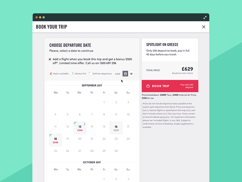
Trip Search
Following the work and research I did on the Last Minute Deals, I was tasked with creating an implementation of the deals into the trip search page.
The page was already designed but the challenging part was how can I show in the same card style all the deals available on a trip—Last Minute Deals, Air Deal, and Current Offer (e.g., 20% off trips to Europe). The content was a lot but the space was very limited.
To solve this, I created a plan for the worse use case where there are the most elements showing on the deals card.
In the UI, I placed the Last Minute Deals first as they offer the highest discount and they are also based on specific departure dates—some departure dates might have a discount, some might not. If there are more than two departures with deals a button that reads “+XX more deals” appears and the user can click on that to expand the rest if it’s interesting.
From this point, the user can access straight away a trip summary via the “Book Now” button and make a booking or access the booking calendar that shows on which dates there is a trip departure.
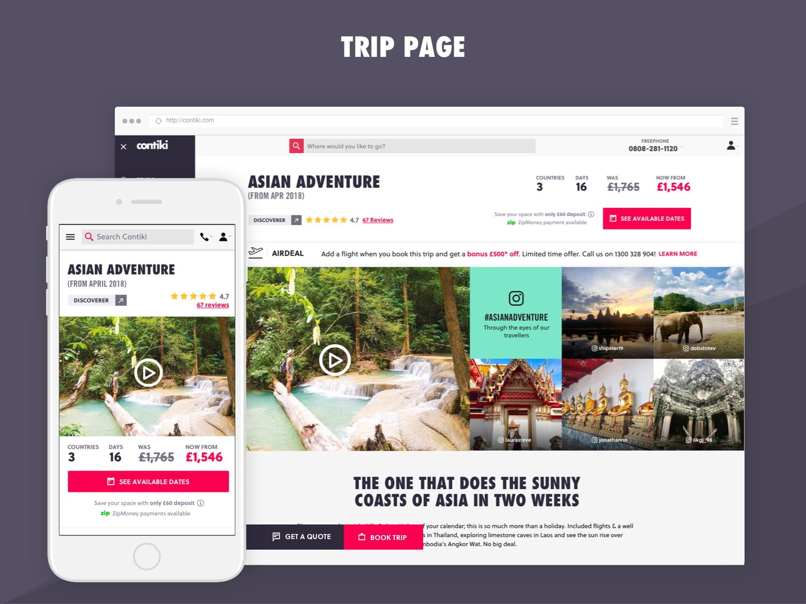
Trip Page
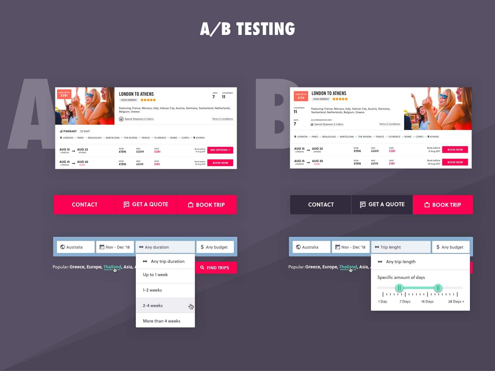
The trip page is the key entry point in the conversion funnel for bookings. Since it’s constantly in the business focus to be improved quite often elements of it are being changed and A/B tested. To find out which direction leads to more bookings.
To perform the live A/B testing, I mainly create the design variations but also I track the statistics using a software by VWO (visual web optimizer)
Problem 1: With the existing version of Trip Page, people did not fully comprehend what they received for the price and what exactly was included in their trips.
Solution: I decided to simplify the UI, give a clear breakdown of what is included in the trip’s price, and put that section at the top of the page.
Problem 2: People were not seeing the value of choosing such a trip for this amount of money knowing that elsewhere they might get it cheaper or if they do it on their own.
Solution: I wanted to promote the travel package as “a better trip experience” and highlight that good trip memories are irreplaceable. To do this I decided to use UGC (user-generated content) images from Instagram to showcase the real experience of real people and how the trip looks like through the eyes of the travelers.
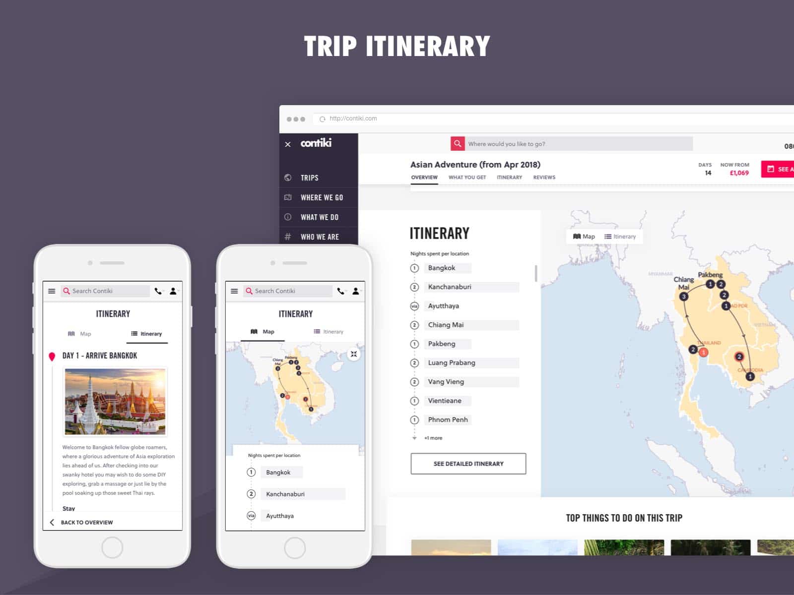
Trip Itinerary
The trip itinerary has been probably the most complicated UI element that I had to design for Contiki. The problem has always been the experience it creates and how different people understand the mechanics and the information provided.
To understand more about the user behavior I’ve met face to face with the customers in London, right before they depart on a trip and conducted a number of interviews and usability testings to gather more insights.
After I analyzed all the information I was provided by the travelers I came up with a design solution and worked with a front-end developer to create an interactive HTML prototype of how the itinerary would work. After that, I used that prototype to conduct another usability testing to see how people would interact with such experience on desktop and mobile.
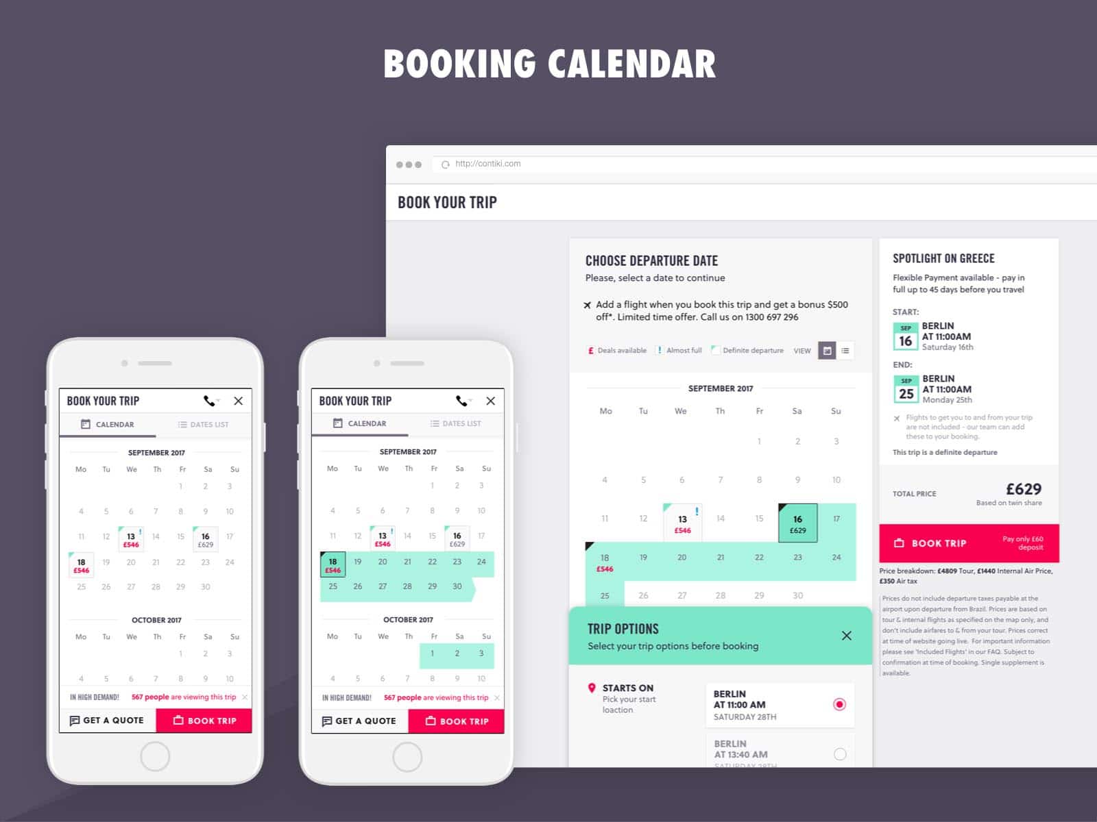
Booking Calendar
Based on Google Analytics, I found out that the majority of people visit the website through their phones and once they open the booking calendar there was a major drop off.
The problem was that just moving the calendar from a desktop to a mobile using responsive design techniques was not improving the experience at all. Instead, I decided to redesign the calendar with a mobile-first approach.
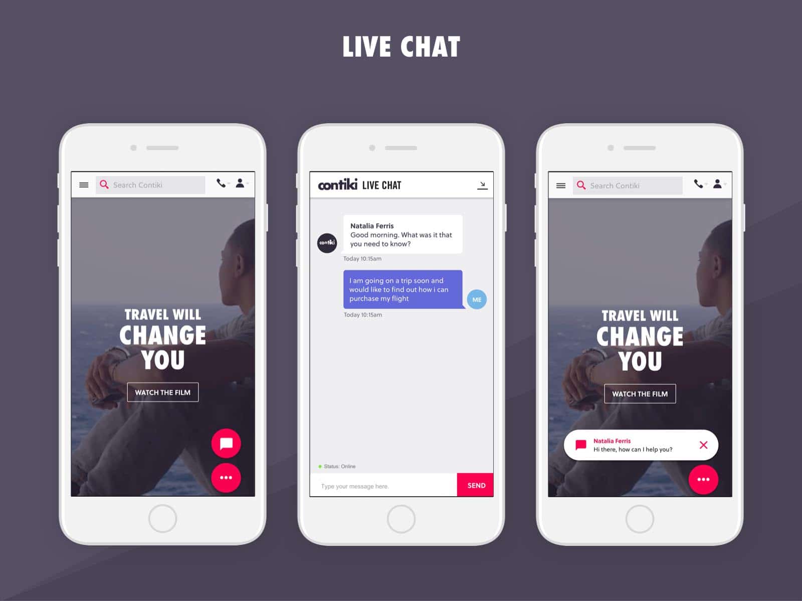
Live Chat
The live chat is a feature that was added to the website and the challenging part was that whenever a user received a new message on their mobile devices, the chat window pops up and takes over the entire screen.
The users found this extremely unpleasant. To solve this, a small version of a new chat message was designed to pop just at the bottom of your mobile screen and only if the user wants to interact with it then a full-screen chat overlay pops.
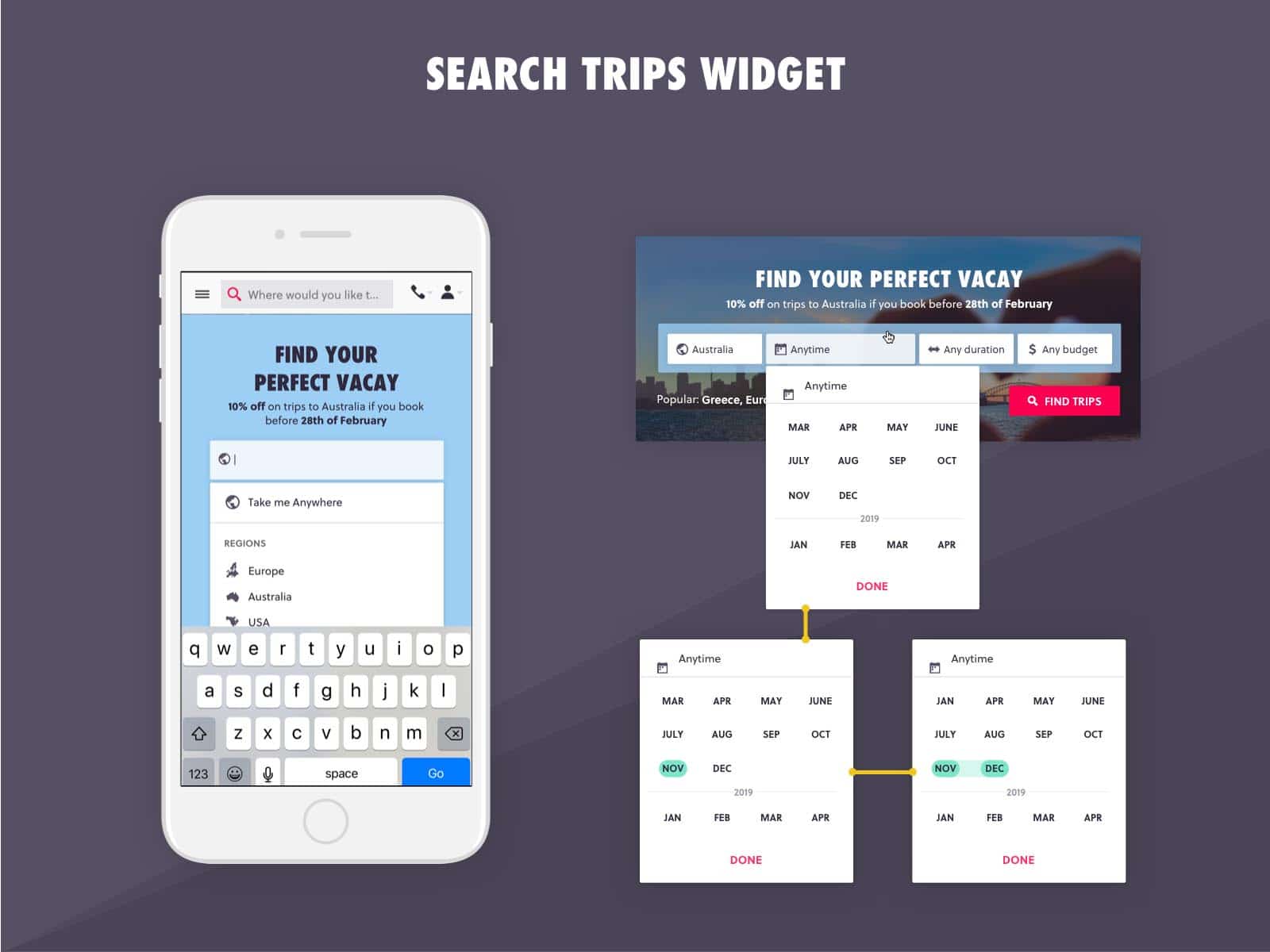
Search Trips Widget
Looking at the website data, it seems that over 70% of the visitors (who land on the home page) first click on the trips menu to see what trips are available to book.
Based on that, we decided to add a search widget on the home page for an easier navigation to the trip search results and filters.
The challenging part here was to understand what information to show at this stage of the user journey.
To find out what was the right approach and the level of information that the filters need to contain, I asked our existing users in the form of a usability and A/B tests; I also performed one with potential customers who might be visiting the website but haven’t seen it so far. Based on the combined feedback, I took the decision on what the filters should contain.
Data-driven Design Changes
Over the last months, the business started adapting the approach of doing data-driven design changes to the web platform. Because of that, I was involved in a lot of A/B tests of different elements and design approaches.
Some changes were implemented on the live website and A/B tested using a platform like VWO. However, some were performed in the concept design stage to validate which version the development should focus on.