


About the project
This product is used when a sales agent and a customer engage in a 1:1 conversation and the customer is asking questions about a trip. It’s crucial that sales agents quickly find relevant information and answer customer’s questions on the spot.
My involvement in the project was mostly as a user experience consultant and it was built by the Contiki marketing lab global in-house team spread between, London Delhi, and Madrid.
Besides working on UX improvements and reviews, I was also involved with 1:1 interviews with Contiki sales agents to understand more about their habits and how they would use the platform to sell a trip to a customer.
Following the initial research, 99% of the sales agents would access the platform from a desktop computer, therefore the digital product was designed to be desktop only.
Keeping in mind of the purpose of the digital product, the visual design style, and an information-focused UI, the key here was to present an easy way for sales agents to find the right information quickly and intuitively.
Client: Contiki Date: Ongoing Tools: Sketch App Skills: User Experience(UX), Customer Interviews
Initial stage
The project already existed where my role was to validate the experience that was in place and amend the designs if necessary as well as add some additional functionality.
Customer Interviews
Since the product’s customers are travel agents alongside one of the project designers we spend 2 days in the “field”. We visited a number of travel agents around London who work with the Contiki brand and we interviewed them about their habits, how they use the platform, what they expect to do with the product and we observed how they get around using it.
UX Solution
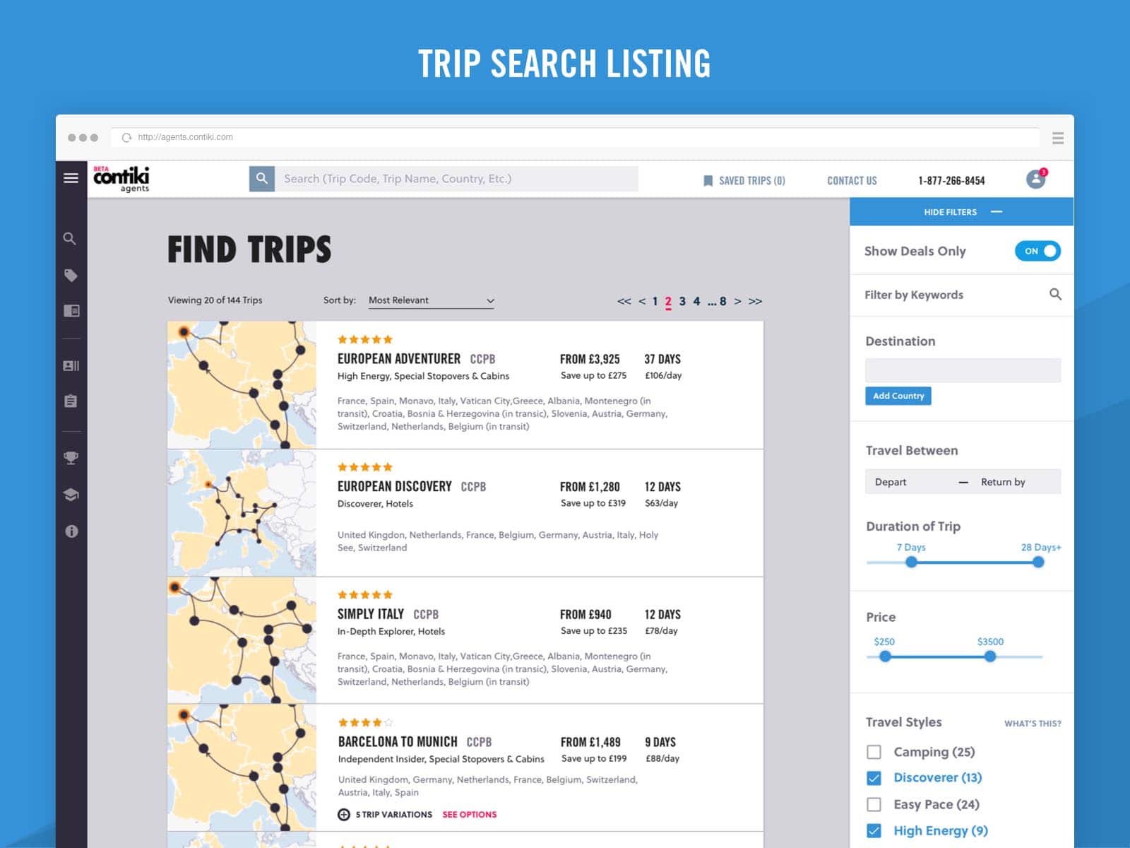
Trip Search Listing
One of the main features of the platform is trip discovery.
It needs to give all key details about a trip to an agent so that he can quickly give that information to their customer.
The challenging bit here was to decide what information is the most important and how quick access controls (e.g., save a trip, compare trip, view trip variations, etc.) can be incorporated into the trip card.
The way to find out what makes the most sense to the people who will be using the platform was through customer interviews. In the first round, there weren’t any usability issues except some small bits that I adapted in the design to reach the final version of this page.
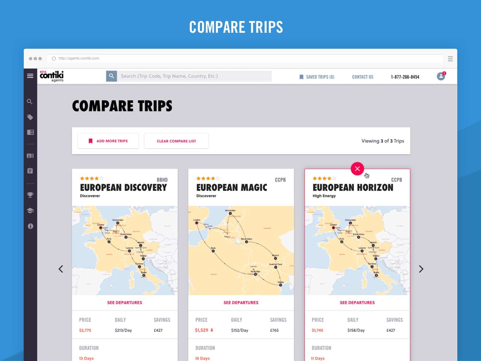
Compare Trips
In the compare trips page, a user can see what are the differences between a number of selected trips.
The challenging bits here were how to make this feature easy-to-use and enable the user to add more trips to a list of already added ones.
The solution was to introduce a button (add trips), once a user clicks on that he/she is taken to a search list UI with the option to select trips activated. That way a user can select more trips and come back to the compare-trips view.
The other challenging bit was how to structure the information so that it makes sense when you look at it at first glance.
To reach a solution, I researched a number of eCommerce websites that have compare-product features. After collecting a number of examples and then analyzing what and how they do things, I created a solution for this digital product.
At a later stage, that solution was validated through usability testing and only minor changes were introduced.
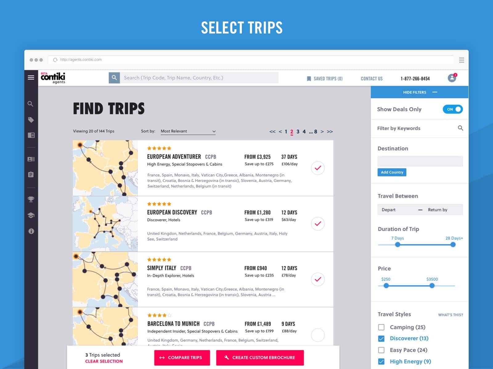
Select Trips
There are a number of functions that a user can do on the platform with the trips—book it, save it, compare it, or add it into an eBrochure (a digital PDF that can be sent to a customer)
All of these functions require the user to select a trip or trips in order to use them.
After a review of the initially proposed user journey, I note that it was a very confusing and overly long flow because all the features were made dependent on each other; e.g., you can’t compare trips unless you save them, you can’t create eBrochure unless you use trips from your saved trips.
Instead, I proposed a breakdown of the features and the user flows:
Feature 1: Save Trips
• Trip Search > Save
Feature 2: Compare Trips and Create eBrochure
• Trip Search > Select Trip > Compare or Create eBrochure
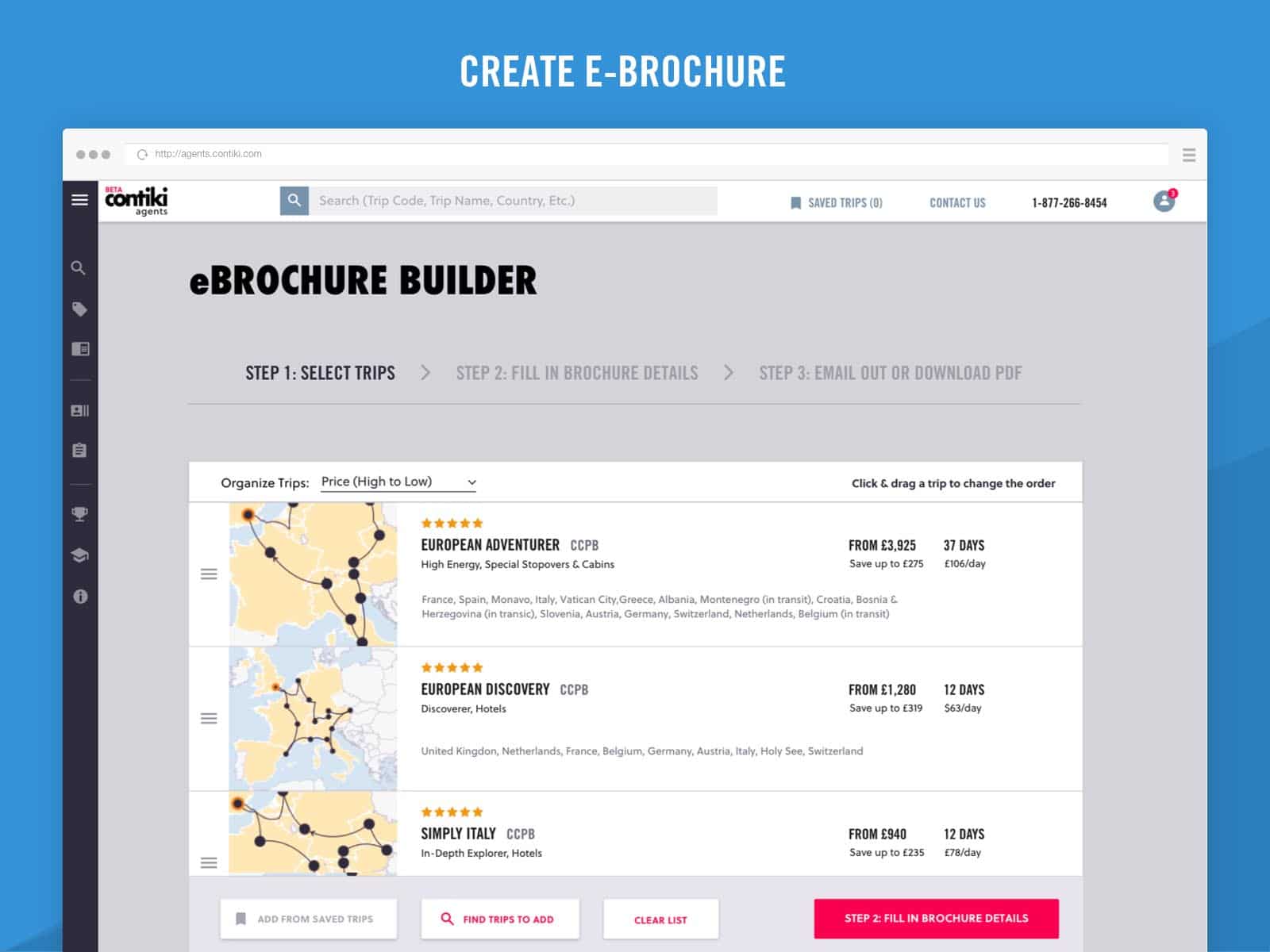
Create an eBrochure
The eBrochure is a tool within the agent’s website that enables users to select a number of trips and email it as a PDF or print it on the spot.
Again in the design of the UI, the challenging bit in this feature was to solve the user flow of how you add trips.
As mentioned already, the users can add trips into the builder from the search listing, but also I introduced a button in the builder called “find trips” that would take a user back to the search to add more trips.
Through usability testing, it was also decided that it would be beneficial for the users if they can add trips to the builder from their saved trips too.
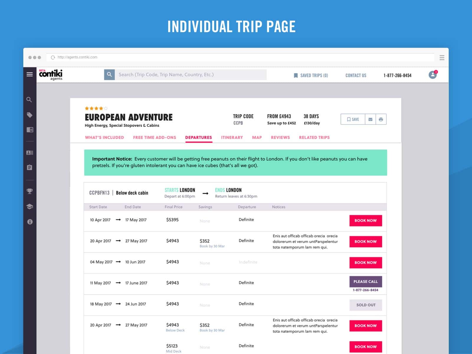
Individual Trip Page
The most challenging part of this UI was to find the right way to structure the information that makes the most sense to the users and creates a seamless usability.
Apart from my usability testings (remote and in person), I also interviewed the users about what information is the most important to see when they speak to a customer and try to sell a trip to them.
Last Minute Deals
The purpose of the last minute deals page for agents is to easily give them the option to tell customers what the available deals at the moment are, how much they would be saving, and when is the trip departure.
If a customer likes the offer, an agent can instantly book it from the online platform.
The challenge here was, again, the information architecture—how to display all the details about a trip into an understandable way.
To find a solution, I reused my research from the Contiki consumer site that I did when I was building the last minute deals page but also the solution was strongly influenced by the different user group that this product is made for. A live interview with a few of the users was necessary to finalize the design solution for this page.
Usability Testing
Once a product feature was completed, I created hi-fidelity prototypes that were shown to customers to gather feedback and pinpoint any usability issues that may have appeared.