About the project
Following user research and customer interviews, a decision was made that the app would not be used for new user acquisition but rather help existing users use some of the platform features on-the-go as well as making available the option to upgrade their accounts to a paid subscription.
The design process consisted of mapping out the user journey and creating wireframes that later were shown to the most active players (the pro players) using the FACEIT community groups on Discord, for feedback gathering. A lot of the feedback about what should the app also arises from a platform called UserVoice where people gave feedback about the current and new features of the platform.
To achieve on-time delivery, I partnered with a team based in Porto, Portugal. We worked together on the app where I was mostly responsible for the general user experience in the wireframing process and visual direction guidance. Once that was established, the team carried on and completed the designs for all secondary screens and modals.
Client: FACEIT Date: Jun 2016 Tools: Sketch App, Mixpanel Skills: User Interface (UI), User Experience (UX)
Customer Involvement
During the process of product development alongside the Product Owners, we build a community of the most active players on the platform using Discord. There we managed to gather feedback on new features, designs, and prototypes. We also actively followed UserVoice to see what ideas of features people would like to see the most added into the platform.
Design Solution
Onboarding
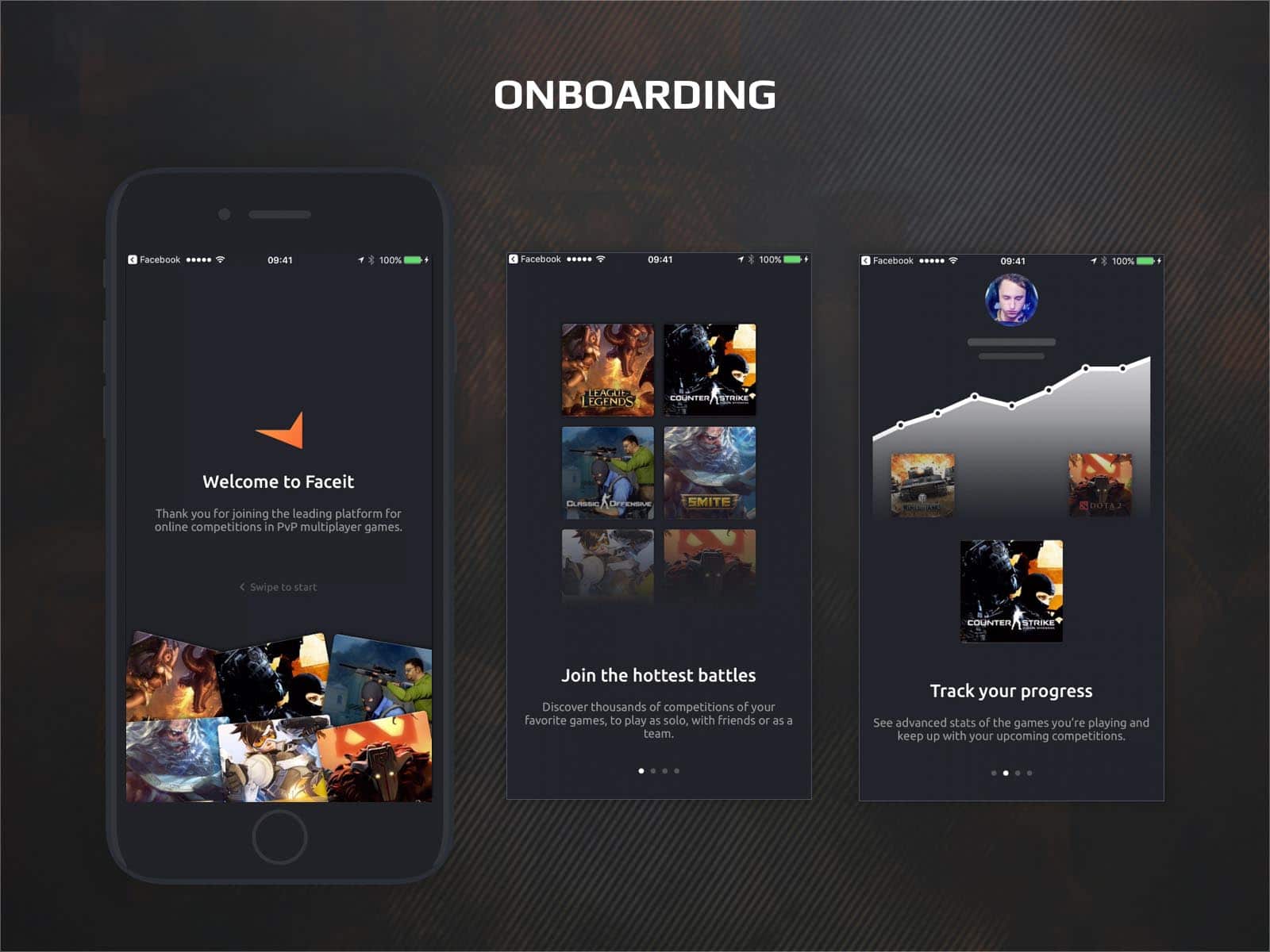
The onboarding of the app takes the users through a quick introduction to what the app does and what functionalities they can use from what players are already familiar with from the platform.
Since it’s crucial for a player to have push notifications on, the app asks the user, during the last onboarding step, to enable push notifications.
Main Dashboard
The Teamfinder tool is a feature that allows players to easily connect with teams that they can compete with. Each player is being matched based on their in-game performance, skill, and stats.
The process of creating this feature involved research on what is already out there and how that can be personalized using player data from FACEIT and integrated into the platform. On top of that, before the actual wireframing began, we also did a feedback gathering session from the top most active players on the platform who shared their ideas and thoughts on what the Teamfinder feature should be.
The challenging part of the design phase was how to combine the variously ranked players who were looking for teams and teams looking for players into one UI as factoring in that a player can be a team owner as well.
As a solution, I suggested that if you are a just a player you can see only teams in the search results but if you are a player that is a team captain too, you can see players and teams together that are separated by two different tabs.
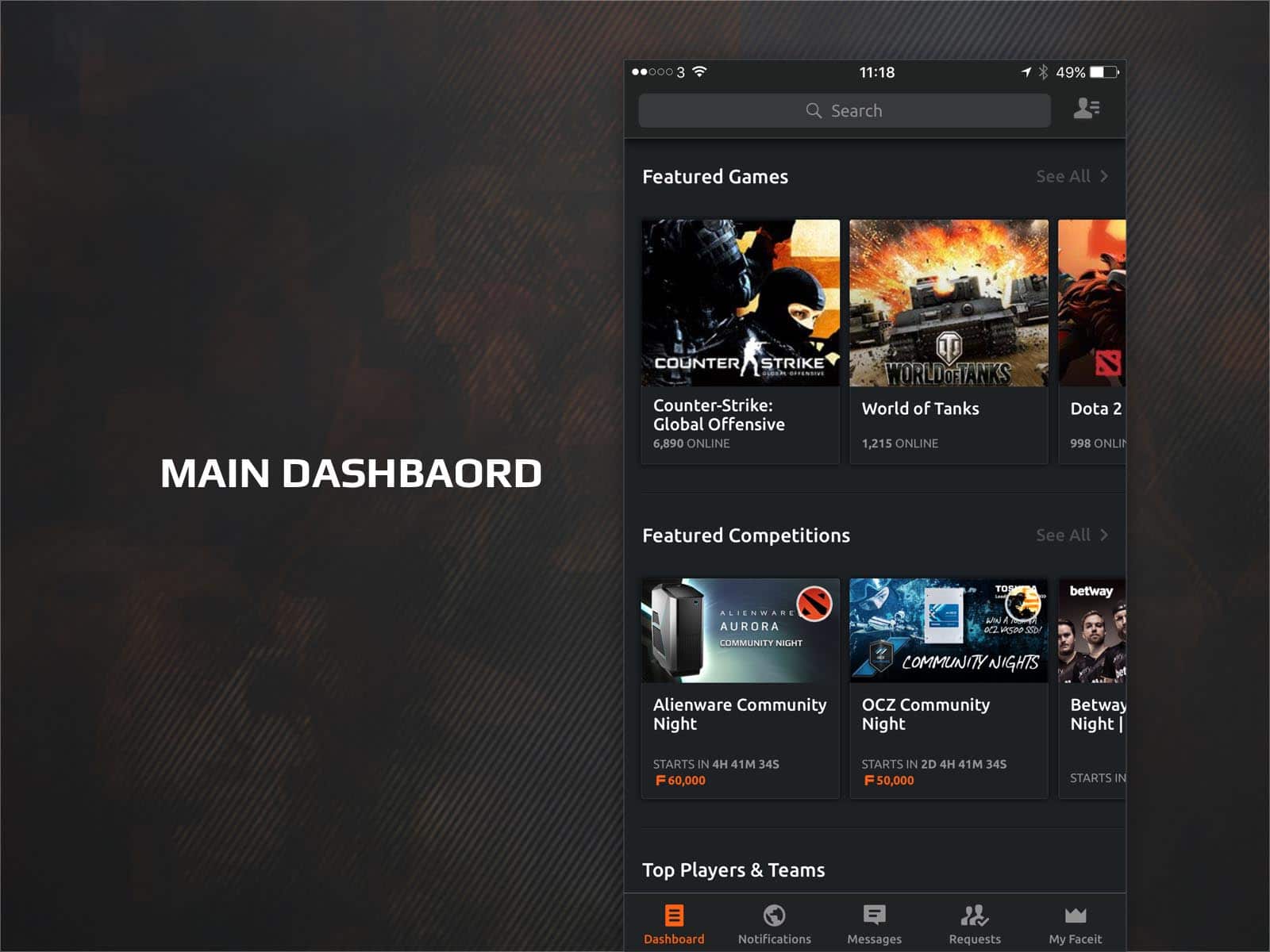
The main dashboard is the hub of FACEIT that hosts all the games available, all featured competitions, featured players, and more.
This is the first screen that a user would see after they log-in. On it there are seven entry points into the different user journeys that a player might have:
- Access to search for games, competitions, players and more (top search bar).
- Access to the social panel—friends list and team (top right).
- Access to notifications, requests, messages, and my profile (main navigation).
I had a few structure versions of the menus but after validating it with the FACEIT customers, I decided on this final design (as it made the most sense for the players).
Game Dashboard
The challenging bit of the game dashboard is that it needs to suit the purposes of premium and free players with each of them having their own features.
Following a large round of interviews with the active FACEIT community on Discord, I came up with this design that is mainly built for our premium and pro users but free users can still use it with some of the features locked but offer the ability to upgrade.
User Profile & Stats
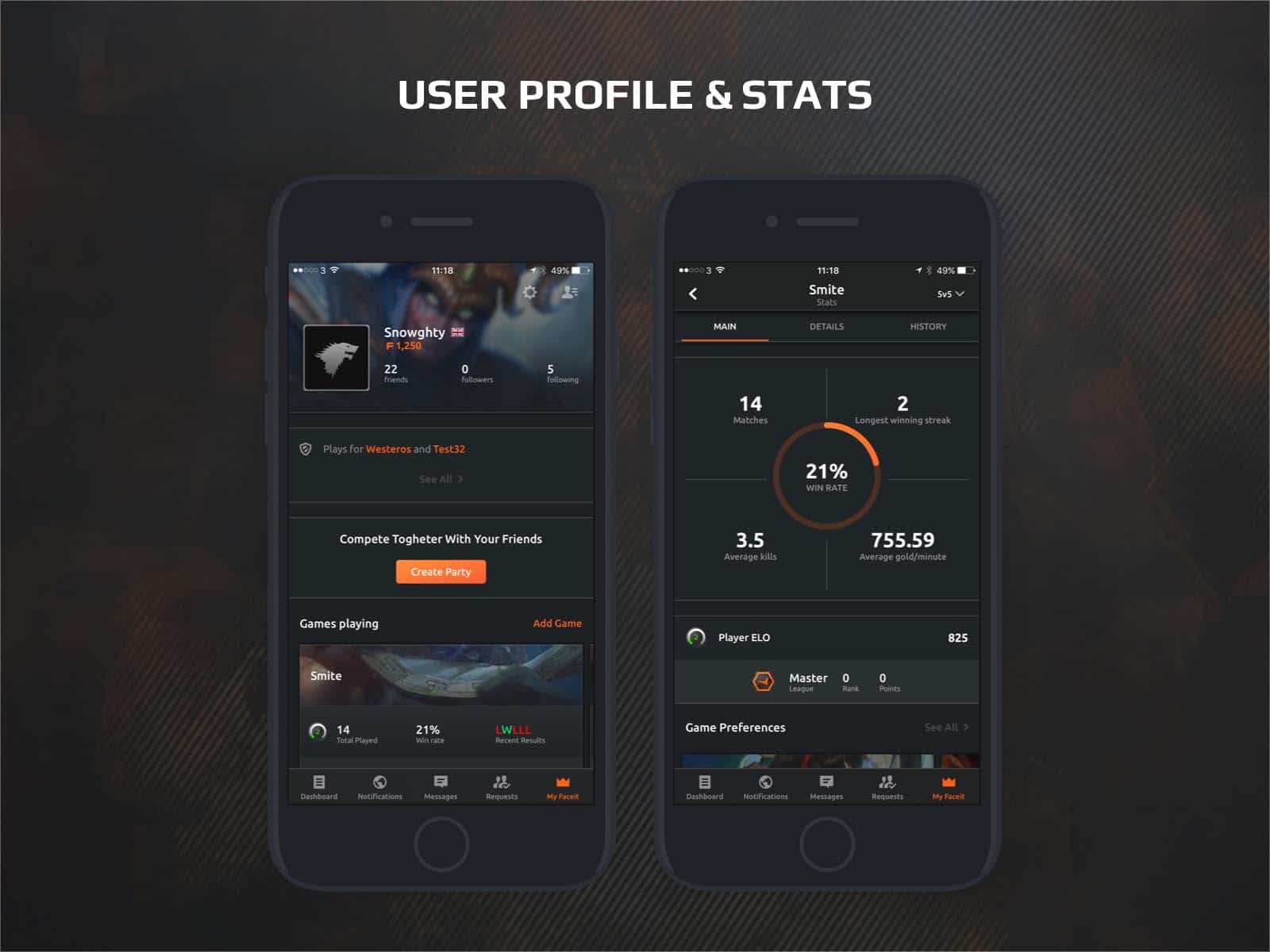
The user profiles take on the information that is available about the players on the desktop version of the platform and was designed for a mobile UI. A small improvement was added to show a quick summary of each player; this was a much-wanted feature by the platform’s audience.
Each individual game that the user has played is listed on their profiles and the user has the ability to tap on it and see more details about their performance in the game—like game stats, wins and loses, competitions played, their rankings in the specific game’s league, and more.
The problem here was how to structure the information—starting from the desktop user profile into a mobile UI. In order to be digestible and easier for the user to find everything about a game they play, tabs were introduced to navigate through different instances of the game statistics.
Game Dashboard & Messages
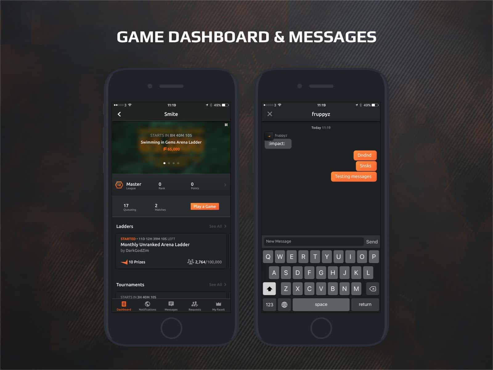
The game dashboard is the hub for each game where all competitions like ladders (daily events), championship, and tournaments are displayed.
The challenging part is that it has two sides the gaming side that shows all the competitions and the user stats side that shows how you are ranked as a player in that game. To solve this, the game dashboard became a combination of the two purposes. A player can see all featured competitions, their stats, and the ability to join the matchmaking queue of that game.
An interesting design solution here was that instead of using the header space for a banner of the game, I decided to make use of that space and have a swipe through upcoming featured competitions with big prize pools for that game. If you tap on any, the user would be taken to the competitions page.
Wireframes
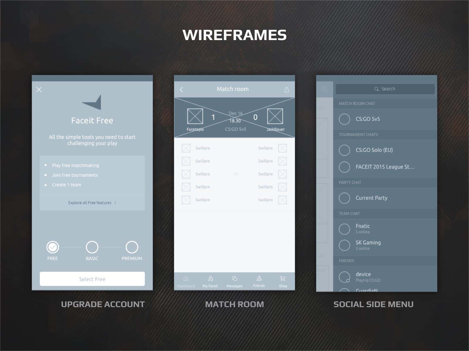
The wireframing stage took quite an extensive amount of work because the most challenging part was how to put all the information on the platform to fit on a mobile screen.
Until the final wireframes were reached, multiple versions of different screens were created and shown in front of users to see what would their opinion be and if they had a magic wand, what they would change to make things better for their gaming experience.
The wireframes were also tested in-house by members of the FACEIT team as well as some of the guest pro players who were coming to the office.
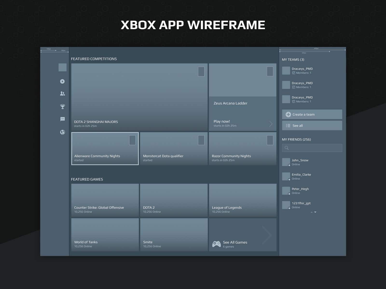
Wireframes
After the wireframes were finished they were combined in a working prototype on InVision. We then tested them in-house again and presented our findings to the tech team. Luckily, they didn’t find anything that was not possible or out-of-scope so it was all good to proceed with the UI design of the app.
The scope of the app turned out to be around 80 screens where the work on them was shared between the team in Porto and me.
